|
|
Critique By:
Russ Cooper (K:759)
10/31/2002 9:42:45 PM
Thanks to you all for the encouraging words. I've learned a lot here just playing around with Project #1. Pretty soon I think I'll get brave go on to (drum roll, please) Project #2. I sure hope it's not the one with the word "metaphysics" in the title.
|
| Photo By: Russ Cooper
(K:759)
|
|
|
Critique By:
Russ Cooper (K:759)
10/31/2002 9:31:13 PM
I like this one better than the other one because this one has less of the tree on the right that has all the leaves on it. I think the bare branches work better for what you are trying to do. If you're interested in more abstract and less tree-like images, you might have fun trying to isolate an interesting part of the tree and fill the frame with just that part. See the attachment for what I mean.
|
| Photo By: Robert Lewis
(K:8)
|
|
|
Critique By:
Russ Cooper (K:759)
10/31/2002 9:14:46 PM
Of the four pepper shots, I like the background in this one the best. The pure white background looks too fake to me, and I like the neutral shade of the background here better than the reddish effect on the other two. Here, though, I think that the background is still too dark.
Did you use the gold reflector on this one?
Drop me an email sometime. rmac@ibab.org
|
| Photo By: Samuel Downs
(K:7290)
|
|
|
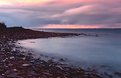
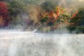
Critique By:
Russ Cooper (K:759)
10/31/2002 8:51:42 PM
Why the troops aren't going ga-ga over this one, I don't know. It's beautiful! The surf looks more like fog than water to me in the long exposure, but it's a neat effect in any case. My only gripe is that I don't like the yellow sky in the upper-left corner. Cropping it out might put the horizon too high in the frame. Maybe there's a different solution?
|
| Photo By: Greg McCracken
(K:129)
|
|
|
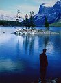
Critique By:
Russ Cooper (K:759)
10/31/2002 7:42:56 PM
Maybe the way to avoid the "hey, Fraser, go stand down by the water" look is to have him doing something. You know, like fishing. Or reading. Or working on an old car.
|
| Photo By: Kim Culbert
(K:37070)
|
|
|
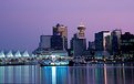
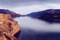
Critique By:
Russ Cooper (K:759)
10/31/2002 7:04:10 PM
1. That purple sky is great, as are the colors in the reflections.
2. The Horizon Police are right !
3. I agree that the Chevron sign is obnixious. Maybe instead of trying to get rid of it completely (and its reflection along with it), you could at least work it over so it looks like just a big light instead of an obvious advertisement. Easy for me to say, huh?
|
| Photo By: C.L. Weldy
(K:18)
|
|
|
Critique By:
Russ Cooper (K:759)
10/31/2002 6:56:40 PM
Beautiful colors and a nicely composed scene, except in my opinion the bridge itself doesn't seem like it belongs there.
|
| Photo By: Ray love
(K:124)
|
|
|
Critique By:
Russ Cooper (K:759)
10/31/2002 6:52:35 PM
The foreground rocks that are away from the shore a little bit look to me like they're just floating in space. I don't know if there's anything to be done with that idea or not.
|
| Photo By: Misty Woodward
(K:18)
|
|
|
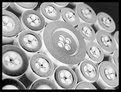
Critique By:
Russ Cooper (K:759)
10/30/2002 9:33:45 PM
Here are some things to try next time you have your buttons laid out on the table getting their picture taken:
1. Either get closer, or else use more buttons so they appear to be endless. The buttonless area in the upper-right corner seems funny.
2. You have a very symmetrical arrangement of buttons here. I think you should either frame the shot in a way that highlights that symmetry, or else arrange the buttons in a non-symmetrical way that gives an interesting composition.
3. I like the negative effect, except for where the pure black holes in the buttons translate to pure white spots in the picture. The white spots bother me. Maybe there's some way you could arrange the light so the holes aren't pure black and the white spots would therefore not be so bright.
Keep at it! I've been workin on the B&W Abstracts project myself and it's harder than I thought it would be.
|
| Photo By: Glen Boyd
(K:23)
|
|
|
Critique By:
Russ Cooper (K:759)
10/30/2002 8:52:27 PM
Great colors and capture. I wish the road didn't end so abruptly where it goes over the hill. Cropping's not the answer, and anything you could have done at the time the shot was taken would have wiped out the sky.
Oh, well!
|
| Photo By: Lisa Brainard
(K:743)
|
|
|
Critique By:
Russ Cooper (K:759)
10/30/2002 8:41:59 PM
Very pretty colours. I could see this one hanging in a store for sale. I can't decide if the half-hidden berry is a distraction or if that's what makes the picture interesting. Do you have any other variations on the same subject?
|
| Photo By: Kristi Zylstra
(K:16)
|
|
|
Critique By:
Russ Cooper (K:759)
10/25/2002 8:29:30 AM
Oh, yeah! That fixed the black and helped the fire also in a way I hadn't anticipated.
|
| Photo By: Robert Lewis
(K:8)
|
|
|
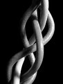
Critique By:
Russ Cooper (K:759)
10/25/2002 6:49:45 AM
This picture has the same "the blacks aren't quite black" problem that Sue O'Shields's "On Rope" picture did. She explained how she fixed it in Photoshop, and I bet the same treatment would help your picture a lot also. Sue's picture is at:
http://www.usefilm.com/showphoto.php?id=25183
|
| Photo By: Robert Lewis
(K:8)
|
|
|
Critique By:
Russ Cooper (K:759)
10/24/2002 11:07:30 PM
I didn't think much of the thumbnail, but the full-sized picture is great. I think the difference (for me, anyway) may be the big fat black frame. That really helps, IMO.
|
| Photo By: Stan Petersen
(K:7)
|
|
|
Critique By:
Russ Cooper (K:759)
10/24/2002 10:57:49 PM
Hi Al. You've got a nice, balanced composition here. Good eyeballs!
|
| Photo By: Al Camp
(K:539)
|
|
|
Critique By:
Russ Cooper (K:759)
10/24/2002 10:51:39 PM
The B&W Abstracts project has ruined me. I keep seeing crops like this one.
|
| Photo By: Kathleen McGivney
(K:112)
|
|
|
Critique By:
Russ Cooper (K:759)
10/24/2002 10:23:14 PM
Yes. Yes. Crop the bottom (but not too much) and get rid of the frame and you have a real winner.
|
Photo By: Ingrid Mathews
(K:7277)

|
|
|
Critique By:
Russ Cooper (K:759)
10/24/2002 10:18:25 PM
Looks like you've got the filters and the B&W figured out ... the tones in this one are great. Conventional wisdom says that a step to the right or left might have made the composition better by getting the path away from the center of the frame. Did you take any like that? Is this a case where the rule was better broken?
|
| Photo By: Sarah Needham
(K:2482)
|
|
|
Critique By:
Russ Cooper (K:759)
10/24/2002 10:08:53 PM
Me too. This is really neat. How did you make this picture?
|
| Photo By: Aiman Nassar
(K:11961)
|
|
|
Critique By:
Russ Cooper (K:759)
10/24/2002 10:06:36 PM
I didn't even notice the boat wake until I read your comment. And I -really- like the overall blue cast. I don't think you overdid that at all. The thing that bothers me about this one is that the brownish-green cliff in the lower-left looks sort of out of place amidst all the blue. Unfortunatley, I don't have any ideas for fixing that.
|
| Photo By: Debi Bishop
(K:140)
|
|
|
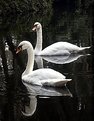
Critique By:
Russ Cooper (K:759)
10/24/2002 9:46:00 PM
My thought was the same as Christopher's ... too bad their necks overlap.
|
| Photo By: Beverly Gustafson
(K:1572)
|
|
|
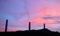
Critique By:
Russ Cooper (K:759)
10/24/2002 9:25:19 PM
Retain sunset, change power station to fence, wipe out smoke, and add realistic bird for scale. Nobody will ever know.
|
| Photo By: heather martino
(K:3648)
|
|
|
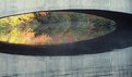
Critique By:
Russ Cooper (K:759)
10/24/2002 9:00:13 PM
I'm amazed at some of the pastel colors people are getting like the ones in this picture. Somehow I think there's too much light gray at the bottom. But cropping it off would make the picture wider and shorter than it already is. Is there a solution?
|
| Photo By: Ingrid Mathews
(K:7277)
|
|
|
Critique By:
Russ Cooper (K:759)
10/24/2002 8:56:27 PM
Hey, this is a far cry from your airplanes and vintage cars. I'd like to see just a little bit of room around the flower, as well as more detail in the middle of it. I can't tell if the problem there is that it's in the shadow or maybe that it's a little bit out of focus. Or maybe some of both?
|
| Photo By: Donald Holman
(K:884)
|
|
|
Critique By:
Russ Cooper (K:759)
10/23/2002 12:38:37 PM
Thanks Chelsea. I stopped down as much as the camera would allow, so I don't know if it will give any better DOF than I got or not. I'll make finding out my next project! If that's all the camera will do, I can always smash the wires together a little bit and try it again.
Any macro/DOF hints from other Coolpix users?
|
| Photo By: Russ Cooper
(K:759)
|
|
|
Critique By:
Russ Cooper (K:759)
10/22/2002 8:26:44 PM
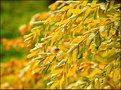
I think the colors that attracted you in the first place are the best part of this picture. But I can see where hubby is coming from, too, and I think maybe it's a matter of too much of a good thing. I was thinking of trying to relate that idea to Anna Nicole Smith, but then thought better of the idea. But I digress. If you go back when the light is warmer like Steve suggested, you might also think about trying to isolate one or two interesting branches to serve as focal points for your picture. And don't worry about "wasting" shots. Every one that doesn't come out quite right teaches you something, and that's a lot better than getting perfect shots every time without knowing why.
|
| Photo By: Debi Bishop
(K:140)
|
|
|
Critique By:
Russ Cooper (K:759)
10/22/2002 6:26:41 PM
Thank you both for the comments, especially about the frame. Sue, I like your idea about a set. I'll keep my eye peeled for a giraffe or a big tall rocket ship or something to complement this one 
|
| Photo By: Russ Cooper
(K:759)
|
|
|
Critique By:
Russ Cooper (K:759)
10/22/2002 4:18:06 PM
Ya! And those colors ... directly across from each other on the color wheel. Makes you think all that theory might actually mean something!
|
| Photo By: Francis Bosse
(K:18)
|
|
|
Critique By:
Russ Cooper (K:759)
10/22/2002 4:15:53 PM
Brr! It's 80 degrees F here in Phoenix and I can't imagine anyplace being cold. But this looks it. Can you go back to this spot again? I'd like to see less of the bare snow in the foreground and more of the tops of the trees.
|
| Photo By: Les Anderson
(K:555)
|
|
|
Critique By:
Russ Cooper (K:759)
10/22/2002 4:06:32 PM
Yup. Real nice. The smoke makes it.
|
| Photo By: Andreas Just
(K:23)
|
|