|
|
Critique By:
jay ott (K:82)
6/26/2004 6:20:10 AM
Very dramatic lighting and the tiny plane gives a sense of scale. Good job.
|
| Photo By: giuliano colivicchi
(K:2880)
|
|
|
Critique By:
jay ott (K:82)
6/1/2004 3:10:58 AM
Infrared film was a good choice for this subject. Nice job.
|
| Photo By: Rick Page
(K:5242)
|
|
|
Critique By:
jay ott (K:82)
5/25/2004 4:58:32 AM
For me these kinds of shots are very difficult for me so I don't do many of them and I admire those that can pull them off which you have done here. Good job.
|
| Photo By: Glenn R. McGloughlin
(K:3716)
|
|
|
Critique By:
jay ott (K:82)
4/21/2004 3:09:31 AM
Great shot.
|
| Photo By: DON H
(K:770)
|
|
|
Critique By:
jay ott (K:82)
12/12/2003 9:48:25 PM
Wow, nice composition and beautiful tones.
|
| Photo By: Nana Sousa Dias
(K:263)
|
|
|
Critique By:
jay ott (K:82)
11/12/2003 6:55:42 PM
Good job.
|
| Photo By: kajo buzek
(K:83)
|
|
|
Critique By:
jay ott (K:82)
11/10/2003 9:50:08 PM
Nice.
|
| Photo By: Cathy Barrows
(K:1897)
|
|
|
Critique By:
jay ott (K:82)
11/10/2003 9:40:56 PM
Apart from the dull sky and the focus a bit soft, this is a good photo.
|
| Photo By: Gerardo Di Paola
(K:224)
|
|
|
Critique By:
jay ott (K:82)
10/29/2003 11:42:35 PM
What a great shot. Nice gradation of tones and great lighting.
|
| Photo By: Richard Demanowski
(K:674)
|
|
|
Critique By:
jay ott (K:82)
10/29/2003 7:15:27 PM
Wow, what a great photo.
|
| Photo By: Matt Oswald
(K:48)
|
|
|
Critique By:
jay ott (K:82)
10/29/2003 5:15:27 PM
I like the low camera angle. I remember the days when grain was not so villified so it doesn't bother me too much. In this case it would probably be better without it, though.
|
| Photo By: Christian Barrette
(K:21125)
|
|
|
Critique By:
jay ott (K:82)
10/29/2003 5:10:13 PM
Very creative. Nice.
|
| Photo By: Jim McNitt
(K:11246)
|
|
|
Critique By:
jay ott (K:82)
10/20/2003 6:58:40 PM
Nice. A couple of things. The focus is a little soft, but maybe that's what you want to make it look old. One thing kind of bugs me is that dark thing on the wall in the back. Otherwise, I like it.
|
| Photo By: Pat Fruen
(K:12076)
|
|
|
Critique By:
jay ott (K:82)
10/14/2003 7:10:08 PM
Nice work. She looks like that girl from the Welch's grape juice commercial from a few years ago.
|
| Photo By: Antonio Martins
(K:401)
|
|
|
Critique By:
jay ott (K:82)
10/9/2003 10:04:25 PM
Excellent shot.
|
| Photo By: T Glow
(K:14955)
|
|
|
Critique By:
jay ott (K:82)
10/1/2003 7:16:12 PM
Shots like these are difficult because there's no time to do make adjustments. I think it could be a bit sharper and use a bit more contrast other than that I think the composition is A+. Perhaps a little fill flash might have perked it up a bit too.
|
| Photo By: Bjorn Beheydt
(K:12096)
|
|
|
Critique By:
jay ott (K:82)
9/25/2003 9:22:11 PM
Excellent. I suppose that it helps living in the most photogenic countries in the world. Don't forget the old adage "bad weather, makes great photos." So if I were you don't mess with the skies too much with PS.
|
| Photo By: Chris Spracklen
(K:32552)
|
|
|
Critique By:
jay ott (K:82)
9/25/2003 8:54:32 PM
I like this image. Good diagonal, good forms, and nice tones.
|
| Photo By: Robert Whiteman
(K:2201)
|
|
|
Critique By:
jay ott (K:82)
9/25/2003 8:52:11 PM
Nice. The only thing I think "might" have worked better for this scene is a 28mm lens. I can't say for sure because I wasn't there. Other than that good job.
|
| Photo By: Kenneth Kwan
(K:3084)
|
|
|
Critique By:
jay ott (K:82)
9/18/2003 10:06:37 PM
Wow, what a great shot! The eyes are intense and the image is tack sharp. Makes me want to go have a curry!
|
| Photo By: Bhaskar A. V.
(K:1246)
|
|
|
Critique By:
jay ott (K:82)
9/18/2003 9:45:05 PM
I like this since there aren't too many of these left. Good subject for bw. A few things that could make it better. The branch obscures the roof a little too much and it could use a bit more contrast. Perhaps a lower camera viewpoint or a tree trimmer would help with the branches. A lower viewpoint to include more of the tree stump. Overall it's still pretty good.
|
| Photo By: Brian Hynes
(K:522)
|
|
|
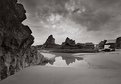
Critique By:
jay ott (K:82)
9/15/2003 11:08:04 PM
Nice! this is a very National Geographic looking shot. I think the rocks are little dark, but other than than it's great.
|
| Photo By: Francesco Bazzi
(K:953)
|
|
|
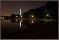
Critique By:
jay ott (K:82)
9/14/2003 7:43:34 PM
Nice composition. I like how you used the pool as a lead-in to the monument. Exposure is perfect. Reflections came out well and good gradiation of tones.
|
| Photo By: Alex Avilov
(K:634)
|
|
|
Critique By:
jay ott (K:82)
9/14/2003 11:07:17 AM
I like the horizontal lines. The boats in color is ok, but I think it would work just as well in b&w. Good soft lighting too.
|
Photo By: Robert Levy
(K:413)

|
|