|
|
Critique By:
Robert Stokes (K:4509)
8/30/2005 2:06:29 PM
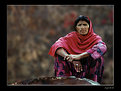
What an intense portrait. Great b/w tones, great sharpness, great use of the square format, just a great photo.
|
| Photo By: Claude Tenot
(K:9960)
|
|
|
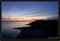
Critique By:
Robert Stokes (K:4509)
8/30/2005 12:03:24 PM
Wow Dave, what great use of a wide angle perspective and that ND grad. You really are getting the most out of your equipment, that's for sure.
I love the sweeping arc of the beach in the composition, accentuated by the smaller designs and ripples in the sand. All of this serves to lead me into the scene, with those wonderful colors helping to keep me there a while. Excellent photo.
|
Photo By: Dave K
(K:-171)

|
|
|
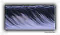
Critique By:
Robert Stokes (K:4509)
8/29/2005 2:38:57 PM
I don't know if it's a little soft in focus or if it's a little motion blur, but either way it works for me. Your image has a bit of a painting feel to it, for me anyway. The colors and abstract composition look great. Very good looking image.
|
| Photo By: Bobby Mun
(K:3709)
|
|
|
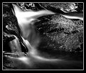
Critique By:
Robert Stokes (K:4509)
8/29/2005 2:23:00 PM
The subtle colors and tones look great and your composition has a nice flow about it. I really like these detail shots and how they help show off the way a photographer thinks about a scene instead of just reacting. Very nice photo.
|
| Photo By: ade mcfade
(K:12388)
|
|
|
Critique By:
Robert Stokes (K:4509)
8/29/2005 2:10:25 PM
I love to see these simple scenes, so long as they are well composed and exposed which this one is. The sky looks great as do the overall b/w tones. Excellent photo.
|
| Photo By: Danny Brannigan
(K:19523)
|
|
|
Critique By:
Robert Stokes (K:4509)
8/29/2005 2:06:50 PM
Very nice, simple composition and good use of b/w as well. The contrast looks good and strong which happens to be the way I like it also. Very nice image.
|
| Photo By: Danny Brannigan
(K:19523)
|
|
|
Critique By:
Robert Stokes (K:4509)
8/22/2005 4:17:24 AM
Thanks for the comment Ryan. No PS work was done on this one, just a straight scan of Velvia with a very polarized Fall sky. This was the first batch of slide film I ever shot and as you might guess I was very impressed.
|
| Photo By: Robert Stokes
(K:4509)
|
|
|
Critique By:
Robert Stokes (K:4509)
8/21/2005 5:26:58 PM
Thanks Hugo for the comments. The black line in the upper right corner (part of the boat) has been taken care of with a little crop. Funny how we sometimes miss such obvious problems in our own images.
As for the DOF, I had to use a pretty fast shutter speed since the boat was bobbing up and down pretty good. The trick was catching a well focused, well exposed shot with the flags blowing just right. It only took about 130 shots to get one I liked.
Thanks again for the comment.
|
| Photo By: Robert Stokes
(K:4509)
|
|
|
Critique By:
Robert Stokes (K:4509)
8/21/2005 5:20:29 PM
Thanks for responding to our questions Louise. I read about a photographer who did a piece for either Outside or National Geographic Adventure, don't remember which magazine or his name at the moment, but he had a monopod type set-up clamped to his top tube. He was shooting a Nikon F100, pre-focused with a wide angle lens, shutter priority mode. He had a cable release screwed onto the body and kept it in his mouth, tripping the shutter by biting down. He actually took this out on real mountain bike trails, chasing the other riders and experimenting with various shutter speeds. I think I remember him having one pretty good wipe-out and maybe destroying a flash in the process.
|
| Photo By: Louise Vessey
(K:13862)
|
|
|
Critique By:
Robert Stokes (K:4509)
8/21/2005 5:07:26 PM
This is a seriously cute photo Jessica. I love the composition, your b/w tones are excellent and those boots are just great. Very nice photo.
|
| Photo By: Jessica Dittmer
(K:477)
|
|
|
Critique By:
Robert Stokes (K:4509)
8/21/2005 4:57:05 PM
Looks nice and sharp, well composed with the diagonal tilt and the colors are very good. They sure do 'stand tall' and hold their ground. Very nice photo.
|
| Photo By: David Chauvin
(K:200)
|
|
|
Critique By:
Robert Stokes (K:4509)
8/21/2005 4:45:15 PM
Cool shot, especially with her looking back and your handlebars in the frame. You may have to let go of the brakes if you ever want to catch her ;-)
Just curious, do you have some sort of mount that attatches to your bike? I have been thinking of some plans for such a contraption, if I can ever get around to fabricating some pieces.
|
| Photo By: Louise Vessey
(K:13862)
|
|
|
Critique By:
Robert Stokes (K:4509)
8/21/2005 4:22:44 PM
Nice abstract image Ryan. The vertical format with a diagonal texture works very well. This one allows the viewer to play with the image in our mind, a good thing for graphic, abstract photos. Very nice.
|
| Photo By: ryan winton
(K:3027)
|
|
|
Critique By:
Robert Stokes (K:4509)
8/21/2005 4:18:02 PM
Only 3 comments on this one??? I think it's pretty freakin' creative and pretty freakin' cool. Perspective, tones, focus, it's all there in this one. Great photo Ryan.
|
| Photo By: ryan winton
(K:3027)
|
|
|
Critique By:
Robert Stokes (K:4509)
7/8/2005 6:50:38 PM
Great photo Raymond. The composition looks fantastic with that big dune sweeping across the frame and the tiny person way off in the distance. The colors and clarity are excellent as well. Very nice.
|
| Photo By: Raymond Pardede
(K:15)
|
|
|
Critique By:
Robert Stokes (K:4509)
6/26/2005 1:37:44 PM
This is pretty cool Michaelle. The sharpness and tones are excellent, and while it may not be your usual style it does show how diverse and talented you are.
It's funny, but for the past few weeks I have been thinking about trying to photograph the Doves out my back door with this same great lens on my D70. Mostly I just sit and watch them. One even flew onto the porch about 3 feet from where I was sitting, without my camera of course. Oh well, sometimes it's ok to just watch.
Thanks for sharing this fine photo Michaelle. I think I will give it a go myself today.
|
| Photo By: michaelle .
(K:3807)
|
|
|
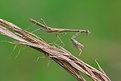
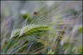
Critique By:
Robert Stokes (K:4509)
6/24/2005 5:17:41 PM
Kevin, the barley is very nice, with the soft light, subtle movement and pleasing composition. The grasshopper is ok, but I would rather see a bit more detail in it. Not always possible I know. Overall a very nice photo.
|
| Photo By: KEVIN TEMPLE
(K:8657)
|
|
|
Critique By:
Robert Stokes (K:4509)
6/24/2005 3:21:12 PM
Wow James, everything has come together just right in this one. The nice graphic elements made by the silhouette, the rich colors in the sky, the silky water and the engaging wide angle perspective. Well composed and exposed. Very nice photo.
|
| Photo By: James Bambery
(K:13421)
|
|
|
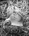
Critique By:
Robert Stokes (K:4509)
6/23/2005 5:49:20 PM
Well Amanda, I usually don't like to jump on the band-wagon when an image has already recieved so many positive comments, but I couldn't pass this one up. First off the styling is fantastic and I'm assuming you had a hand in that. Of course the moment captured is quite adorable and your composition, exposure and b/w tones are all right on. This is certainly a marketable image as well, as I'm sure you can see for yourself. Very, very nice image Amanda. Thanks for sharing and inspiring.
|
| Photo By: A K
(K:8499)
|
|
|
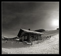
Critique By:
Robert Stokes (K:4509)
6/23/2005 5:29:34 PM
Yeah, the curvature of the slope looks great in your composition and the b/w tones are fantastic. This is one of those scenes where having a subject pretty much centered works well. Now you got me really wanting to step into my skis and hit the slopes, but I'm afraid I'll have to wait about 6 months. Very nice photo.
|
| Photo By: Mirek Netusil
(K:572)
|
|
|
Critique By:
Robert Stokes (K:4509)
6/19/2005 11:05:25 AM
Samantha, you clearly have an advantage over me and most other photographers when it comes to self portrait photography; that is to say, you are quite a looker. But the important thing is what you have done with your beauty. Throughout your portfolio you display a great deal of confidence and creativity, with images that showcase a range of ideas, techniques and emotions on your part.
As for this image, the framing is nicely done and b/w is likely the best choice. Two big elements stand out for me;first is the contrast between the soft and pretty subject (you), and the hard and ugly brick wall. Hmm, but are you really that soft? The second element, that steely, 'knowing' glance suggests otherwise. All together it makes for a very fine image.
|
| Photo By: Samantha P
(K:1961)
|
|
|
Critique By:
Robert Stokes (K:4509)
6/19/2005 10:41:26 AM
Now this is a very interesting image, and one that works very well in b/w. There is quite a lot going on though not in a distracting way. All the elements seem to fit nicely, from the geometric patterns to the alluring posture of the subject, it just works. What ties it all together is the just right amount of blur you created. Amazing image Samantha.
|
| Photo By: Samantha P
(K:1961)
|
|
|
Critique By:
Robert Stokes (K:4509)
6/17/2005 4:55:17 PM
Pretty cool contrast between the light and dark areas. The scale of the scene is just amazing and your color saturation is nicely done. Very nice image.
|
| Photo By: Naomi Weidner
(K:6636)
|
|
|
Critique By:
Robert Stokes (K:4509)
6/17/2005 4:32:29 PM
The lighting and exposure look great, your b/w conversion is right on and the models pose is fantastic. The only thing I would change is the title; Erin Kelly, Goddess
Too dramatic? Oh well.
|
| Photo By: Delete My Account Delete my Account
(K:1232)
|
|
|
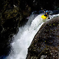
Critique By:
Robert Stokes (K:4509)
6/17/2005 4:27:54 PM
Awesome scene Ben. The subject is really in the sweet spot of the frame - and the creek as well. Looks like a nice drop/pool/repeat type of run, though I'm afraid a bit out of my league at the present. Cool shot.
|
| Photo By: Delete My Account Delete my Account
(K:1232)
|
|
|
Critique By:
Robert Stokes (K:4509)
6/16/2005 2:12:22 PM
The light and colors look great and your choice of composition, focal legnth and aperture work very well. I have to agree with Rebecca as this is certainly one of my favorite places in all the world. Very nice photo.
|
| Photo By: Eric Foltz
(K:18)
|
|
|
Critique By:
Robert Stokes (K:4509)
5/22/2005 1:34:06 AM
The background work is very well done Saqib. You were quite right that the original was a bit distracting, but this is well seen and blended. The subject is also well seen and captured, with rich colors and contrast that really help set the mood for this scene.
I must say, I am also impressed that you are so famaliar with this song by Temple of the Dog. The lyrics do fit your scene well. Nicely done in all regards.
|
| Photo By: Saqib Zulfiqar
(K:2745)
|
|
|
Critique By:
Robert Stokes (K:4509)
5/10/2005 12:30:29 AM
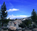
Overall this is a good image, though not quite of the caliber you may see in Climbing or Rock & Ice magazines (not that I have ever taken anything that good myself, but here goes anyway). On the plus side, the exposure looks pretty good, the subject (you) is framed nicely by the dark pine trees on the sides and your position on the rock is nice and dynamic. I do tend to prefer these type of shots to feature the subject (again, you) in a more frame filling manner. In other words, get closer, and resist the natural instinct to include all of everything, as in the whole rock or the whole tree in the image. Anyone who can't figure out what's going on in a tighter composition won't really be interested anyway. Besides, it looks like you have some ink on your back that in my opinion would add to the vibe of the scene. But hey, I understand wanting to show-off that blue bird sky as well, and as I said I do think this is a pretty good image. The important thing is that you were there enjoying life and have the image to prove it.
|
| Photo By: Bill Baer
(K:212)
|
|
|
Critique By:
Robert Stokes (K:4509)
3/29/2005 1:41:18 AM
She loves the camera, and the camera loves her. Nice job with the sunlit hair and the catch lights in her eyes. Very nice photo.
|
| Photo By: Gustavo Scheverin
(K:164501)
|
|
|
Critique By:
Robert Stokes (K:4509)
3/29/2005 1:13:00 AM
Great moment you have captured here and an excellent title as well. The light is very pleasing and your use of depth of field is right on. The square format looks good to. Very nice photo.
|
| Photo By: Kat B
(K:-66)
|
|