|
|
Critique By:
Kathy Hwang (K:142)
12/17/2004 12:38:36 AM
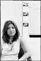
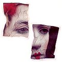
I took this portrait for a photography class. When we did a presentation on portraits at the very end, I did not get that much feedback. Did this invoke any strong feelings?
|
| Photo By: Kathy Hwang
(K:142)
|
|
|
Critique By:
Kathy Hwang (K:142)
12/17/2004 12:28:55 AM
Wow, this is beautiful. Great color. and great form. good choice.
|
| Photo By: Reidar Olsen
(K:144)
|
|
|
Critique By:
Kathy Hwang (K:142)
12/17/2004 12:28:17 AM
Nice shot. Wish the resolution was higher.
|
| Photo By: Matt DeClaire
(K:3)
|
|
|
Critique By:
Kathy Hwang (K:142)
12/17/2004 12:27:03 AM
Adorable face! Looks like he's looking right at you!
|
| Photo By: Mistral Vortex
(K:627)
|
|
|
Critique By:
Kathy Hwang (K:142)
12/17/2004 12:26:21 AM
Very nice printing. Very interesting. Looks like a 2-D black and white painting. Really nice even colors and an intriguing subject.
|
| Photo By: Mark Drago
(K:10902)
|
|
|
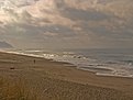
Critique By:
Kathy Hwang (K:142)
12/17/2004 12:23:44 AM
The slanted horizon bothers me a bit, but thats because I'm really sensitive to that. Other than that, GREAT photo. The saturation of the sky really draws you in and the white spots in the sky complements the white of the waves. Very tumultuous scene. I like it.
|
| Photo By: paul smith
(K:12)
|
|
|
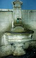
Critique By:
Kathy Hwang (K:142)
12/17/2004 12:21:32 AM
Nice. i like how the fountain seems to jump away from the wall. nice surrealist quality.
|
| Photo By: Sally A.
(K:4601)
|
|
|
Critique By:
Kathy Hwang (K:142)
12/16/2004 3:24:13 AM
thanks. i went through your photos. very nice. can you provide me with more critique?
|
| Photo By: Kathy Hwang
(K:142)
|
|
|
Critique By:
Kathy Hwang (K:142)
12/9/2004 5:00:15 PM
Amazing shot! Deep, bright colors. Very surreal.
|
| Photo By: Bobby Mun
(K:3709)
|
|
|
Critique By:
Kathy Hwang (K:142)
12/9/2004 4:51:36 PM
very beautiful shot. love the amazing texture on the sand.
|
| Photo By: Brian T. Ach
(K:1742)
|
|
|
Critique By:
Kathy Hwang (K:142)
12/9/2004 4:42:20 PM
Nice shot. Is it a little underexposed?
|
Photo By: Robert Gaither
(K:34128)

|
|
|
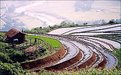
Critique By:
Kathy Hwang (K:142)
12/9/2004 4:41:05 PM
Very nice photo. I like the way that photo is partitioned into 3 different sections and the lines draw you eyes into the center of the frame. The hut and the yak(?) add a good balance.
|
| Photo By: ngythanh
(K:430)
|
|
|
Critique By:
Kathy Hwang (K:142)
12/9/2004 4:37:39 PM
Good highlights and good shadows. I wish there was a close crop of the head or no crop at all. Very nice
|
| Photo By: SORRENTE Patrick
(K:3307)
|
|
|
Critique By:
Kathy Hwang (K:142)
12/7/2004 11:28:25 PM
Nice Angle but try focusing on one tool or painttube. The lack of focus seems distracting.
|
| Photo By: Long Tran
(K:107)
|
|
|
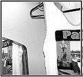
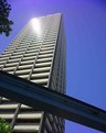
Critique By:
Kathy Hwang (K:142)
12/7/2004 11:07:25 PM
For an architecture shot, the glare off the building is distracting.
If you want to capture the Monorail, maybe a horizontal shot would work better.
There is no strong idea presented by this image.
|
| Photo By: Roger Skinner
(K:81846)
|
|
|
Critique By:
Kathy Hwang (K:142)
12/7/2004 11:04:29 PM
great highlights!
nice effects with the smoke!
|
| Photo By: Carlheinz Bayer
(K:14220)
|
|
|
Critique By:
Kathy Hwang (K:142)
12/7/2004 10:53:00 PM
nice colors in the sky but the trees are distracting more than anything.
|
| Photo By: Pete Church
(K:43)
|
|
|
Critique By:
Kathy Hwang (K:142)
12/7/2004 10:49:43 PM
I'm very appreciative of that comment, although i wouldn't call it necessarily negative. It's honest at least. I prefer criticism in fact.
But, I do understand your point of view. I did take another photo with your suggestions but I chose this one rather than the other because the architecture of the buildings could be seen more clearly. I'll upload it and you can tell me what you think of it.
|
| Photo By: Kathy Hwang
(K:142)
|
|
|
Critique By:
Kathy Hwang (K:142)
7/8/2004 12:11:44 AM
Great expression on the lady's face. She looks ghostly. Printing is good. Might want to check the tiny little dust mark (?) on the head of the girl facing away from us. I like the composition.
|
| Photo By: Niels V. Nielsen
(K:9)
|
|
|
Critique By:
Kathy Hwang (K:142)
6/28/2002 12:09:49 AM
No. not cross processed...just when i scanned it the colors got distorted so it just turned out like this by accident. but thanks for the comment. yeah the left side is empty
|
| Photo By: Kathy Hwang
(K:142)
|
|
|
Critique By:
Kathy Hwang (K:142)
5/26/2002 7:15:46 PM
First words that came to mind were "oooo"....love how it drew me right into the photo. Great colors
|
| Photo By: Robert J. Fox
(K:17)
|
|
|
Critique By:
Kathy Hwang (K:142)
5/26/2002 6:55:21 PM
Love this photo!
|
| Photo By: Helena K Karlsson
(K:23)
|
|
|
Critique By:
Kathy Hwang (K:142)
5/15/2002 6:55:54 PM
Love this photo. Very beautiful. Love the fading and shadows.
|
| Photo By: Don Martel
(K:551)
|
|
|
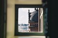
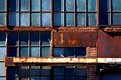
Critique By:
Kathy Hwang (K:142)
5/7/2002 12:18:09 AM
I actually like the white bar just as a contrasting element, although I agree that maybe it would help if it was more in focus, and also to brighten bricks under the bar. But otherwise, I really like the use of colors and shadows.
|
| Photo By: Jim Graham
(K:38)
|
|


")