|
|
|
Stephen Bowden
{K:64141} 9/7/2005
|
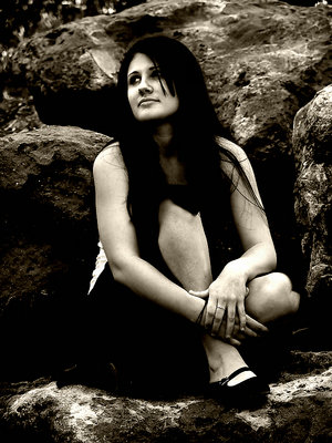
Beautiful portrait photograph Judi, I like the toning very much. Love the colour one also - hey I'm easily pleased - a couple of chocolate cakes and I even give 10/10 to a traffic warden !
Best wishes,
Steve
|
|
|
|
|
joanna ewa
{K:8061} 9/1/2005
|
this is like from old photography:)
interesting idea and good shot
regards:)
|
|
|
|
|
sherif hussein
{K:13815} 8/26/2005
|
Both versions are wonderful but I think the B&W more convienent with the title
Well done Judi
Sherif
|
|
|
|
|
Chuck Freeman
{K:13616} 8/26/2005
|
n Judi: Personally I like both. THe B&W is startling . Would like to see a little detail in her hair..but super
|

Sweet Little 16 |
|
|
|
|
James Bambery
{K:13421} 8/26/2005
|
Hmmmm, cant quite decide on this one Judi.I am tending to lean towards the color version with a little work done to it to bring out the little bit of flatness it has. IMHO, your posted version has lost some of the body and depth of the pose.( for example, where her hair meets part of her dress or skirt around her knee.) It is still remarkable pice of art.
Jim
|
|
|
|
 Judi Liosatos
{K:34047} 8/26/2005
Judi Liosatos
{K:34047} 8/26/2005
|
Thanks Wayne. The model saw it today and really liked it. I really appreciate your honest opinion...that helps a lot.
Judi
|
|
|
|
 Wayne Harridge
 {K:18292} 8/26/2005
|
Interesting treatment - what does the model think of it ?
I don't mind the high contrast, but unfortunately (in my opinion) you've lost all detail in the dark tones.
...Wayne
|
|
|
|
|
Judi Liosatos
{K:34047} 8/26/2005
|
Thankyou so much for you valuable advice. I will definitely try that out.
Judi
|
|
|
|
 Roberto Arcari Farinetti
{K:209486} 8/26/2005
Roberto Arcari Farinetti
{K:209486} 8/26/2005
|
strong darkness.. agreat effect of old self-printed in the camera!
marvellous
roby
|
|
|
|
 Ameed El-Ghoul
{K:42215} 8/25/2005
Ameed El-Ghoul
{K:42215} 8/25/2005
|
Excellent,
Love the contrast, the tones, the B&W, and the pose,
impeccable,
very well done,
Regards,
|
|
|
|
|
Salvador María Lozada
{K:69375} 8/25/2005
|
Tha title has psychological implications which are
skillfully expresed in your masterful shot. As always, excellent.
Congratulations Judi.
Salvador
|
|
|
|
 Larry Hammond
{K:16631} 8/25/2005
Larry Hammond
{K:16631} 8/25/2005
|
Hi Judi,
This b/w is very nice, but I prefer the color for reasons I explained deeply in the past..:-)) OK?
Larry
|
|
|
|
 Larry Quigley
{K:12887} 8/25/2005
Larry Quigley
{K:12887} 8/25/2005
|
You did the right thing with this, Judi. The toned version has my vote. Cheers, Larry.
|
|
|
|
|
Lucas L
{K:12145} 8/25/2005
|
both really wonderful, i love the mood of the toned version, and apreciate much the details in the colour one. Both great.
|
|
|
|
 Mohamed Banna
{K:34237} 8/25/2005
Mohamed Banna
{K:34237} 8/25/2005
|
Judi
i opened this unique piece from about an hour...
every time i switched to another one,,or i went down to see the color one....
...... and return back.
why?
i think it needs some words not in my mind now...
so ... time is past..
....and i didn't write anything :)))))
cheers,,,,,
well done but i like the colored one
7777777
|
|
|
|
 Larry Fosse
{K:66493} 8/25/2005
Larry Fosse
{K:66493} 8/25/2005
|
Beutiful potraits....both of them Judi..the B&W effects you added really enhance the presentation
|
|
|
|
 Liz Wallis
{K:26133} 8/25/2005
Liz Wallis
{K:26133} 8/25/2005
|
Your toned version is lovely Judi....a very pretty model...gives the picture a very different feel.
|
|
|
|
 Kiarang Alaei
{K:49415} 8/25/2005
Kiarang Alaei
{K:49415} 8/25/2005
|
Oh~ most intimate and hearty portrait. bravo!
|
|
|
|
 Igor Sivjakov
{K:4671} 8/25/2005
Igor Sivjakov
{K:4671} 8/25/2005
|
Very nice picture! Good efect!
Cheers,
Igor
|
|
|
|
 Giulio Rotelli
{K:28441} 8/25/2005
Giulio Rotelli
{K:28441} 8/25/2005
|
Devo dire che anche l'originale è molto bella. L'elaborazione ha dei contrasti molto intensi tra luci ed ombre, ed è una caratteristica che mi piace, anche se è un pò in divergenza con l'espressione serena della ragazza, che guarda verso qualcosa di ignoto, ma lo fa con tranquillità.
|
|
|
|
|
B:)liana
{K:30945} 8/25/2005
|
Lovely tones and pose dear Judi
;0)
Kiss,
Biliana
|
|
|
|
 Mark Evans
{K:17428} 8/25/2005
Mark Evans
{K:17428} 8/25/2005
|
Love both versions judi , but must admit the B&W one does it for me !! superb photo and model .. cheers .. marky .
|
|
|
|
 pan g.
{K:16899} 8/25/2005
pan g.
{K:16899} 8/25/2005
|
Beautifull pose Judi.Nice pose and tones. Bravo!
|
|
|
|
|
andrea giuseppe
{K:3122} 8/25/2005
|
Usually I prefer to see colors but this time the tranformation give to the picture a perfect balance.
|
|
|
|
 Robert Kocs
{K:89085} 8/24/2005
Robert Kocs
{K:89085} 8/24/2005
|
" Be yourself " very apt title. Everybody needs should to know yourself. Lovely fine tones and the background hard line very stirring opposite. Love the model soft lines and tones. Well balanced really fine portrait. Nice artwork dear Susie.
My best regards!
Robert
ps: ...the original version is wonderful, but this one better. :)
|
|
|
|
|
patrizio napolitano
{K:13119} 8/24/2005
|
oltre che brava, sei anche bellissima
complimenti
patrizio
|
|
|
|
|
Fabio Ficola
{K:10466} 8/24/2005
|
Dear Judi I don't know wich is the best in the B&W version i like the toning with the dramatic effect added by the high contrast, but i miss the details on hair thet i like so much in the colour version.
The colour one seem a bit flat but I think that every effort was on the B&W.
Best regards Fabio
|
|
|
|
|
Saad Almansour
{K:1101} 8/24/2005
|
perfect image .
Saad
|
|
|
|
 Paul Lara
{K:88111} 8/24/2005
Paul Lara
{K:88111} 8/24/2005
|
It has a very organic feel to it, as if her face is growing out of the rock, since you've crushed the blacks.
I'm not sure about this one.
|
|
|
|
|
Antonia BauerleinSehnert
{K:30599} 8/24/2005
|
K Judi...I never find fault with your images...stellar photographer that you are, but the light in the original is a bit flat for my taste. So the effect does give the image more character, and for that reason I'd go with that. Not so long ago I had the light go that way in a shoot and used Niks midnight green and midnight violet filters to get similar dramatic effects (see the closeup shot called Faery". A good way to go. Antonia
|
|
|
|
|
Galal El Missary
{K:84569} 8/24/2005
|
I like Both version but prefer the color one's , wonderful pose & expression Judi , nice colors & Texture , Kind regards .
Galal
|
|
|
|
 Andre Denis
{K:66407} 8/24/2005
Andre Denis
{K:66407} 8/24/2005
|
Judi,
Funny you should mention the high spots... I haven't had too much experience with photoshop. I've mostly just been picking up a little here and there. What I've been doing with a lot of my shots is convert to greyscale, then go back to colour and use the colour balance adjusters to tone to taste. I find this sometimes turns the high spots nice and creamy looking. Quite often the effect is much more dramatic than the colour shot. I don't know if this is the recommended way to do this, but I like the results. Check out my two photos from a couple of days ago called "38 Delux" and compare the B&W toned to the coloured one and you will see what I mean.
Andre
|
|
|
|
 Mark Kresl
{K:9434} 8/24/2005
Mark Kresl
{K:9434} 8/24/2005
|
Being someone who struggles making up my mind, let me just say that I like both shots for very different reasons. The feel you get with the effects really set the mood well. It demonstrates a timelessness and moodiness.
The original version is very well done because the setting has such muted tones that seem to compliment the model and her skin tones. She also has such fair and perfect skin which is highlighted in the original.
I vote for BOTH!!
Mark
|
|
|
|
 Jason Mckeown
{K:22200} 8/24/2005
Jason Mckeown
{K:22200} 8/24/2005
|
both versions are beautiful, the B&W ensures you focus on the model
|
|
|
|
|
Judi Liosatos
{K:34047} 8/24/2005
|
Thankyou Andre for agreeing with me. I like the dramatic feel to this image with the tones....even the high spots...LOL!!
Judi
|
|
|
|
|
Andre Denis
{K:66407} 8/24/2005
|
I think the toning is the way to go on this one Judi.
Nice job!
Andre
|
|
|
|
|
Judi Liosatos
{K:34047} 8/24/2005
|
Before effects.
|

Original |
|