|
|
 carlo raingini
{K:11977} 8/7/2006
carlo raingini
{K:11977} 8/7/2006
|
great colors & great series.
carlo
|
|
|
|
|
Jan .
{K:8693} 3/31/2005
|
See...James cropped it too...
the "Slasher on the Sly"
|
|
|
|
 Matt Davis
{K:3935} 3/29/2005
Matt Davis
{K:3935} 3/29/2005
|
James,
Looks good to me. A little enhancement never hurts anyone! The shot wasn't planned - this girl was actually out walking her dog and went past me whilst I was photographing a possible shoot location.
So, naturally the two just happened to coinside!
I guess PS is the perfect substitute for no make up artist.
So, what basic tools are you using for the touch up here? I'm no PS master so don't really know all it's powers!
Rgds
Matt
|
|
|
|
|
James Berg
{K:274} 3/29/2005
|
alright Im bored.. so I did what I said I would do to this shot!
|

|
|
|
|
|
James Berg
{K:274} 3/29/2005
|
Matt... I like this shot... I would have bumped the contrast a little -- and would have ps'd the lines under her eyes out, and smoothed the skin on her chin. -- but these are all just my opinion....
Great model... great shot!
|
|
|
|
|
Matt Davis
{K:3935} 3/27/2005
|
David,
Yeah again I see your point. This photo has foxed me a little.
1) Because of the 50/50 composition.
2) The note you've made - I too find the blur a little aggressive. When out I nearly always shoot Av at max aperture if poss. Looking at this I think f4 was a mistake and should've chosen a saller app.
3) When I just uploaded the 'saturated' shot this looked a little to subtle in tone. I think that's why you too said that! Maybe I'll spend 5 mins in PS with this one day! Not sure it should be messed with too much mind - Faces are hard to PS well I think!
Thanks again for your comments - always valued & always good.
Matt
|
|
|
|
 david cunningham
{K:8255} 3/26/2005
david cunningham
{K:8255} 3/26/2005
|
matt... nice. i'd like to see a bit of bump in the saturation and contrast. that may be just because i'm thinking in those terms lately. i may be forcing my current state of mind onto your image. i would like to see a bit of detail in the grey wall on the left. it runs out to total blur way too fast for me and makes me a bit dizzy. feels like my left eye won't focus, like i'm looking at an image with my hand covering one eye. i think the vertical texture of the wall would be a great contrast to the beauty and the curves of the model... david
|
|
|
|
|
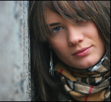
Hollow Eye
{K:1306} 3/23/2005
|
Hi Matt
This is a great shot. I think the eye contact & the colours in the shot are the highlight for me with the DOF on the wall pulling your view down into her eye.
I saw your comments on how to convert to B&W & you asked how I had manipulated my self portrait. Basically I used the same techniques. Channel mixer is a minimum I would use to convert to B&W. Then you can toy around with Hue & saturation & the contrast. If you are working in PS do all of these as adjustment layers so you can trace back your steps & tweak them at any stage. I will send the file to your email so you can see what I am talking about. Just toggle the layers on and off to see the effect.
A great site for this is www.luminous-landscape.com. He has a number of really good tutorials on there & this is one of them plus some other bits I have picked up.
Have a good one
|
|
|
|
|
Jan .
{K:8693} 3/23/2005
|
Matt...hehehe, sorry about the crop, I'm anal about odd numbers, it's a sickness! If I have 6 of something I have to split them into 2 groups of 3...don't ask!! Anyway, I just got your email, so after I get a few more cups of coffee in me, and the cloud lifts, I'll get typing. Also, I think I may have a few links to tutorials for you to read...I'll get it all to you later!!
Jan
|
|
|
|
|
Matt Davis
{K:3935} 3/23/2005
|
Jan,
Auto everything hasn't really let me down here too much then? Thanks for your time is demonstrating this.
I've just mailed you requesting my first PS tutorial.... maybe I'll then bannish my 'Auto' ways for a more refined approach.
PS - I see, you just couldn't resist cropping it into 1/3rds! Looks good.
|
|
|
|
|
Jan .
{K:8693} 3/23/2005
|
Hey Matt...I've gone through your porfolio...nice job pulling my leg...your BW tones are AWESOME!! Where's the problem?
Jan
|
|
|
|
|
Jan .
{K:8693} 3/22/2005
|
Now here's a copy of your image...my way...
Channel Mixer adjustment layer (to convert to BW)
Levels adj. layer (to tighten up the range of tones)
Curves adj. layer (to adjust contrast w/o blowing out anything to black or white)
My point is this, you may be achieving acceptable results by simply desaturating and auto levels, but it's by the seat of your pants and you have no control over it. I'm glad to help, so if you would like me to go into further detail...email me at jkgranger@aol.com.
Hope that helped!
Jan
|

|
|
|
|
|
Jan .
{K:8693} 3/22/2005
|
O.K. Matt...you asked for it (and you've sucked-up enuff...quit already...LOL) Here's a copy of your image...desaturated, auto levels...
|

|
|
|
|
|
Matt Davis
{K:3935} 3/22/2005
|
Jan,
Now I'd agree with your comment. The good old rule of 1/3rds obviously came about for a reason!
This shot followed 'J-One', which is the 1/3rd composition. That one is my fav but all have their merits and all are different hence my choice of these three to upload.
One other question, I read your notes on toning in PS using 'S' curve, sat levels etc. Now call me dumb but I searched & tried but didn't get any results better than 'Ctrl/shift/U' (desaturate) and 'Crtl/shift/L' (auto levels). Could you spell it out in laymon terms for me therefore. I just wanna copy you - it's that simple - you're great! LOL. But seriously, any PS help would be greatly appreciated.
Ta
|
|
|
|
|
Jan .
{K:8693} 3/21/2005
|
This is my favorite! The grey wall makes her blue eye really stand out against all the brown tones. Love the subtle colors...really quite lovely! The only thing I would nit-pick about this is that it's cut in half by wall...I prefer thirds! Not a big deal..
Congrats.
Jan
|
|
|
|
 Roberto Arcari Farinetti
 {K:209486} 3/21/2005
|
una modella adorabile ed una foto stupenda..
roby
7+
|
|
|
|
 Naomi Weidner
{K:6636} 3/21/2005
Naomi Weidner
{K:6636} 3/21/2005
|
Nice job of cropping. Some might have cropped away the out-of-focus object to the left, but I think leaving it in really adds to the final product. -- Naomi
|
|
|
|
|
Mohamed Khalil
{K:121} 3/20/2005
|
very beautiful shot.. i love it..
|
|
|
|
|
Gertrud Gozner
{K:14222} 3/20/2005
|
nice portrait...
|
|
|
|
 Paul Lara
{K:88111} 3/20/2005
Paul Lara
{K:88111} 3/20/2005
|
I think this is the best portrait of her so far...it's beautiful, and quite moody. I think the large out-of-focus area to the left really helps push the eye right to her.
|
|
|
|
 Shane Brown
{K:1831} 3/20/2005
Shane Brown
{K:1831} 3/20/2005
|
Nice Portrait =)
|
|
|
|
|
Ken Alexander
{K:3905} 3/19/2005
|
Nice portrait, Matt, quite original!
|
|
|
|
 - -
{K:10510} 3/19/2005
- -
{K:10510} 3/19/2005
|
great portrait..
congrats
|
|
|
|
|
Francesco Martini
{K:12249} 3/19/2005
|
very original and beautiful portrait!!!
|
|
|
|
|
Nuno Borges
{K:1570} 3/19/2005
|
Curious expression. Nice composition, fine detail, soft colours.
|
|


![San Marco []](http://thumbs.imageopolis.com/images/2/5/3/3/2533/648549-Micro.jpg "San Marco []")