|
|
 Ian McIntosh
{K:42997} 10/21/2005
Ian McIntosh
{K:42997} 10/21/2005
|
Nice find.
|
|
|
|
|
Margaret Sturgess
{K:49403} 10/20/2005
|
Great capture of textures, great lines to make an intersting composition
Margaret
|
|
|
|
|
Dirck DuFlon
{K:35779} 10/7/2004
|
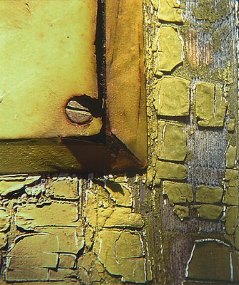
I love the intensity of the colors and the way the strong lighting brings out the wonderful texture of the paint and the wood! The perspective lines formed by the paint chips and the shadow in the lower-right makes it look to me like the frame is on a corner, but below the bottom of the frame it looks like a flat surface. I don't know why that makes any differece, but it seems to have occupied my attention for a while! :)
I think that if the shadow had continued to intensify toward the lower-right as you say it did in the original it would look really cool, but right now it looks kind of murky to me - not light enough, but not dark enough. Maybe you could dodge that area or burn it in further in this crop? Don't get me wrong, though - I like this a lot! :)
|
|
|
|
|
Lucy Bernadette
{K:5806} 9/27/2004
|
i love abstracts and this is a very good one. i love the colour, it's what first attracted me in the thumbnail.
|
|
|
|
 Emma Petrella
{K:3577} 9/26/2004
Emma Petrella
{K:3577} 9/26/2004
|
Composition, tessiture and colors very good. It's a really good work!
Emma
|
|
|
|
|
Becky V
{K:9699} 9/25/2004
|
Thanks for the comments, everyone. I kind of wish I had metered this properly. I took some other macros here and while I like them compositionally, they're too hot for my liking. Well, live and learn . . . and I did!
|
|
|
|
|
Kim Culbert
{K:37070} 9/22/2004
|
As you know, I love the textures in this one... and I am sooo happy that you kept the colour present. This could have made an excellent B&W study as well, but I find the rusty colours really add a punch.
Composition is excellent... a well seen, well captured shot!
|
|
|
|
Zeev Scharf
 {K:25603} 9/20/2004
|
Becky a great shot,lovely colors,excellent presentation
Well done
|
|
|
|
|
Stefan Engström
{K:24473} 9/20/2004
|
It is an unusual color - probably not the originally intended one :-) The screw gives me a scale for the photo and what I find interesting is that if it wasn't there I'd think this would be a larger part of a window frame with some stonework. Now these two impressions compete with each other and I think it adds a lot of interest. Great detail and color of course.
|
|
|
|
|
Jorg Reif
{K:16020} 9/20/2004
|
Very nice abstract you made here, color is interesting and the composition (certainly not easy!) is very good. well seen, great job. best of regards! Jorg
|
|
|
|
 Paul's Photos
{K:35235} 9/20/2004
Paul's Photos
{K:35235} 9/20/2004
|
very nice abstract.. this is probably one area that I have not spent a lot of time on but I will in the future :) Like the colors and the texture really adds to the overall image.. great work
|
|
|
|
|
Antonio Trincone
{K:23167} 9/19/2004
|
good catch, I like this kind of shot
|
|