|
|
 Ian McIntosh
{K:42997} 10/21/2005
Ian McIntosh
{K:42997} 10/21/2005
|
Pulls me in but disappoints close up. I'm looking for ore definiton in the grass left. So are you I gather.:) I usually try to stepen the curves at that area, usually creating problems elsewhere.
|
|
|
|
|
Mark Beltran
{K:32612} 5/25/2004
|
You rescued it totally. I can't even tell it was repaired in PS. The composition is nearly perfect, and worth the risk. The lens sure is sharp. Good old Yashica camera. Let me know if you want to sell it.
|
|
|
|
 Jose Ignacio (Nacho) Garcia Barcia
{K:96391} 2/29/2004
Jose Ignacio (Nacho) Garcia Barcia
{K:96391} 2/29/2004
|
I love the low contrast.marvelous mood.
|
|
|
|
|
Becky V
{K:9699} 2/11/2004
|
Dirck: *thank you* for that response. I get it now! I guess my thought process at the time stopped cold at "I wonder what would happen if . . ." and I really didn't really think things through. But now my brain is racing with thought (and I haven't even had breakfast yet!) Thanks again. :)
|
|
|
|
|
Dirck DuFlon
{K:35779} 2/11/2004
|
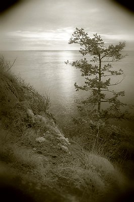
Becky, I think in this case the filters worked against you. The red filter darkens blues and lightens greens - since it was an overcast day, neither the sky nor sea had much blue in them, and so remained pretty much gray. The greens in the foliage did get lighter, but under these conditions that just brought their tonal values closer to those of the sky, resulting in the low-contrast. The polarizer probably had little effect at all (other than cutting light a stop or so,) since you were shooting into the sun (optimal polarization is at 45 degrees to the sun, and drops off at angles greater than or less than that, with the least effect at 0 and 180.) Sorry if that sounded pedantic!
Compositionally I still like this shot and the aged effect you were able to get out of it!
|
|
|
|
|
Becky V
{K:9699} 2/10/2004
|
Once again, thanks for the comments everyone - they make me happy. ;) About the vignetting, it is present in the original shot. It's darkness surprised me too. Usually my polarizer does produce a bit of vignetting when I use it with my wide angle lens, but I guess the red filter made it even more pronounced. I thought my feeble attmept to make the photo look Holgarific would lessen its impact, but I completely agree it's too strong, especially against a bright sky. It's as good as gone.
What was I thinking combining a polarizer and a red filter? I don't think I was. Because the weather conditions weren't that great (very overcast, very bright sky), I thought I would get darker water and darker sky by using the two filters together (and a bit of it was just plain old curiosity). In the end, it just prevented me from seeing anything out of my viewfinder (all my shots have very tilted horizons. It's kinda funny . . . .)
Audrey: people tell me that all the time. Are they right? Absolutely. Do I listen? Um . . .
|
|
|
|
|
Stefan Engström
{K:24473} 2/10/2004
|
My musings on contrast were just sent into /dev/null so here is a more to the point critique... The softer contrast works nicely if you want to create the impression of an aged and faded photo, but personally I do prefer the higher-contrast versions. I like the Holgafication, but the vignetting seems a little too strong. Is the vignette added or removed from the original shot, I am a little confused...
|
|
|
|
|
Dirck DuFlon
{K:35779} 2/10/2004
|
As Mary said, it really does have a nice 'old' feel to it - like something taken on one of the early expeditions west... I like the vignetting, but maybe it's a little too dark in the upper corners, since there is very little true black in the image. In my opinion, the red filter may have rendered the tones of all the vegetation in the foreground a little too evenly and detail starts to get lost. I'd like to know what effect you were aiming for with the red and polarizing filters?
|
|
|
|
|
Audrey Reid
{K:5872} 2/10/2004
|
Becky, you really beat yourself up over your photography - has anyone told you not to be so hard on yourself?
I like the 'wrong file-ARG' version best. Had wondered and couldn't work out why you had the 4 corners darkened in the main photo. I like the overall composition, the sheen on the water and the tonal treatment. Think I would be tempted to crop a little of the lower foreground.
|
|
|
|
|
MaryBell
{K:32791} 2/10/2004
|
I like the vignette version - it has the mood and feel of an old photo and draws us in...
|
|
|
|
|
Murat Tanriover
{K:8387} 2/10/2004
|
Do not get killed taking pictures Becky. That is the first thing you need to do. It is allright this way as well...
|
|
|
|
|
Ronald Peregrim
{K:18} 2/9/2004
|
I think it came out pretty good only next time send your boyfriend or husband out to take the picture that way you won't be the one to get hurt:-)
|
|
|
|
 Irenka Daniluk
{K:8011} 2/9/2004
Irenka Daniluk
{K:8011} 2/9/2004
|
I like the photo, but would rather see it with more contrast.. I like the vignette...
|
|
|
|
|
Dubravko Grakalic
{K:25235} 2/9/2004
|
nice mood here.
|
|
|
|
|
Becky V
{K:9699} 2/9/2004
|
Wrong file! ARG!!!!!
|

|
|
|
|
|
Becky V
{K:9699} 2/9/2004
|
A bit more contrast (via channel mixing and level adjustment) and vignette removal for comparison. Personally, I still like the atmosphere of the low contrast shot, but I think I've become way too enamoured with my photos lately, so I really need some more opinions!
|

|
|
|
|
|
Becky V
{K:9699} 2/9/2004
|
Kim: low contrast vs. high contrast is an area I'm struggling with right now. Perhaps I'm trying to justify the recent low-contrast returns of my black and white photographs, but I'm purposely trying not to crank the contrast on all of my images. However, I'm unsure of myself: is high-contrast an aesthetic choice or is there a certain level of contrast that must appear in all photos (especially black and white ones) for them to look "right"? I don't know.
|
|
|
|
|
Terry McCully
{K:9221} 2/9/2004
|
I like the neting here... nice view thats for sure.. nice and quiet looking
|
|
|
|
|
Kim Culbert
{K:37070} 2/9/2004
|
I honestly can't help you with the low-contrast... I guess reducing the time would have helped, but when you're there, and you can't see squat out of the viewfinder with the polariser and the red filter on, it's hard to guest-imate.
The toning of the image is okay, but it feels so uniform grey. Nothing JUMPS off the page from it, but this could be my own need for harsh contrasts and bright colours. I'm just not a pastel person. I would love to see an option with darker contrast... a definite black somewhere in the image, as well as the upper vingettes gone. (either cropped or PS'ed)
|
|