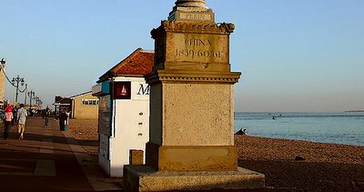
This is an enlarged crop (about a third) of a snapshot presenting this column (yes there is a column on top pf the near structure). I set myself the task to transform the picture into one that could easily have been browsed in a comics magazine (such as Asterix for example).
This being a photo-site I limited myself to make a presentation that would stay as near to the photo itself as possible. That meant reducing noise and pixellation in endless iterations with PS filters to a bare minimum while transforming the image in subtle ways to achieve the comic presentation. The shapes, colour tones, textures were developed on that basis. Did it work?
Hi Vassili, I like the colors and lighting, they reflect a soothing atmosphere but I think it's too tighly cropped on the top. Also I would have preferred the column to be off centered for a more dynamic composition. Rgds, Rena