|
|
 Nick Karagiaouroglou
 {K:127263} 2/7/2007
|
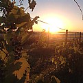
It is also my impression that something is wrong with that dark area at the lower right, Andre, though I also think that it does play some role. It is likely though that this role would have been better for the overall impression it that dark area were.. differently dark or differently spread over the image. A lighter shade like charcoal could have been indeed good but then the composition should ommit that corner completely since it is the upper part of a forest that itself stood in the shadow of the mountain and so it had to appear very dark in comparison to the rest of the image. (Fog and mist under light appear very highlighted while fog and mist in the shadow appear very dark.)
So the darkness of that corner gets amplified when seen simoultaneously with the rest. If we isolate the bottom right part we can see that the corner does not appear as dark anymore (attachment) so the great luminosity of the rest makes it seem even darker than it is. It really doesn't fit the rest of the image this way.
Thanks alot for the detailed comment and the ideas.
Nick
|

Isolated bottom right part |
|
|
|
 Andre Denis
{K:66407} 2/7/2007
|
I think the vignetting effect works fine on this one Nick. As you say, it helps to add some dimension to the image. I like that the image is gently lighter near the middle. It is lighter, without being blown out or to bright. I'm not sure why the small area at the lower right has come out quite that dark. It probably would look better if it was more of a lighter charcoal shade spread out over a larger area. (similar to the other three corners.) I didn't notice it that much at first, but since you point it out, now it is a bit distracting. Still a good image.
Andre
|
|
|
|
 Nick Karagiaouroglou
 {K:127263} 2/6/2007
|
Thank you very much for the detailed comment, Joggie! I'll have to retry this and include some more darker parts.
The sight has been quite usual, though. A very foggy sky and a mountain. It was the used settings that turned that to what it looks like on the photo. Especially the overexposure that made the light so strong.
Best wishes,
Nick
|
|
|
|
 Joggie van Staden
{K:41700} 2/6/2007
|
Lovely image Nick - I can just imagine what a sight it must have been. Great mood introduced by the glowing light. Aggree with Joe on the dark parts, would even include a bit more of the foreground for that purpose. Regards.
Joggie
|
|
|
|
 Nick Karagiaouroglou
 {K:127263} 2/6/2007
|
Thank you very much for the detailed comment, Joe! So the dark parts do play their role on this one - thanks for the insight!
Best wishes,
Nick
|
|
|
|
 Joe Brown
{K:23213} 2/6/2007
|
I forgot to say I wouldn't remove the darker parts. For me they tend to anchor the shot.
Joe
|
|
|
|
 Joe Brown
{K:23213} 2/6/2007
|
Very nice image Nick. Great light which radiates from from this fantastic landscape. Very well done.
All the best.
Joe
|
|


