|
|
 Kenneth Roine
{K:3538} 5/4/2006
Kenneth Roine
{K:3538} 5/4/2006
|
Steve,
Thank you for the suggestions, I do appreciate your time and efforts. I now see what others have been suggesting and I will be working again on this photo soon. I hope you will like the changes.
Regards
Ken
|
|
|
|
 Steve Aronoff
{K:18393} 5/3/2006
Steve Aronoff
{K:18393} 5/3/2006
|
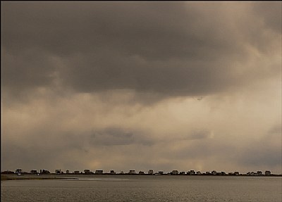
Nice shot, Kenneth. I do agree with the comment about contrast. The problem I see is that in wanting to portray the sky overwhelming the buildings you've given so much sky with so much dark that the sky ends up overwhelming the photograph. In my opinion, you could remove all or almost all of the dark part of the sky and still end up with that dramatic lower part of the sky that on its own overwhelms the buildings. I've mocked up a suggested change.
It's a really nice picture that's well worth working on to get what you want.
Steve
|

suggested change |
|
|
|
|
Kenneth Roine
{K:3538} 3/23/2006
|
Tom,
Thanks for your suggestions and comments. This shot has not been cropped, when I shot it I was focused (no pun intended) on the sky overwhelming the building on the land. So I'm stuck with the composition as is. I've worked on this image for days and still not happy with it, so I deeply appreciate yours as well as all people who take the time to comment.
Thanks again.
Regards
Ken
|
|
|
|
|
Tom Nosella
{K:177} 3/23/2006
|
Its an interesting shot, but i agree with some of the comments, i would have raised the horizon a bit. Since the background is sort of a silhouette anyway,i would have maybe taken this shot close to the ground and captured some ground detail.. might have played off nice against the clouds. A neat technique might have been to take two shots, one close to the ground and focused near, and the other focused at infinity, and then blend them together for an overall sharp shot... anyway, LOTS you can do with this one.. nice work!
|
|
|
|
|
Kenneth Roine
{K:3538} 3/22/2006
|
Thanks Nessa, I appreciate you taking the time to view and comment on my photo.
Regards
Ken
|
|
|
|
 vanessa shakesheff
 {K:68840} 3/22/2006
|
A dramatic sky .well balanced and nice colour and contrast ..nessa
|
|
|
|
|
Kenneth Roine
{K:3538} 3/21/2006
|
Jose,
Thank you.
Regards
Ken
|
|
|
|
|
Kenneth Roine
{K:3538} 3/21/2006
|
Hugo,
Thank you for your suggestions, I do appreciate it.
With regards
Ken
|
|
|
|
 Christopher Jamison
{K:1230} 3/21/2006
Christopher Jamison
{K:1230} 3/21/2006
|
You're very welcome, Kenneth. I would love to see the reworked version. Good Luck!
|
|
|
|
|
Kenneth Roine
{K:3538} 3/21/2006
|
Christopher,
Thank you for your time and comments. After your critique I increased the contrast and straightened the horizon (funny how such an imnportant element gets overlooked) on my original image and it looks better.
Thanks again for your help.
Regards
Ken
|
|
|
|
 Hugo de Wolf
{K:185110} 3/21/2006
Hugo de Wolf
{K:185110} 3/21/2006
|
Hi Kenneth,
The colours in this photo are spectacular, and the subtle contrast adds a very dramatic feel to the image; rather ominous with the warm, saturated tones.
I do like the simplicity of the composition, too. It makes the sky the primary subject of this shot, with the buildings on the horizon as a geometrical pattern. A good and well balanced shot.
The horizon is slightly askew, though. It has a minor clockwise tilt in it. With the simplicity of the composition, that becomes rather noticeable, diverting the attention a bit.
Cheers,
Hugo
|
|
|
|
|
Hugo de Wolf
{K:185110} 3/21/2006
|
Hi Kenneth,
The colours in this photo are spectacular, and the subtle contrast adds a very dramatic feel to the image; rather ominous with the warm, saturated tones.
I do like the simplicity of the composition, too. It makes the sky the primary subject of this shot, with the buildings on the horizon as a geometrical pattern. A good and well balanced shot.
The horizon is slightly askew, though. It has a minor clockwise tilt in it. With the simplicity of the composition, that becomes rather noticeable, diverting the attention a bit.
Cheers,
Hugo
|
|
|
|
 Jose Ignacio (Nacho) Garcia Barcia
{K:96391} 3/21/2006
Jose Ignacio (Nacho) Garcia Barcia
{K:96391} 3/21/2006
|
very cool. wonderful tones. marvelous composition. 7
|
|
|
|
|
Christopher Jamison
{K:1230} 3/21/2006
|
this is a cool capture of some interesting clouds. a couple things that I think might help. over all the lighting is a bit flat. a boost in contrast may help. also, some color help. boost the saturation and then back off some of the colors that over saturate. i think the horizon may be a bit low in the frame. you could crop out some of the clouds at the top to make it more of a 'panoramic' looking shot. and the horizon seems to be tilted a bit to the right. another easy photoshop fix.
|
|