|
|
Critique By:
Henrik Hanselmann (K:658)
2/25/2007 9:01:29 AM
Hi, yes maybe white? And a bit thinner possibly.
|
Photo By: Nick Karagiaouroglou
(K:127263)

|
|
|
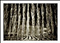
Critique By:
Henrik Hanselmann (K:658)
2/24/2007 6:24:55 PM
Very nice Nick! Beautiful colours! Perfect DOF. Not sure about the red line around it.
|
| Photo By: Nick Karagiaouroglou
(K:127263)
|
|
|
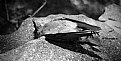
Critique By:
Henrik Hanselmann (K:658)
2/24/2007 6:22:35 PM
good capture, i like her expression. But the background is too cluttered, or at best too much in focus.
|
| Photo By: michael carrozza
(K:1425)
|
|
|
Critique By:
Henrik Hanselmann (K:658)
2/24/2007 6:19:46 PM
this is excellent. you make it obvious that it's intentional to include som much empty sky. good choice. I agree about the thinner line, also i would've preferred a smaller signature.
|
| Photo By: josh evilsizor
(K:1417)
|
|
|
Critique By:
Henrik Hanselmann (K:658)
2/24/2007 6:16:25 PM
This is great Sandra! and quite innovative. Landscape is traditionally shot with a slow shutter-speed, this one is not. Excellent! You get much sharpness from that f6.8.
|
| Photo By: Sandra Berry
(K:8352)
|
|
|
Critique By:
Henrik Hanselmann (K:658)
2/24/2007 6:11:35 PM
This is very interesting! So much detail. I think the photo would benefit from a more dramatic light. Also the person have some blur and the image it too blue.
|
| Photo By: Thilo Bayer
(K:50358)
|
|
|
Critique By:
Henrik Hanselmann (K:658)
2/24/2007 6:04:44 PM
this is good, great tones and composition! I think you've could've been more lucky witht the lighting. A little sun might have made it even more interesting, is a bit dull.
|
| Photo By: Sheryl Phillips
(K:2728)
|
|
|
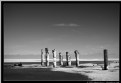
Critique By:
Henrik Hanselmann (K:658)
2/24/2007 6:00:03 PM
Very good! Good tones and contrast. Think i agree with serge, they should be closer to the camera so there would be a larger contrast between the salt pillars and the background.
|
| Photo By: Johnny Kurtz
(K:893)
|
|
|
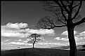
Critique By:
Henrik Hanselmann (K:658)
2/24/2007 5:54:29 PM
You're getting a tough time from Serge. I really like this shot. Perfect exposure and light. I think the composition works well, the clouds on the left balance out the tree on the right. Good depth.
|
| Photo By: Tony Hunter
(K:4647)
|
|
|
Critique By:
Henrik Hanselmann (K:658)
2/24/2007 5:45:41 PM
Very nice! Good colors and contrast.
|
| Photo By: Ryan Torres
(K:411)
|
|
|
Critique By:
Henrik Hanselmann (K:658)
2/24/2007 5:38:15 PM
Hi Nacho! I really like this one. But I think it would be more interesting with a smaller aperture. I've made some changes, less sharpness and more yellow. Let me know what you think...
|
| Photo By: Jose Ignacio (Nacho) Garcia Barcia
(K:96391)
|
|
|
Critique By:
Henrik Hanselmann (K:658)
2/24/2007 5:28:47 PM
This is a very good still life/advertising shot! I really like the colours, the background material and the creative use of the flowers. You might have used a different f-stop to get the background a bit more out of focus. I also think the bottle looks a bit tilted, needs to be straighten out. You might also try to use a lower angle, to make the bottle look more prominent. The lighting is perfect.
|
| Photo By: shamsa Rashid
(K:950)
|
|
|
Critique By:
Henrik Hanselmann (K:658)
2/24/2007 5:21:53 PM
this is interesting! i'm quite intrigued by what they are looking at. But the shot needs a proper title and it's a bit blurred. I'm guessing it's taken during poor lighting conditions.
|
| Photo By: nathan combs
(K:2242)
|
|
|
Critique By:
Henrik Hanselmann (K:658)
2/24/2007 5:18:08 PM
very nice, i like the framing and the tone. Would've wanted a bit more contrast between its beak and the background.
|
| Photo By: Daniele Di Marco
(K:532)
|
|
|
Critique By:
Henrik Hanselmann (K:658)
1/14/2007 6:10:42 PM
Very nice, and good title! Maybe a bit too much contrast.
|
| Photo By: Leo Régnier Я£
(K:67696)
|
|
|
Critique By:
Henrik Hanselmann (K:658)
1/14/2007 6:03:11 PM
very nice. a good exposure and a interesting image.
|
| Photo By: Tony Hunter
(K:4647)
|
|
|
Critique By:
Henrik Hanselmann (K:658)
1/14/2007 5:56:55 PM
very interesing peter! i like this style, almost looks like its lit with artificial light.
|
| Photo By: Peter De Rycke
(K:41212)
|
|
|
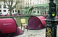
Critique By:
Henrik Hanselmann (K:658)
1/10/2007 4:39:16 PM
Very nice! good use of complimentary colors, red and green. Would've removed the bright yellow spot on the post, also not sure what the chair means. It's quite dominant in the photo.
|
| Photo By: Carlos Gutierrez
(K:1805)
|
|
|
Critique By:
Henrik Hanselmann (K:658)
1/10/2007 4:34:19 PM
Very nice Antonio! interesting pose, good expression, hair and body. i like the golden tone. i also think the border around fits. I think maybe the image would've been better without her wearing the bracelets. They steal a bit attentions.
|
| Photo By: antonio harrison
(K:401)
|
|
|
Critique By:
Henrik Hanselmann (K:658)
1/10/2007 4:22:51 PM
good, i like the light and colours. a very interesting image. unfortunately i think the persons are a bit too far i the right part of the photo, in that case not so balanced.
|
| Photo By: Wayne Harridge
(K:18292)
|
|
|
Critique By:
Henrik Hanselmann (K:658)
1/4/2007 5:09:25 PM
This is really good Jessica, beautiful group portrait. natural poses and light. But there is something about the background that i dont like. i think it's a bit to bright. I would've liked it to either be darker or show more structure.
|
| Photo By: Jessica Hughes
(K:266)
|
|
|
Critique By:
Henrik Hanselmann (K:658)
1/4/2007 4:59:58 PM
very nice! good idea. the only problem i have is that it's a bit unbalanced, i only seem look at the right part of the image. Made a new crop that i think is better.
|
| Photo By: Patrick Crowther
(K:13393)
|
|
|
Critique By:
Henrik Hanselmann (K:658)
1/4/2007 4:52:55 PM
i liked this very mich. good light,composition and contrast. i would maybe crop the left hand side a littl bit.
|
| Photo By: Derek Bair
(K:1530)
|
|
|
Critique By:
Henrik Hanselmann (K:658)
1/2/2007 2:12:09 PM
Ok, I would buy a real SLR camera, not compact. Nikon or Canon. Check out Nikon D40 or Canon EOS 400D or the older models Nikon D50 or Canon EOS 350D. They should be around 500 dollars if not, try to get them used.
|
| Photo By: Salvador María Lozada
(K:69375)
|
|
|
Critique By:
Henrik Hanselmann (K:658)
1/2/2007 1:02:40 PM
good idea, but lacks a bit technical quality, i wised you had used a better camera.
|
| Photo By: Salvador María Lozada
(K:69375)
|
|
|
Critique By:
Henrik Hanselmann (K:658)
1/2/2007 1:00:10 PM
this one is very nice as well, you have a good eye for composition.
|
| Photo By: Salvador María Lozada
(K:69375)
|
|
|
Critique By:
Henrik Hanselmann (K:658)
1/2/2007 12:59:16 PM
a very powerful image, maybe a bit too much noise for my taste.
|
| Photo By: Salvador María Lozada
(K:69375)
|
|
|
Critique By:
Henrik Hanselmann (K:658)
1/2/2007 12:56:15 PM
very interesting! i really like the contrast between the bright colours of the cottoncandy and the grey background. But at the same time i think the some elements in the background are very distracting like the blue plastic window and the car.
|
| Photo By: Hrvoje Plantak
(K:259)
|
|
|
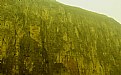
Critique By:
Henrik Hanselmann (K:658)
1/2/2007 12:44:44 PM
Excellent Pawel, poor wasp:( The only thing is that I think the colour of the branch is to similar to the ant's upper body colour, but that's out of your control.
|
| Photo By: Pawel Bieniewski
(K:-239)
|
|
|
Critique By:
Henrik Hanselmann (K:658)
1/2/2007 12:33:01 PM
very good, just enough sharpness.
|
| Photo By: Craig Law
(K:32)
|
|