|
|
Critique By:
Vincent K. Tylor (K:7863)
3/13/2005 1:21:06 AM
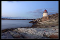
A nice, peaceful and simple seascape/lighthouse capture. The f/16 aperture really maximized your depth, allowing for the bridge in the background to be as nice and sharp as the foreground. I'd suggest going back again when there are a few more clouds, or a little more dramatic weather or lighting to give us another perspective from this location. Very nice work!
|
| Photo By: Chris Hunter
(K:25634)
|
|
|
Critique By:
Vincent K. Tylor (K:7863)
12/14/2004 1:29:38 AM
Amazing work as always.
|
| Photo By: Lars Raun
(K:1701)
|
|
|
Critique By:
Vincent K. Tylor (K:7863)
5/7/2004 8:13:42 AM
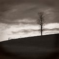
Nice simple moody capture here. It's been a while since I looked at your work. Like you mentioned in your bio, you have gained much experience. Nice rich tones in most all of your portfolio.
My only suggestion here would be to crop out a portion of the foreground. While you would eliminate a bit of the better lighting below as well, I still think you strengthen this by bringing more attention to the tree and sky. Great atmosphere in this to say the least!
|
| Photo By: michaelle .
(K:3807)
|
|
|
Critique By:
Vincent K. Tylor (K:7863)
5/7/2004 7:53:03 AM
Very interesting capture here. I like the mood, the varying elements, the colors. Quite a unique image. I do think if the lone rock was less centered it would only strengthen this just a bit more. It could easily anchor either the bottom right or left very effectively. Just my opinion...still a nice scene just like it is.
|
| Photo By: Barry Wakelin
(K:7838)
|
|
|
Critique By:
Vincent K. Tylor (K:7863)
4/27/2004 9:07:47 PM
Feel free to e-mail me at vince@hawaiianphotos.net I'd be hapy to help anyway I can! Aloha.
|
Photo By: LaMaro Hall
(K:3658)

|
|
|
Critique By:
Vincent K. Tylor (K:7863)
4/27/2004 8:43:33 PM
The composition is fine here. The title well describes what you were after. One thought that would improve this in my opinion, would have been to use a tripod and stop down to f/11 or even possibly f/16 to maximize your depth of field. While I like the amount of foreground road you've chosen here, it's just not sharp enough to work as effectively as it could. Stopping down would certainly solve this. The background sky also appears a bit too bright...is mildy distracting. I returned not too long ago with many similar types of images from the Pacific Northwest and one thing really saved the day so to speak over and over...bracketing! Practically each image was bracketed by .3 in each direction. I have found most all of the better images slightly under-exposed rather than over. It is much easier to add a measure of density to an image than it is to take it away. Just my two cents. This one is nice as is with even greater potential for another visit. Thanks too for your very well thought out comments on my images. Always appreciated! Aloha.
|
| Photo By: Becky V
(K:9699)
|
|
|
Critique By:
Vincent K. Tylor (K:7863)
4/26/2004 2:10:51 AM
This is really nice work. I like the composition of the trees, as well as the rough water. Palms, mountains, ocean and a colorful sky...looks pretty good to me. Here is one from the exact same location a couple of years earlier.
http://www.usefilm.com/image/166813.html
Thanks for the comments on my work as well. Perhaps we'll run into each other one day!! Aloha.
|
| Photo By: LaMaro Hall
(K:3658)
|
|
|
Critique By:
Vincent K. Tylor (K:7863)
4/21/2004 2:49:27 AM
Initially I decided not to send the toned down colored version but just the B&W. But before deleting it figured I'd post it anyway. Just one persons opinion here! Keep up the good work Kim. It's a pleasure to watch you progress!!
|
| Photo By: Kim Culbert
(K:37070)
|
|
|
Critique By:
Vincent K. Tylor (K:7863)
4/20/2004 9:28:50 PM
Hi Kim, nice to see you getting into some longer exposures. I too really like the composition here. You have brought us down into the water so to speak. I feel the layout of rocks framing the scene here is excellent. That is something that while it can be trained to a degree, is really more or less something you are born with. You either have an eye for a well laid out composition or you do not. This simply works...very nicely balanced.
That said, I will have to break away from the crowd here with regards the color and contrast. In my opinion there is just far too much going on. That filter by itself is one I have since retired just because it does not look very close to being natural. In addition here, the brightness or perhaps contrast appears to be pushed a few degrees too far. When you put the two together it gives me the impression that this is plugged into a wall socket. Portions of the sky as well as much of the moving water are simply too hot. But more than anything else the saturation is just too strong here in my honest opinion. I realize I am in the minority on this one, but wonder how much all of this great shot and praise really helps somebody especially if it encourages them to go out and do the same thing again. Your work IS very good and continues to improve. You also know that I like and use filters, just in this case here, it just seems over the top. Here is a B&W version to just illustrate how good the composition is. Try using a Cokin sunset 1 or 2. It is a graduated slight orange tint that keeps a much more natural appearance. Just my honest opinion here. Look forward to seeing more of these. Aloha.
|
| Photo By: Kim Culbert
(K:37070)
|
|
|
Critique By:
Vincent K. Tylor (K:7863)
4/1/2004 4:52:27 PM
Very dramatic scene captured perfectly! I like the extra contrast here. 7! Aloha.
|
| Photo By: Russell Love
(K:7006)
|
|
|
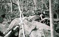
Critique By:
Vincent K. Tylor (K:7863)
4/1/2004 4:50:39 PM
Excellent work here Mr Russ! Great angle. I like how you capture the strength in his hands. Since when do you do B&W?? Can we see some pics of...you know...my friends ...the goats?? Aloha!
|
| Photo By: Russell Love
(K:7006)
|
|
|
Critique By:
Vincent K. Tylor (K:7863)
2/28/2004 8:08:40 PM
Can't fool me John. Yes you offer the most colorful comments that I have been privileged to enjoy. And yes behind the glasses and distinguished gentlemanly look is are a caring sincere soul...cat lover too. But inside the heart of it all is a big ole-firecracker...full of life, fire and zeal...sometimes wise-guy too!! Nice to meet the man behind the words!! Aloha.
|
| Photo By: John Charlton
(K:5595)
|
|
|
Critique By:
Vincent K. Tylor (K:7863)
2/19/2004 5:59:37 PM
Nothing wrong with this at all Kim. I would perhaps crop just a bit of the sky since there is very little cloud action up above, and just a bit of the right side...a little dark and just slightly heavy in my opinion. Other than that (or even with those elements) you have a very nice image. Certainly the kind that would find mass appeal....if you ever wish to sell. I know you do not use borders, but with the all-white background here, I think using an off white does help see what you have. Nice work once again.
|
| Photo By: Kim Culbert
(K:37070)
|
|
|
Critique By:
Vincent K. Tylor (K:7863)
2/6/2004 7:45:05 PM
Very creative work!! I agree with your messsage. Actually it can be interpreted many different ways as well. Excellent job Mr. K.W.!
|
| Photo By: Ken Williams
(K:862)
|
|
|
Critique By:
Vincent K. Tylor (K:7863)
1/28/2004 7:21:42 AM
Nice shot Levi. I wonder what they are thinking. Probably something like...hurry up Levi! Look forward to seeing more of your work. Aloha.
|
| Photo By: levi fabiana
(K:145)
|
|
|
Critique By:
Vincent K. Tylor (K:7863)
1/13/2004 11:47:40 AM
A beautiful model indeed. Excellent tones as well. However, the lights just look rather foolish on her. Just my honest opinion. I am a fan of most of your work...just not this one.
|
| Photo By: emil schildt
(K:427)
|
|
|
Critique By:
Vincent K. Tylor (K:7863)
1/12/2004 10:52:36 AM
Excellent detail and very nice composition with the big rock anchoring the bottom left quite nicely. I do like the combination of the flowing water, rocks and trees. My only suggestions: This would also look nice with a little slower exposure time...gives the water that dream look. Also a polarizor would have been very helpful. You have a fair amount of glare coming from both the water and rocks. The polarizor would have lessesned the glare, deepened the color and therefore added a richness not available any other way. Still, even as is this one is very good work!
|
| Photo By: David Yates
(K:4698)
|
|
|
Critique By:
Vincent K. Tylor (K:7863)
1/10/2004 8:22:43 PM
I believe the ingredients are here for a very good photograph. A very interesting yet aesthetically pleasing composition and subject here. What really hurts this Kim is the contrast. There is just too much of it in my opinion. Yes the film has it's limitations...but not this limited. I suspect then that our good ole friend Mr. Scanner may be the problem. One of the greatest noticeble differences between the good ones and poorer models is D-Max. The ability to capture detail in both the bright and shadows. This one seems to lose detail in both areas...meaning the dynamic range in this one is not good at all. The grain only adds to the dilema in this case.
I know I sound like a broken record here. If ever you do have the money to spend try the Minolta Dimage Elite 5400. It's around $800 US and is the best desktop I have yet seen. Still, you did your part and perhaps with beter equipment may still find a winner here. Aloha!
|
| Photo By: Kim Culbert
(K:37070)
|
|
|
Critique By:
Vincent K. Tylor (K:7863)
1/10/2004 8:08:48 PM
At first seeing this, the colors and beauty do jump out Becky. Then, after a few seconds I had the feeling that something did not fit quite right. At first I pegged the culprit here as a bit too much business going on. Fence, bushes, lake, trees, mountains, clouds and sky. However, in my opinion, because the fence is at an angle and the clouds seem to mirror that angle, plus they all have room to breathe, I believe they DO actually fit together in this case. So then what IS the culpri?? You nailed it in your "About" section. The darkness on the left side knocks this one off balance. Just a little more light is truly needed here to make this one complete. Or in Kim's analogy...to jump over the fence and OFF the page!! Still a very nice image.
|
| Photo By: Becky V
(K:9699)
|
|
|
Critique By:
Vincent K. Tylor (K:7863)
1/7/2004 5:38:21 PM
A nice clean and simple photo! I like the boat composed over to the right as well. Nice job.
|
| Photo By: Witold Wolak
(K:173)
|
|
|
Critique By:
Vincent K. Tylor (K:7863)
12/30/2003 8:33:01 AM
Outstanding!
|
| Photo By: Pedro Libório
(K:36301)
|
|
|
Critique By:
Vincent K. Tylor (K:7863)
12/7/2003 10:31:44 AM
Another nice one Levi. The tilt is so minor you really cannot even tell unless using a straight line. Here is another possiblity attached. You have a lot of options with this one. And, it's nice just as is!
|
| Photo By: levi fabiana
(K:145)
|
|
|
Critique By:
Vincent K. Tylor (K:7863)
12/7/2003 10:23:43 AM
Nice shot here Levi. Looks like she is in deep thought! I like the tones as well. Nice!
|
| Photo By: levi fabiana
(K:145)
|
|
|
Critique By:
Vincent K. Tylor (K:7863)
11/22/2003 3:56:49 PM
Nice capture Levi! I would try cropping some of the sky to bring her in a little closer. just my opinion. Still a nice job! Aloha.
|
| Photo By: levi fabiana
(K:145)
|
|
|
Critique By:
Vincent K. Tylor (K:7863)
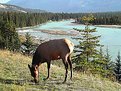
9/26/2003 10:52:05 AM
This is a very nice capture Nacho. Even without the Elk it would be beautiful. The fact that she is in there as well as with the sun highlighting her face very nicely makes this one special. My only suggestion would be to buy and use a polarizor. It will do wonders once you try it! Good job here.
|
| Photo By: Jose Ignacio (Nacho) Garcia Barcia
(K:96391)
|
|
|
Critique By:
Vincent K. Tylor (K:7863)
9/26/2003 10:47:30 AM
Nice natural colors going on here Nacho. However, in this case I would suggest dropping this image from your portfolio altogether. Your portfolio has many very good images, and you are a good photographer. But tis one does not represent what you are capable of in my opinion In this case as well as any sunset image, there must be SOMETHING in the image that is sharp and in focus if the image is to work. In this case nothing at all is sharp here. Just my two cents, I will also comment on one that I do like. Aloha, and thanks for commenting on my work as well.
|
| Photo By: Jose Ignacio (Nacho) Garcia Barcia
(K:96391)
|
|
|
Critique By:
Vincent K. Tylor (K:7863)
9/26/2003 10:39:10 AM
I like your portrait type of composition here Amna. The gray road background actually works very well too in my opinion....especially for a turtle. The only suggestion that could possibly improve this a bit would be to perhaps lighten a few areas on his head...especially around the eyes and mouth areas to give him a tad more life here. Nevertheless, this has still been captured very well. Aloha!
|
| Photo By: Amna Al Shamsi
(K:21795)
|
|
|
Critique By:
Vincent K. Tylor (K:7863)
9/20/2003 9:14:45 PM
For a car window at 60 this is a great shot! Is even sharp Kyle...wow. However, I would ask you this, why even bother. If you can do this at 60, immagine what you could do by pulling over somewhere and really lining it up. I would simply suggest always trying your best to make any location you shoot, quite simply the best you can make it, and the best it can be. Not perfect mind you, but really put the focus on quality as you build your portfolio...(pun not intended). Still once again very nice.....60 mph?!
|
| Photo By: Kyle Blair
(K:1542)
|
|
|
Critique By:
Vincent K. Tylor (K:7863)
9/19/2003 7:07:30 PM
I did NOT have to look to see if this was Velvia. This should be perhaps the only film you use Kim. It really pops and shines here. Obviously the lack of depth was what you were after here and I think it succeeds very nicely. The only tiny suggestion here (better have something after todays forum thread) is the small portion that is sharp, is not quite consistently sharp. In other words, even the small portion in focus is not quite fully in focus. If it was tack sharp, it would be absotluely perfect! Still almost perfect is pretty doggone good if you ask me! Thanks too for sharing your thoughts earlier. Aloha.
|
| Photo By: Kim Culbert
(K:37070)
|
|
|
Critique By:
Vincent K. Tylor (K:7863)
9/9/2003 8:50:14 PM
Nice action shot Isaac. I do like how the field is tilted. Would just suggest cloning out the guy in the background and brightening up a bit. Just an idea. Good catch! Aloha!
|
| Photo By: Isaac Shaw
(K:2563)
|
|