|
|
 Jose Ignacio (Nacho) Garcia Barcia
{K:96391} 2/29/2004
Jose Ignacio (Nacho) Garcia Barcia
{K:96391} 2/29/2004
|
marvelous composition.
|
|
|
|
|
john amore
{K:14015} 2/5/2004
|
becky good job it could be a travel poster John
|
|
|
|
|
Becky V
{K:9699} 1/29/2004
|
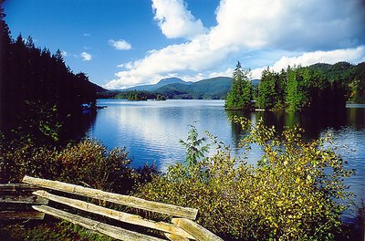
Thanks yet again for the great comments, everyone! After reading what people had to say and then looking at the photo carefully, I think I've found what's "off" about it. It's the angle, I think. The slight elevation at which I took it looks strange in relation to the fence. I suppose I should have taken the photo right in front of the fence, but I think I wanted to include it for a bit of foreground.
Lex: I tried to brighten/lighten the darker areas of this photo, but there isn't any detail there to coax out. If you think you can improve it in PS, I say go for it! (Just let me know what you did!) ;-)
|
|
|
|
|
L B.
{K:13965} 1/29/2004
|
The view is great and the lake ain't boring. Although i agree with you the left side is way to dark. But a little photoshop can do miricales. And the right from the group of trees in the water could done to, made a little lighter. But although the lighting ain't perfect i think the photo is overall excellent. If i got some time tomorrow i will (if you want, else it is a waste of time) let you see what i should do with photoshop to make the picture better. So let me know.
Greets, Lex
|
|
|
|
 Vincent K. Tylor
{K:7863} 1/10/2004
Vincent K. Tylor
{K:7863} 1/10/2004
|
At first seeing this, the colors and beauty do jump out Becky. Then, after a few seconds I had the feeling that something did not fit quite right. At first I pegged the culprit here as a bit too much business going on. Fence, bushes, lake, trees, mountains, clouds and sky. However, in my opinion, because the fence is at an angle and the clouds seem to mirror that angle, plus they all have room to breathe, I believe they DO actually fit together in this case. So then what IS the culpri?? You nailed it in your "About" section. The darkness on the left side knocks this one off balance. Just a little more light is truly needed here to make this one complete. Or in Kim's analogy...to jump over the fence and OFF the page!! Still a very nice image.
|
|
|
|
|
peta jones
{K:12615} 1/7/2004
|
Becky, lovely scene, pretty enough for a calendar.
Not sure about the film types, I just notice that slide film seems more saturated...I think that is the right word. I noticed that scanning old slides of my fathers.
|
|
|
|
|
Mr. Arrey
{K:11516} 1/7/2004
|
I love this picture Becky!
|
|
|
|
|
Hugo Pierre
{K:15692} 1/7/2004
|
Delightful landscape. Gorgeous colors and splendid composition.
Regards from Argentina.
|
|
|
|
 Teunis Haveman
{K:53426} 1/7/2004
Teunis Haveman
{K:53426} 1/7/2004
|
Becky, great compositie
Nice work
Beautiful Landscape
Teunis
|
|
|
|
|
Kim Culbert
{K:37070} 1/7/2004
|
The Velvia does have less room for varying exposure than a print film... slide film on a whole is usually like this. I think that your exposure looks right on as the clouds are hovering on being hot, but aren't quite overexposed and the only part of the image that is really dark is the forest on the left. Everything else is wonderful.
I really like how the clouds balance out the image with their presence... if they were missing it would feel left heavy with the darkened side and the fence.
It's a nice scene, and not boring, but for some reason it doesn't jump off the page either. For me, it's sitting on the fence. *grin*
|
|
|
|
|
Stefan Engström
{K:24473} 1/7/2004
|
You are welcome Becky, I'll take a slice of apple pie now :-) Velvia is slide film, right, so the exposure latitude is much narrower than for color negative film?
|
|
|
|
|
Becky V
{K:9699} 1/7/2004
|
Stefan: this was my second foray with Velvia and I knew I wouldn't be disappointed. Yes, the clouds are a bit overexposed. So is the fence. (Shhh!) As for focusing issues, I used my trusty wide-angle lens, which is very forgiving. I was also quite a way back from the fence/foreground, perched on an elevated gazebo.
Thank you, as always, for your comments!
|
|
|
|
|
Stefan Engström
{K:24473} 1/7/2004
|
The left side lies in shadow, so little light and little exposure from those trees :-) On the other hand it seems from the clouds that this was a little bit over-exposed (?). I wonder how you managed to get everything in focus with f/4... The colors are great and very much what you hoped for with this film I'm sure.
|
|
|
|
|
Andrej V
{K:6693} 1/7/2004
|
Hello
Very nice photo for sure!
Great composition and colors, The DOF is outstanding and the complete image is sharp what it defenately should be for landscape pictures!
Maybe the forest is a bit too dark but making it lighter would probably over expose the complete picture so I guess you couldn't do much about it...
It might be also because of a polarizer because on the island the forest is also too dark.
Best regards
A
|
|