|
|
Critique By:
Mark Tate (K:1151)
10/23/2004 5:31:22 PM
you have a very original and impressive styly jeanette.. you work inspires me somehow..very arty and personal. definitely the style i like in photography. i will keep tracking your shots. regards,
pawel
|
| Photo By: Jeanette Hägglund
(K:59855)
|
|
|
Critique By:
Ryan Greene (K:3297)
10/19/2004 3:53:59 PM
Well, I think it helps to have a digital camera. That way, you can experiment and get results right away. And if it doesn't work, you can erase and do it again. Film is great for star trails, something digital can't do yet. But I think digital cameras are great for learning and experimentation because of the instant results. The LED picture is done in a pitch black room, with a 30 second exposure, I just spun the LED around myself on a string. The light paintings are 10 seconds if I remember correctly, and they involve a lot of spinning myself and the camera. Aperture settings I left up to the camera to decide, I'd just set the camera on "S" mode and pick how long to keep the shutter open. You can do all this stuff with film, but it's very expensive to experiment that way. If you don't have a digital, check out www.dpreview.com, it can help you decide on one to purchase.
|
| Photo By: P R
(K:341)
|
|
|
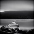
Critique By:
Armen Jamkotchian (K:5879)
10/19/2004 4:19:48 PM
There is some very subtle concept of symmetry in this greatly asymmetric composition. To me, that hidden "misbalance" makes it stand out. What also strikes me is the very tiny glimpse of the sea in the left corner, that creates a perception of eternity of the faith concentrated in this magic church. The lightness of the tones and domination of the sky enhance the feeling of eternity of the soul!
On the sentimental note, I wished I ever had a chance to sit on these stairs to stare at the see and freeze in internal harmony.
Best regards - Armen
P.S. It would be nice if you add information on the location of this church.
|
| Photo By: David Moya
(K:50)
|
|
|
Critique By:
Todd Miller (K:16464)
10/17/2004 10:17:18 PM
fantastic shot tom! this screams tom rumland....
the vastness of it is great, and the colors are really wonderful as well. i like how the reflection and the actual mountain side are near identical in tone... great shot TR!
TM
|
| Photo By: tom rumland
(K:14874)
|
|
|
Critique By:
Becky V (K:9699)
10/10/2004 4:10:36 PM
Wow, John... I just discovered your portfolio and I'm glad I did! I really like your skill and style.
I think you've done a wonderful job at recolourizing - it's quite believeable. It's interesting to consider an antique photo in this setting, as the Louvre is so timeless, the two together seems quite natural.
The light in the Louvre layer is quite strong and low, and I feel it should be the same way on "Aron" for a more natural integration. Perhaps a bit of burn tool on the left side of his body and face? I realize you're not going for 100% realism; I just feel there's a little too much separation between subject and setting. 
Good job - and proof that hard work pays off!
|
| Photo By: [[dead account]]
(K:6692)
|
|
|
Critique By:
Thilo Bayer (K:50358)
10/5/2004 1:43:59 PM
Dear Maja,
awesome photography. bravo!
the toning is very unusual, but well suited in this case. very dramatic effects. I guess you worked on blur/sharpness, but please tell me if I'm wrong ;-) I personally think that the difference between the sharp floor and the blurry lower part of the house is a bit hard.
anyway, your portfolio gets more impressive every day, and I would vote for a BIP.
Take care,
thilo
|
| Photo By: Maja Gligoric
(K:13528)
|
|
|
Critique By:
Ameed El-Ghoul (K:42215)
10/4/2004 2:03:09 PM
Hi Ahmed, i like this one my friend, actually i find it very well composed, i am sure you were aiming to the road in between the palms, in the same time you didn't place it in the died center, so you put it a little to the right, and about the palm to the right, i don't know if you placed it there in purpose to use it as a natural frame. If you done that on purpose, then well done, it meets my taste as well. i like this picture allot, one last thing, don't be afraid of trying new things, this is the only way to learn, and i like your style, take good care, and btw, check the main page of Use Film, your picture in the main now
|
| Photo By: Ahmed Maher
(K:422)
|
|
|
Critique By:
Gustav Miller (K:309)
10/3/2004 8:31:57 PM
Admirable composition of the world of a Kreuzspinne as we call it. Great colors and details. There are about 800 different types of this particular spider in Europe. This particular kind of spider "Arneidae" belongs to the spiders that consruct a net like a wheel with about 30 none sticking spokes. In each of these spokes there are about 40 sticky threads in a concentric shape. The spider is sitting either in the centre of the net or outside hidden and connected with a signal thread to the net.
Admirable nature images. Well done.
Kind regards,
Gustav
|
| Photo By: Titia Geertman
(K:5582)
|
|
|
Critique By:
Telmo Domingues (K:9639)
10/2/2004 12:04:51 PM
Ahoy!!!!!!!!!!
This sounds like a "Hoogrterp's C major variation". As I told you, I find interesting all these "marriages" you make with objects around you... In this case I agree with Hugo but there is something strange about the smoothness of the nut... It looks like it was cleaned with some kind of oil (?), with lots of care, to improve it texture....
I like it. ;P
|
| Photo By: Gerhard Hoogterp
(K:4863)
|
|
|
Critique By:
Ameed El-Ghoul (K:42215)
10/2/2004 1:14:56 PM
Simply perfect Judi it can't be any better, i like it as it is, i don't think it need cropping, the blackness gives more depth to the picture, and i think what makes this picture unique is the sharp clear sparkles capture, of course the way the Kidd's set down and the impression on their face ad the final touches very well done and congratulations for BIP, you really deserve it, keep up the good work dear
|
| Photo By: Judi Liosatos
(K:34047)
|
|
|
Critique By:
Randy Lorance (K:24769)
10/1/2004 4:14:54 PM
Hi Neil, I looked at this photo and liked it, but almost didn't stop to comment because,though I really liked the candid capture and the comp. in general, I thought their were some distracting elements in it. As I started to move on, I had to go back to it again to tack another look.
It seemed it was a photo made for doing a little PS photoart work to, and I hope you don't mind that I played with it. If you do, I understand and will never again, and you have permission to take one of my photos and trash it I wouldn't have proceeded at all if I didn't see that you do have appreciation for some photoart.
Anyway, I hope you like what I have tried, or at least don't hate it. If I didn't really like your original image, I wouldn't have played with it at all.
Randy
|
| Photo By: Neil Niamh White
(K:9165)
|
|
|
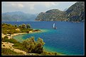
Critique By:
Scott McFadden (K:5663)
10/1/2004 7:35:05 AM
Certainly a beautiful place.
the most attractive and unrelentingly so is the light upon the foliage which glows with such warmth and dignity all else seems cold and harsh.
I feel no doubt when saying this photo needs a small deception. A trick if you will to make the reality of it less cold and uninviting.
often reality looks fake on film and this may be one instance of such.
Explaining my meaning in clearer terms the attractive foliage could do with dumbing down to give the overall print a more exceptable vibe.
So too may be an extra crop off the top to reduce the content of the cold uninviting outside and the sky seems so average it really doesnt add a great deal.
Placement of the boat has added depth to this image.
|
| Photo By: iNNOCENt
(K:3)
|
|
|
Critique By:
Zandra T (K:3635)
9/30/2004 7:51:31 PM
It is a very nice graphich composition. Depending on what you were after, this can bee seen as very good, or good. The mountain in the backgrudn does not looklike they belong in the picture. Tehy do not have enough structure and depth. But if this was your goal, not to have them blend in a natrual way, then then your job is complete. If youwant them to blend more they will need more structure. In that case you can try to blend them with a picture of clouds. You would have to uselayer masks and difrent belnd moods in Photoshop or paint shop pro. You woudl probably need more thne one layer, moving around the clouds abit to get depth. I am not sure it would work though and i guess it would take a lot of paitnece to do it.
That was about the mountain. Now, to the picture as a whole...absolutly love it. It has so much drama with those wonderfull clouds and vibrante colours of the flowers. The perspective provided by the hills in the backgroud as wellas the cloud makes me feel like i am being drawn in to the picture. You did a good job.
|
Photo By: KEVIN TEMPLE
(K:8657)

|
|
|
Critique By:
Olga Vareli (K:22477)
9/30/2004 8:16:46 PM
This shot is awesome.For me, it is more than art.It is a part of real life and I feel very grateful for letting us look at this image.The image of the dead musician in the photograph adds to the tension...Well done...
|
| Photo By: Dennis Couvillion
(K:165)
|
|
|
Critique By:
Ameed El-Ghoul (K:42215)
9/30/2004 10:28:32 PM
Excellent Ahmed, very nice angle and great composition, you have the artistic taste and a photographer eye, very well done, and btw, what a a coincidence, i just uploaded my picture and it is called Columns as well Now about your picture, i think the only thing you needed to do is to soften the picture a little, i've done it to the picture to remove the noise and the grains in it, tell me what do you think!!
|
| Photo By: Ahmed Maher
(K:422)
|
|
|
Critique By:
Bradley Prue (K:30678)
10/1/2004 12:13:22 AM
There is incredible detail here, Ursula! The colors and saturation levels are perfect, and the limited DOF is unavoidable when this close up. Bees make excellent subjects, as they often are slow movers, and rarely become aggressive. Very nice work! ...Brad
|
| Photo By: Ursula Luschnig
(K:21723)
|
|
|
Critique By:
Chris Hayward (K:1519)
9/30/2004 3:14:41 AM
Diana -
The thing that makes this work for me is not the sunset but the people on the beach. Although they are almost just dots, there are at least four distinct stories told here; the couple on the far right holding hands enjoying a quiet moment, the couple near the center walking along the beach, the couple to the left separated but either talking or quietly watching, and the family on the far right. Without these stories, this would just be another sunset image (granted a very nice sunset). The perspective with the sunset dominating the image mirrors what must be the subject of each of these couples conversation and so dominates the image to produce a unity among the people.
Very nice well composed shot. Is there anything you would liked to have been able to do differently for this place and time??
|
| Photo By: Diana Cornelissen
(K:26437)
|
|
|
Critique By:
Margaret Sturgess (K:49403)
9/29/2004 10:03:46 AM
Wonderful Chris, those glimpses of sunlight [and that is all we seem to have had in the past few days here. Except Sunday for Lucy's blessing the sun shone and it was a beautiful warm day - we were blessed indeed] Love the colours and the real old texture/feel - like part of a 'secret garden' in fact in put me in mind of that book which I haven't read since I was young - and no comments of 'boy that was a long time ago'
Margaret
|
| Photo By: Chris Spracklen
(K:32552)
|
|
|
Critique By:
Patrick Jacobson (K:29151)
9/27/2004 6:18:52 PM
Sweet sweet Roberta.. and a wonderful photographer named Massimo Di Maggio is a superb combination!! =)
This is a wonderful portrait! My heart pumps extra fast when i see this one... You have captured every sense of her beuty and maked magnificent ART!! Her expression is so great.. the pose is wonderful!! The tones and light are perfect!!
This one goes into my favorites for sure!! It can be said many times over and over again.. this is ART!! Congratulations Massimo Di Maggio and Roberta and thanks for this wonderful serie of fabolous photos!
Ciao!!! =)
Patrick Jacobson
|
| Photo By: Massimo Di Maggio
(K:36342)
|
|
|
Critique By:
Stefan Engström (K:24473)
9/23/2004 9:24:05 PM
I like this chaos - as far as I am concerned there is only one rule for foot photography - it has to make the viewer want to eat what is on display and you succeed admirably here. There are some minor details I think may be worth discussion. Some of regards the presentation as a triptych and to what degree they hang together. I like the focus in the two top images, but the last one seems to be a little bit of a runt of this particular litter. The images blend into each other and I wonder if continuing the thin line you used for the frame between the panels would be helpful? The insalata caprese on top looks very tasty to me and I like how it manages to separate itself from the flower-petal salad below it. Again the third image with fenocchio and chives seems to lack that ability to distinguish itself from its neighbor. Colors are great throughout, but the two hotspots in the middle image are not ideal, all IMHO of course.
|
| Photo By: Hugo de Wolf
(K:185110)
|
|
|
Critique By:
Becky V (K:9699)
9/25/2004 5:46:55 PM
Hey Kim, nice to see you submitting again (like *I* should talk *L*)!
I agree with Stefan as well. For me, it's the fact that the effect makes your background look pixelated. While the rendering on your foreground flowers look natural, the background looks like there's something "wrong" with it . . . like the computer compressed the photo oddly.
Instead of using filters, try using brushes on the photo. If your painting-with-a-mouse skills are good, the smudge tool can create a nice effect. Blurring and/or darkening the background might work as well. Anyway, you have to whole weekend to play around with it. Good luck!
|
| Photo By: Kim Culbert
(K:37070)
|
|
|
Critique By:
Sérgio Vieira (K:3384)
9/21/2004 11:38:20 AM
Great composition and colours! It's all just working together there: the recently planted rice leads to the woman working, and the woman defines the limit and the curve of the other rice. The diference in texture of the two parts of rice just adds a lot of rhythm and interest to the photo.
Maybe it would work way better if you had used a polarizer filter to take that white sky out of the water. Have you tried to take a bit of that gaze out in PS?
And maybe crop that litle dark line in the top of the photo?
Best regards,
Sérgio
|
| Photo By: Girish Menon
(K:1384)
|
|
|
Critique By:
Massimo Di Maggio (K:36342)
9/17/2004 1:32:39 PM
Splendid, the little bridge seems to be suspended over the water, I like the blur effect, a long exposure I suppose, very misty landscape with a great mood, very well composed, even if maybe there is too much sky, anyway I like the square format. Bye Max
|
| Photo By: Eirik Holmøyvik
(K:58)
|
|
|
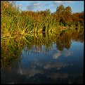
Critique By:
John Lamb (K:9687)
9/13/2004 10:19:50 PM
Of the two I prefer the colour version Tim. The bright blue sky fights for attention. Have you tried a cropping off the sky and focus attention into the reeds and moody water? Good work as ever. Regards John
|
| Photo By: Tim Schumm
(K:29196)
|
|
|
Critique By:
Paul S (K:894)
9/10/2004 4:04:51 PM
A very strong and powerful image. It is unfortunate that much of this image is subtle and not recognizable in the thumbnail. Too bad. This image deserves more attention.
Here a small child enters a darkened room. Making the transition from light to dark signifies his journey from innocence to something else. What is that something else?
Often times the journey is signified as a rite of passage to adulthood. However, this image is not that optimistic.
The room is dark and featureless and the child merely peers around the door. There seems to be a hesitation on his face about making the entry. However, his entry is inevitable.
But how innocent can we assume he is? He is coming from a concrete, lifeless playground. There is graffiti on the wall behind him and his teddy bear is snagged in the barbed wire above. Certainly this is not an optimal place for a child to be. Perhaps he is heading toward a dark future based upon his hardened past.
The use of hard contrast really emphasizes the theme of this image.
A very strong image.
|
| Photo By: Maciek Olechnowicz
(K:-36)
|
|
|
Critique By:
Eric Goldwasser (K:4294)
9/9/2004 12:28:12 AM
I love it! The DOF lends the perfect feeling of delicate-ness ( I know that isn't a word, but I like it anyway. ) ;-)
Color is excellent, the sharp areas and soft areas work well together. Having the sharpness on a crash point is perfect, too.
|
| Photo By: Mary Sue Hayward
(K:17558)
|
|
|
Critique By:
Stephen Bowden (K:64141)
9/8/2004 9:32:51 AM
Excellent work John, I experienced something similar at a model aircraft show many years ago. Those where the days when CB radio was operating on the same frequencies as the model aircraft. I remember seeing a plane go out of control and come straight at the crowd (and right at me !!!). I can still remember the noise of the propellers as it missed my head by only a few feet.
Plane was totalled unfortunatley - owner came up to me and shouted at me for not trying to "catch it" - hmmmm 5 foot wingspan, 100mph, two props - I don't think so !!!
|
| Photo By: John Beavin
(K:4477)
|
|
|
Critique By:
Kurt Pas (K:2267)
9/6/2004 6:54:57 AM
Excellent!
Nice details in the dark parts of the fur! The eyes looks very intelligent and understanding. And the photo has a tree dimentional feeling! Looks like he can give a kissy right trough the screen of me laptop. Well done.
From where is the light coming? Did you use a flash or not (in all the pet portraits) and did you trust the camera light settings are did you do some compensation? The lighting is brilliant in all the pet pictures.
|
| Photo By: Shelly N Alexander
(K:1451)
|
|
|
Critique By:
Craig Garland (K:27077)
9/2/2004 7:51:56 PM
Hi Roger; if I undersatand this (or if I don't;>) your composition is effective. The large dark areas on both sides contain the photo well. It's difficult to get the mind around these, but I like looking at them.
...just saw your comments re the Pen FT. I think the E-1 system could accomodate such a system because of its sort of 1/2 frame 35mm, but the adaptor Olympus makes is for the older OM lenses, ie I've seen several posts where people have used the OM 75-150 with an adaptor on the E-1. It then becomes a 150-300 f4-- a nice telephoto range and speed. I used to own all the OM camera bodies and several lenses, including the 75-150 but no longer do.
If you have more info re Olympus' plans regarding introduction of a "Pen FT like" digital camera, I'd sure like to hear about it. Cheers. Craig
|
| Photo By: Roger Williams
(K:86139)
|
|
|
Critique By:
Rodrigo Hernández Salgado (K:-229)
8/31/2004 12:08:02 AM
Hi Jon, It's not the same building, there are several buildings along the right margin of the Guadalquivir, in fact the buildings are mills of arab construction, but now what we see is a product of later restorations and reconstructions. They were used to crush grains and for making flours. Here you can see a photo I found on the web which actually shows one of the mills with its enormous wheel which was used to elevate the water from the river to the caliphal gardens and later to the Catholic Kings' Royal Palace, until Queen Isabel ordered to dismount it because of the noise it made.
Greetings!
|
| Photo By: Rodrigo Hernández Salgado
(K:-229)
|
|