|
|
Critique By:
Robert Kocs (K:89085)
10/21/2006 7:05:27 AM
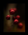
What an original composition, I do love the modern
urban art (grafitti). Your composition with steps is
very impressive and interesting. Love the dark tones
and monotone colours, very nice rusty surface,
Well captured and seen! Bravooo my friend! 7+++
Have a nice week end dear Fabrice!
Robert
|
Photo By: G G
(K:61359)

|
|
|
Critique By:
Francisco N-G (K:28728)
10/19/2006 3:43:27 PM
Dear Marija, a wonderful image again. The composition and presentation are really well thought out. I love how well you controlled the different parts of the scene, the background and water are just perfect, the silhouettes are sharp and well defined.
A fav!!!
:-)
Francisco
|
| Photo By: Marija Ristic
(K:4136)
|
|
|
Critique By:
Timothy Schirmer (K:7201)
10/18/2006 7:14:58 AM
Wow, this is very disorienting at first because I feel like I am looking into a broken mirror, although. What I love about it most is the depth, how we are carried from one space to the next, and then out the window! One of my favorites. -Tim
|
| Photo By: D M
(K:79)
|
|
|
Critique By:
Robert Kocs (K:89085)
10/19/2006 8:06:22 AM
Absolutely impressive work, love your original idea
the mood and way that you illustrate this perspective.
Oh my God! Many nice exciting details and lovely tonality,
the atmosphere is superb. The light and focuse well
concentrated to the lighthouse. Excellent work, bravoo
my friend! Nicely done! 7+++
Bonjour my dear Fabrice!
Robert
ps:...saved my favourites! :)
|
| Photo By: G G
(K:61359)
|
|
|
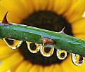
Critique By:
Jo Sparreboom (K:145)
10/19/2006 8:39:25 PM
Dear Mohammad,
Excellent !! Very original point of view! Nature is amazing isn't it? I like the reflection of the sunflower in the waterdrips!
Congratulations with this beautiful picture!
Greetz
Jo
|
| Photo By: Mohammad dt
(K:101)
|
|
|
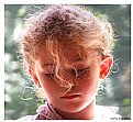
Critique By:
Andrzej Pradzynski (K:22541)
10/17/2006 11:59:13 AM
nessa, again one of those fantastic radiant portraits you make, you likely have a secret to capture the light so well with no harsh contrast no much burned out areas. Wonderful portrait. Is it the characteristic of your Fuji supper CCD sensor that gives you the range? Cheers, NJ
|
| Photo By: vanessa shakesheff
(K:68840)
|
|
|
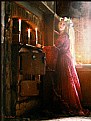
Critique By:
Marco Vredegoor (K:7301)
10/14/2006 4:38:16 PM
excellent shot, great use of the grain in the picture. It looks like a prerafaelite, was that your intention? the lighting is very good, with the light falling in from the right and the candles lighting the frame on the left. The composition is also excellent. Well done! All the best, Marco.
|
| Photo By: Aniko Heart
(K:26503)
|
|
|
Critique By:
Anson Moye (K:3480)
10/16/2006 12:28:15 AM
A true jewel itself, Giuseppe, with the luminescence of the light shining through along with some reflected light. Amazing detail in the middle of the flower, and the background is appealing, with rich color and a little stippled look to it. A great capture, Giuseppe. Anson
|
| Photo By: Giuseppe Guadagno
(K:34002)
|
|
|
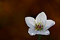
Critique By:
Emgy Massidda (K:60358)
10/14/2006 1:36:18 PM
I think this is a really amazing capture. Lens babies can produce some stunning results
Not easy to shoot these minuscule flower pods.
You did a great job here. Fantastic colours and effects. A favorite!!!!
Regards - Emgy
|
| Photo By: Joel Aron
(K:14920)
|
|
|
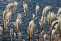
Critique By:
The Pilgrim (K:65058)
10/13/2006 2:46:19 AM
Such a beautiful and delightful image to view!
A wonderful work Larry! I love the details and the contrast of the grass and the blue of the water! Outstanding vision and capture!
Big Congrats
Paul E Brumit
|
| Photo By: Larry Donnelly
(K:644)
|
|
|
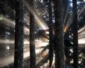
Critique By:
Olga-Eva Krajciova (K:19240)
10/12/2006 8:17:11 AM
Hej, what is this?? It is very great. It is not just a beauty of that moment, but it makes my imagination to driveall around and bring some ideas...It reminds me all those pictures of Saint people who I had seen as a small child, with strong light around theire bodies, it reminds me movies about aliens, it reminds me a sign of hope...even if u are lost there is still a light! YOur image makes alive old idealistic remembers in my head :)) But mostly, it is magical moment and very very great picture.
Regurds
Olga
|
| Photo By: Rob A. Johnston
(K:36)
|
|
|
Critique By:
Aniko Heart (K:26503)
10/9/2006 6:59:15 AM
Another brilliant shot!!!
You chose a great angle to shoot from and I love the DOF. Subject matter very much to my taste also, and the whole image is so wonderfully presented!
You rock, Bek!!!
Hugs~
Ani )
|
| Photo By: rebecca claassen
(K:12904)
|
|
|
Critique By:
Sophie King (K:3250)
10/9/2006 10:01:06 AM
This is good Nikki =) Ur use of the rule of thirds is good and the sharpness at the end of the perspective is really good. Im glad to see u on Usefilm. Maybe you could lighten the pic just a tad..I find it a little dark but overall its good =)
-Soph
|
| Photo By: Nikki Whyburn
(K:859)
|
|
|
Critique By:
chris d (K:3046)
10/9/2006 10:52:13 AM
My first re-action also was to smile. As morten says, a very happy shot.
I did want to get a really good look up close, and for that, perhaps a bigger image would be nicer...
really enjoyed viewing this tho'
|
| Photo By: yudhono arie
(K:186)
|
|
|
Critique By:
Giuseppe Guadagno (K:34002)
10/7/2006 10:45:15 PM
Lovely Jacek! The stones are so real and the water so clean that going farther in the pool I don't understand any more what is reflection and what reality. Excellent work for me Jacek.
Have a pleasant weekend.
Giuseppe
|
| Photo By: Jacek M.
(K:2999)
|
|
|
Critique By:
Linda Imagefree (K:72276)
10/7/2006 11:27:39 PM
Rocky your work is so awesome, this is incredible...ohhhhh I love it!! The depth is wonderful, I love the warm tones especially the background colors, once again the details, the sharpness, and the clarity are excellent!!!!! Truly wonderful animal portrait. And more Rocky tips too...wooohooo!! Very nice work, Yabo gets a hug from me too...big big hugs to you mister...:)Lin
|
| Photo By: Rocky Berlier
(K:2009)
|
|
|
Critique By:
rebecca claassen (K:12904)
10/8/2006 2:54:36 AM
Ani, let me tell you straight away, I love all of your work...but this...is my most fave (so far). To me, there is a very 'french' feel to this, the colour is superb and your post-processing work fantastic!!! Stunning.
hugs, Bek
P.S. perhaps you could retrofit this models jacket to bring with you to 'the farm'...lol:)
|
| Photo By: Aniko Heart
(K:26503)
|
|
|
Critique By:
Todd Weeks (K:7636)
10/8/2006 1:32:47 AM
Rob,
BTW, the purple band you have captured is often refered to as the Belt of Venus. It appears opposite the sun at sunrise and sunset. It is so named because Venus can be found there at those times when it is visible in the sky.
Todd
|
| Photo By: Rob Burgoyne
(K:-1207)
|
|
|
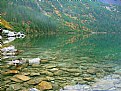
Critique By:
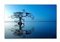
Dave Holland (K:13074)
10/8/2006 5:59:37 AM
Interesting morning view of Mt Victoria. I like the lighted foreground pathway across the lake, leading the eye to the distant rockwall. The rocky foreground on the right is strong. A little weaker on the left. I might have cropped the left side to the point where the left mountain reaches the top edge of the photo.
|
| Photo By: Gaetan Dery
(K:718)
|
|
|
Critique By:
Cathy Carroll (K:28144)
10/8/2006 5:43:03 AM
Hi Phillip, your eye for composition is superb! I love that the grass has a little length and the tree is bare, and the little bird is trying to find shelter. It all looks very dramatic. Lots of texture. CC
|
| Photo By: Phillip Minnis
(K:13131)
|
|
|
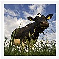
Critique By:
stingRay pt.4 . (K:250401)
10/5/2006 12:08:55 PM
I'm out to play again my gorgeous girl.
This is a wonderful simplistic nature study sweetie and the pof and dof are superb. I love the toning to this and enjoyed reading the about which set the scene nicely. I have this vision of you crawling around the grasses in an attempt to avoid the attention of the cows. Saved a small boy....hmmmn....you ran, didn't you? My very best wishes to you as always sweetie a great big hug and an even bigger kiss......Catch....X Ray;)
|
| Photo By: Caterina Berimballi
(K:27299)
|
|
|
Critique By:
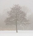
ABC 123 (K:677)
10/2/2006 8:59:50 PM
Great mood! We have similar winter landscape in Switzerland but still not easy to capture in such a perfect way. Symmetry is very important on the foreground and the asymmetry on the background delivers in the end a great shot!
Congrats, Roland
|
| Photo By: Mats Wallin
(K:-418)
|
|
|
Critique By:
Francisco N-G (K:28728)
10/2/2006 9:40:30 PM
Well done my favourite glass engineer!!! The B/W abstract is just perfect. The composition and play of refractions is well done and the result is optimum, as usual in your work.
The straight lines and curves create very interesting illusionary effects. The tonal range is broad and well distributed. I wonder how a little bit (more) of noise reduction would have affected the final product (maybe you like it this way).
With admiration...
F...
|
| Photo By: Radmila Gorjanovic
(K:3113)
|
|
|
Critique By:
ABC 123 (K:677)
10/2/2006 9:39:49 PM
Hi Guili,
Very original shot. It reminds me a picture I have seen in an exhibition with the same very limited depth of field. The only difference is that the photographer had real human beings instead of toys but in the end, with such effect, the human beings looked like toys...
Excellent shot! Congratulations,
Roland
|
| Photo By: Oui Lee
(K:3238)
|
|
|
Critique By:
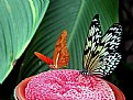
Larry Donnelly (K:644)
9/13/2006 4:28:32 AM
I rarely get conflicted by photography, I either feel pretty warm or cold about it; this shot has some great elements, the detail of the butterfly wings,the vivid color of the wings and the pink "sponge" (what is that by the way?)they are sitting on, but the fronds in the background and all the variety of bright, contrasting colors make it busy and almost hard to look at for any length...maybe sensory overload is the way to describe it, but overall a intriguing photo.
|
| Photo By: Sarah States
(K:357)
|
|
|
Critique By:
Doyle D. Chastain (K:101119)
9/12/2006 8:25:31 PM
Brenda this has beautiful color and tone and a wonderful minimalist composition - very sleek!
Your range of lighting from the left to the right side of the composition looks to be problematic but you seem to have handled it well as far as exposure . . .
One thing, in my opinion, that would help this shot along would be if the horizon line wasn't a centerline through the composition. Since the sky seems relatively free of drama . . . I would consider dropping the lower crop which comes very near to that wondrous tree reflection. If not possible due to outside influences . . . then I expand the sky upward. Just some thoughts of mine for your consideration . . .
This is a wonderful shot . . . I very much like it!
Regards,
Doyle I <~~~~~
|
| Photo By: Brenda Guiles
(K:6128)
|
|
|
Critique By:
Joggie van Staden (K:41700)
9/4/2006 8:52:27 AM
Hi Hugo - Let me first congratulate you with a great photograph, very well composed and great contrast between the texture & monochrome mood in the painting against the strong side-lighted face of the cardinal in full colour. Very well executed and a BIP well deserved.
I've read some of the comments above (not all though) and after a lot of thought and a hard re-look at the photo I would like to give my impression. The subject(s) of the image will bring different emotions to the fore, depending on your background (protestant/catholic etc.). I'm from a protestant viewpoint and looking at the picture I cannot help to be moved in a way by what I know of church history (inquisition etc.)as both of the subjects of the photo are in a way symbols of Roman Catholicism. Looking at the image from that viepoint will make me see no peace or tranquility in it.
The one aspect of the image that struck me though was the expression on the cardinals face, everything else is static, yet his expression seems to be alive. It is as if he asks a question and a profound one I think: Within and through the turmoil of history and the present circumstances around us - do you have peace and tranquility in yourself?!! That is something everyone needs to find for him/herself. We can try to find it in things, places, religion or through experiences, but if we don't have it within, it will fade as soon as those things changes! And its only through faith that we can get it because faith alone brings us before God who is bigger than anything in creation or what man can offer!
Thanks again for a thought provoking and chalenging image. Regards.
Joggie
|
| Photo By: Hugo de Wolf
(K:185110)
|
|
|
Critique By:
Cathy Carroll (K:28144)
9/4/2006 10:51:46 AM
The lighting once again drew me to your thumbnail. I really wish you would write a little about how you create your works. How do you get such amazing lighting. Do you do much "photoshopping" on your images? I really admire your work. CC
|
| Photo By: Rarindra Prakarsa
(K:-86)
|
|
|
Critique By:
Joe Johnson (K:8529)
9/2/2006 1:16:26 PM
It's a little soft, say her face, the front of the scale, and closest orange, other than her hand. That can be sharpened in software if one wished. But it's interesting because you are playing a repeated theme, and emphasizing it by the use of light; almost as if using spotlights. It's the A-frame composition, which is natural for the body. But it also natural for the scale. In addition, the placement of the oranges shows it, yet again, or at least extends the 'A' from both the child and the scale.
In addition, there is the report of what she is doing, suggesting innocence and curiosity. How many of these weights equal a banana and apple?
And of course, though reduced and unstated by your use of light, even the strip background (of a curved bureau?) shows an interesting texture. Everything seems to be there, in this photo, for a reason, in other words - which is a principle of a good photograph.
|
| Photo By: Radmila Gorjanovic
(K:3113)
|
|
|
Critique By:
Bradley Prue (K:30678)
8/31/2006 4:08:11 AM
Holy c.... no! I won't say it!
I'm not sure what I enjoy more.. the incredibly fun perspective, or the thought of you lying in the grass among the herd! That says everything about your passion, Hugo. You consistently seek out the unusual, and then NAIL the composition. I smile when admire your work...
|
| Photo By: Hugo de Wolf
(K:185110)
|
|