|
|
Critique By:
this is not me (K:460)
4/25/2004 7:37:01 AM
woooooha Verena, It looks very nice but....but...this is so weird looking at your work in color...haha. but very nice
|
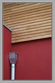
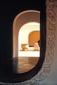
Photo By: Verena Rentrop
(K:15233)

|
|
|
Critique By:
this is not me (K:460)
4/19/2004 12:44:18 AM
haha Verena,
I feel special. yet another one of my fave. buildings. Not that many people can understand his work to photograph it. But you've done a superb job. I'm back!!!
|
| Photo By: Verena Rentrop
(K:15233)
|
|
|
Critique By:
this is not me (K:460)
1/1/2004 3:43:47 PM
Ahhh. One of Norman Foster?s greatest masterpieces. You?ve done a great job Capturing his immaculate style of clean lines. And also one more great work from Verena.
I?ll be picky hoping you wont be offended?the horizontal lines formed by the tension cables are not perfectly horizontal; they are sloped down to the right by a few degrees which it could be fixed by cropping at a slight angle.
|
| Photo By: Verena Rentrop
(K:15233)
|
|
|
Critique By:
this is not me (K:460)
12/30/2003 4:05:05 PM
Verena,
You?ve become my favorite photographer on here. One reason being that you actually enjoy architecture and the other reason is because you like Frank Gehry( which he is one of the god?s of architecture, the other 2 being Meis Van Der Rohe & Zaha Hadid.)
As usual, you have presented yet another masterpiece. The fact that you didn?t use any filters for a sky and left the sky white has really made your photo amazing. You have a great eye. Contrast and tone is really just right, Colosseum is just hinting in the background and not taking over your subject. There is also the imperfection on the left side of the Colosseum?s rim and the lamp?s imperfection is in the same direction as the chip on Colosseum.
I know you don?t think about these things when you?re shooting, but subconsciously you see these thing which is why you?re so talented.
You have a Safe and happy new year.
Nikko
|
| Photo By: Verena Rentrop
(K:15233)
|
|
|
Critique By:
this is not me (K:460)
12/29/2003 12:42:01 AM
good job...you've done a great job composing this.
|
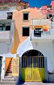
| Photo By: ventrix drogo
(K:65398)
|
|
|
Critique By:
this is not me (K:460)
12/28/2003 3:08:28 PM
I forgot to rate it on my last comment.
|
| Photo By: Verena Rentrop
(K:15233)
|
|
|
Critique By:
this is not me (K:460)
12/28/2003 3:07:35 PM
This is an interesting work. One question comes to my mind is that did you plan on taking this photo at that exact time? reason I'm asking is that the small hand is in perfect allignment with the roof I-beams and the big hand of the clock is lined up with the horizontal pipes going across...not only that I see the time is 1:45 and where you have positioned the clock in the frame is in the same 3/4 position of the clock. I believe this picture makes a very solid statement having all those in mind. I've looked at this for a while to see if you can improve it in anyway and I can't find anything that can be improved. Very professional...
|
| Photo By: Verena Rentrop
(K:15233)
|
|
|
Critique By:
this is not me (K:460)
12/27/2003 12:27:44 AM
also...one last thing...your imaage would've been stronger if your light source on the RIGHT would've been out of the frame...just something to think about.
|
| Photo By: Ahmet Baki Kocaballi
(K:13618)
|
|
|
Critique By:
this is not me (K:460)
12/26/2003 10:39:48 PM
hey Baki,
great photo. but more interesting is that about 9 months ago I finshed designing a club in chicago with a wall of chains like that. But the chains were spaced closer together to be used as a screen for lasers.
|
| Photo By: Ahmet Baki Kocaballi
(K:13618)
|
|
|
Critique By:
this is not me (K:460)
12/22/2003 8:43:48 PM
Hey heather....nice shot....I would love to see those bamboo scaffoldings in person...I'm an architect and when we're doing site visits and they have METAL scaffoldings it's a nightmare...I wonder how it feels like to be on one of those.
|
| Photo By: heather martino
(K:3648)
|
|
|
Critique By:
this is not me (K:460)
12/22/2003 8:21:22 PM
Just shooting some ideas your way.
|
| Photo By: Troy Stanton
(K:67)
|
|
|
Critique By:
this is not me (K:460)
12/22/2003 8:13:22 PM
Hi Kim,
You do a very nice work. One thing that I like to bring to your attention that I learned myself not too long ago. I see that you've used a 28mm lens. If you look on your frame you see that you have vignetting and this happens when you use a 28mm lens with screw on filters. The way to get rid of this problem is to use a bigger size filter by using a stepping ring and this would take care of your vignetting.
|
| Photo By: Kim Culbert
(K:37070)
|
|
|
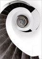
Critique By:
this is not me (K:460)
12/22/2003 1:18:18 AM
Hey Sandro,
To me your exposure looks good. There are only 2 things I would change about this photo. just minor details, If you look at the top of the picture, a bit of the railing is cropped. I would have included that during composition. Also in the lower left corner of your frame, the stair end in a weird place, I think if the curve of the strais would've started at the corner of your frame it would've been a stronger photo. You could have achieved this by changing your angle just a couple of degrees.
This is just what i think. I hope i was of some help.
nikko
|
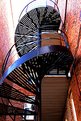
| Photo By: Sandro Monti
(K:1278)
|
|
|
Critique By:
this is not me (K:460)
12/22/2003 12:15:49 AM
I just read your caption about this image...To be frank, this is an amazing shot(keeping the title in mind). The fact that the image is in B&W takes all the distractions away and helps strengthen your emotions and statement through the main jubject which it would be the window with the reflection. One small thing though...There is a small distraction at the lower left corner...if you could crop it or touch it up in PS would make this photo a perfection.
Regards,
nikko
|
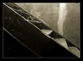
| Photo By: Troy Stanton
(K:67)
|
|
|
Critique By:
this is not me (K:460)
12/21/2003 11:55:01 PM
Hey troy...this is a just a sugestion...I hope you're not offended by me playing around with you photo...All i did was a crop and adjusted the curves in photoshop.
With all respect
nikko
|
| Photo By: Troy Stanton
(K:67)
|
|
|
Critique By:
this is not me (K:460)
12/21/2003 11:06:14 PM
Hey Andre,
What a great shot.
|
| Photo By: Andre Knudsen
(K:124)
|
|
|
Critique By:
this is not me (K:460)
12/21/2003 10:59:18 PM
Hey Teunis...Good job..Congrats on being the photograph of the day!!!
|
| Photo By: Teunis Haveman
(K:37426)
|
|
|
Critique By:
this is not me (K:460)
12/21/2003 10:42:59 PM
Jennifer....
before saying anything else...I would like to tell you that this picture really put a smile on my face. The title and the picture are so perfect. Just one thing...The eyes of the baby are a bit dark...I did what I could off of your picture to lighten the eyes a bit. You could do a better job with your higher res. file.
|
| Photo By: Jennifer Lord-Palmer
(K:2596)
|
|
|
Critique By:
this is not me (K:460)
12/21/2003 2:03:26 PM
Hey Teunis....
This is a really nice shot...I'll it's my fave. one out of your work. And i like the tree at the end of the trail.
|
| Photo By: Teunis Haveman
(K:37426)
|
|
|
Critique By:
this is not me (K:460)
12/21/2003 1:02:13 AM
hurry up and get your scanner...I want to see more stuff from chicago...I miss that place...I lived in Greek Town for 7 yrs....moved away 2 yrs ago. =(
|
| Photo By: Sarah Nader
(K:87)
|
|
|
Critique By:
this is not me (K:460)
12/21/2003 12:43:36 AM
Gorkem,
I really LOVE this...you've done a superb job...the background is such a compliment to your subject and the Soft focus is enhances the character of your subject...good job.
|
| Photo By: Gorkem Somer
(K:6)
|
|
|
Critique By:
this is not me (K:460)
12/21/2003 12:35:57 AM
Oh my god...maybe I'm weird but i thought those are intestines or something...nice job.
|
| Photo By: Jytte Kristensen
(K:446)
|
|
|
Critique By:
this is not me (K:460)
12/20/2003 10:37:37 PM
very nice...good toning as well...i think the tonal work compliments the feeling.
|
| Photo By: A. W. Osnafotos
(K:6373)
|
|
|
Critique By:
this is not me (K:460)
12/20/2003 10:31:18 PM
Hey Keith...Sweet shot...The use of framing, composition, and angel really compliment each other...also good lighting for the foreground.
|
| Photo By: Keith Song
(K:-11)
|
|
|
Critique By:
this is not me (K:460)
12/20/2003 10:27:44 PM
I love this...where was this place?
|
| Photo By: Stian Wiik
(K:1516)
|
|
|
Critique By:
this is not me (K:460)
12/20/2003 10:21:54 PM
I dont know how much you know about architecture...but the Sky compliments Frank Gehry's style and sketches. The Jet line in the sky and the soft clouds swirled in circles shows Frank Gehry...goood work.
|
| Photo By: Marta Pereyra
(K:5029)
|
|
|
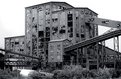
Critique By:
this is not me (K:460)
12/20/2003 10:15:05 PM
Troy...i like this one better than the other one. was it the same location? I like it a lot...I don't seeing this in a true b&w
|
| Photo By: Troy Stanton
(K:67)
|
|
|
Critique By:
this is not me (K:460)
12/20/2003 10:11:49 PM
Hey Troy...good work buddy. I bet this was a a ton of fun to shoot at. did you get to break in and shoot stuff inside?
|
| Photo By: Troy Stanton
(K:67)
|
|
|
Critique By:
this is not me (K:460)
12/20/2003 10:00:09 PM
hey Maarten....i like your angel.
|
| Photo By: Maarten Venter
(K:885)
|
|
|
Critique By:
this is not me (K:460)
12/20/2003 9:48:01 PM
this would be a very lucky hip shot since it came out as it did. like it a lot.
|
| Photo By: Olle Holmberg
(K:31)
|
|