|
|
Critique By:
Roy Breslawski (K:458)
6/21/2003 4:15:19 PM
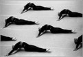
This is one of the best photos I have seen in quite a while. I really can't see anything to improve. The lighting and composition are both excellent. Great job. It really cuts through all the cliche photographs that show up in a constant stream.
|
| Photo By: Gustaf L Bjerne
(K:245)
|
|
|
Critique By:
Roy Breslawski (K:458)
6/21/2003 4:09:13 PM
You have chosen a very nice rose with well formed petals and good color. I think it could be a stronger composition if the rose was not dead center in the frame. Maybe toward one of the corners and even a higher angle. Even less depth of field might have helped also. The background leaves would be even more of a wash of color if more out of focus, and their color is a nice complement to the blossom.
|
| Photo By: Marc OLIVIERI
(K:177)
|
|
|
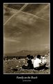
Critique By:
Roy Breslawski (K:458)
6/21/2003 4:04:56 PM
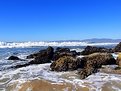
It is a nice beach. Excellent sharpness and detail. I would like to see it with much warmer and softer light. The harsh mid-day lighting does not do it justice. All the empty blue sky detracts from the interesting part of the scene. It would be a much stronger composition if most of the sky was cropped out. A sky needs some clouds for interest or should not be included in a scene like this.
|
Photo By: Gregory McLemore
(K:35129)

|
|
|
Critique By:
Roy Breslawski (K:458)
6/9/2003 8:54:53 PM
Excellent colors, very sharp and nice lighting. It lacks a compelling subject, however. If there was a person walking in an impact point in the frame it would have a very large affect on interest. As it is the photo is a nice scene, but not compelling enough to keep your eye in the frame.
|
| Photo By: Bill Ciavarra
(K:10216)
|
|
|
Critique By:
Roy Breslawski (K:458)
6/9/2003 8:49:29 PM
Very nice. This is one of my favorite pictures I have seen here yet. I like your composition with the daisy way off in the corner and the extreme lighting range. Not really much to critique here. It would be interesting to see this with a little less water drops or maybe the highlight in the upper left not quite so burned out. Overall, though a beautiful photograph.
|
| Photo By: Nabil Majid
(K:2073)
|
|
|
Critique By:
Roy Breslawski (K:458)
6/5/2003 9:17:22 PM
Interesting subject, but tough to photograph with impact. I think this would benefit greatly from earlier or later lighting. It is quite flat in this photo. The back end of the car at the end of the row really distracts from the VW theme. I do not know if you had the option, but moving the cars around so that a brighter color is at the front would help pull the viewer into the photo. The black up front acts as a block to your eye moving further into the photo.
|
| Photo By: Marcos Alexandre
(K:39)
|
|
|
Critique By:
Roy Breslawski (K:458)
6/5/2003 9:10:50 PM
Wonderful photo. Great composition, and the lighting and contrast on the lily and underside of the lizard is fantastic! The only room for improvement I see is the hot spot in the upper right of the background. If that was burned in it would help the subject stand out even more. As it currently stands it really pulls your eye away from the subject.
|
| Photo By: Ronnie Gaubert
(K:3700)
|
|
|
Critique By:
Roy Breslawski (K:458)
6/5/2003 9:06:48 PM
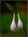
Beautiful lighting and color. It also has nice, sharp detail. What I find distracting is that there are two of them. In general flowers have more impact when there are one or three blossoms. Sometimes two works, but it is usually a somewhat static composition. Maybe if this frame was rotated a little to make the bottom of the blossoms form more of a diagonal it would be more dynamic. Please don't take this as harsh criticism. It is a very nice picture that I think has potential to be great.
|
| Photo By: Ronnie Gaubert
(K:3700)
|
|
|
Critique By:
Roy Breslawski (K:458)
5/28/2003 9:03:14 PM
A very nice flower and the black background is great. I would like to see a little highlight on the interior of the flower. Maybe a small gold reflector aimed to the inside of the flower. There is nothing that jumps out as the main point of impact since the brightest highlight is below the flower petals.
|
| Photo By: Gil Draper
(K:3194)
|
|
|
Critique By:
Roy Breslawski (K:458)
5/28/2003 8:40:03 PM
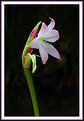
Similar to what I have noticed on your other photos. The lighting is very nice and it adds quite a bit to the impact overall. I would like to see the flower in the lower left instead of centered. It needs something to make it more dynamic. Centering a subject can work, but I don't think it does in this case.
|
| Photo By: Carlos Schmidt
(K:78)
|
|
|
Critique By:
Roy Breslawski (K:458)
5/28/2003 8:36:22 PM
Beautiful shot. I like the lighting and sharp focus on the front eye. Seeing the detail in the black cloth is fantastic. In my personal opinion there are a couple of opportunities to improve this. First, and I think the biggest impact, would be to crop a little off the top. In general a shot like this is more pleasing if the eyes are about 1/3 of the vertical from the top. Not sure if you could have done it, but I think it would also be better if the eye in the back was sharper. That would require a small aperture and focusing a little bit further back.
|
| Photo By: Carlos Schmidt
(K:78)
|
|
|
Critique By:
Roy Breslawski (K:458)
5/27/2003 9:03:28 PM
I really like this photo. My favorite that I have looked at this evening. Original, nicely composed, simplified focus on a subject. The high key tone through the middle adds a lot to what would probably normally be seen as a dark subject.
|
| Photo By: Yvon Loyer
(K:1449)
|
|
|
Critique By:
Roy Breslawski (K:458)
5/27/2003 9:00:59 PM
Excellent photo. Great composition with three distinct planes in nice proportions. Colors are great and the reflection is nice. One possible area to work on is getting some detail into the dark rocks cutting through the middle. That is a tough place to have negative space.
|
| Photo By: Mike Hollman
(K:315)
|
|
|
Critique By:
Roy Breslawski (K:458)
5/27/2003 8:58:44 PM
Good use of a wide angle. It might have more impact if the foreground was cropped some. With the hot tub centered it might also be better if the chairs were rearranged to be symmetrical. If you have a chance you might want to shoot this either earlier or later in the day. The harsh, mid-day sun makes it flat and washes out the colors.
|
| Photo By: michael faulkner
(K:327)
|
|
|
Critique By:
Roy Breslawski (K:458)
5/27/2003 8:55:49 PM
Very nice image. The black background adds a lot. It seems a little soft. I know it is supposed to have a shallow depth of field, but it seems the in focus plane is not as sharp as it could be. The colors are very nice. I would like to see an even tighter image with just the colorful bud. Good job.
|
| Photo By: Carol Watson
(K:5185)
|
|
|
Critique By:
Roy Breslawski (K:458)
5/26/2003 3:20:16 PM
Excellent. The sky is terrific. I wouldn't change a thing about it.
|
| Photo By: Fabrizio Dutto
(K:944)
|
|
|
Critique By:
Roy Breslawski (K:458)
5/26/2003 3:18:05 PM
Very nice. I like the willingness you have to do something other than a straight on shot. Overall the lighting is very good, but I would like to see the man pop out more compared to the bright area on the right side of the background.
|
| Photo By: Fabrizio Dutto
(K:944)
|
|
|
Critique By:
Roy Breslawski (K:458)
5/26/2003 3:15:41 PM
Very creative. Wish I could come up with that kind of creation. Excellent work. It would be interesting to see how it looks cropped off the right a little bit. The dead space in the lower right corner seems distracting to me.
|
| Photo By: Fabrizio Dutto
(K:944)
|
|
|
Critique By:
Roy Breslawski (K:458)
5/26/2003 10:25:25 AM
Sorry to digress from the other early comments, but I think you can learn a lot by hearing potential improvements suggested. First, the composition is a little static. The subject is completely flat with no originality. If the head is turned it will be more dynamic. For lighting the background is way too bright on the right overpowering the subject. In addition the eye needs a catchlight. Wildlife with flat black eyes lack impact.
Please do not take these comments the wrong way. You have very nice feather detail and were able to get close. Some additional practice paying attention to the lighting and composition will yield images with much more impact.
|
| Photo By: Ron Bergeron
(K:262)
|
|
|
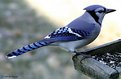
Critique By:
Roy Breslawski (K:458)
5/25/2003 9:02:21 PM
Great colors. I would like to see more light on the head. The brightness of the tail feathers draws my eye away from the most important part of the subject.
|
| Photo By: JoydipSuchandra Kundu
(K:582)
|
|
|
Critique By:
Roy Breslawski (K:458)
5/25/2003 8:57:36 PM
Exceptional composition. The low horizon really adds impact. Great image.
|
| Photo By: jean E marre
(K:1577)
|
|