|
|
Critique By:
Artie Colantuono (K:12275)
1/6/2004 11:32:40 PM
Well done; you captured a moment and image to be proud of. Good framing and very good lighting on this. Appreciate the fact that using the flash and controling the light's colors would have given you the same results. However as you did it you did it very, very well.
|
| Photo By: alberto hernandez
(K:187)
|
|
|
Critique By:
Artie Colantuono (K:12275)
9/8/2003 4:30:55 AM
John there are many interesting elements that make this work really well....your focus is strong on her mouth and eyes and gradually moves off into the body,hair and the arms...(read makeup ad)you also made sure the necklace lay straight and true on her form which merely adds polish (read Lifestyle jewelry ad)...the slight softness on her face works extremely well as it gives a bit of a "dream" mood which fits perfectly with the way you framed her and her pose( read makeup, perfume clothes or any lifestyle concept). The lighting is really nicely done in a very elegant and classic style. The perspective selected is perfect for this very high impact image...This is what makes up a perfect two page spread...This image definitely has Balls....excelent concept (nothing really new) but executed perfectly...usually images like this you can easily find dozens of minor mistakes or didn't notices by the stylist and photog alike; here you nailed it perfectly...
|
| Photo By: John Stalter
(K:66)
|
|
|
Critique By:
Artie Colantuono (K:12275)
9/7/2003 5:22:31 AM
Karen this is a very sweet image of a really really really cute girl...the cats saying are we done yet....I agree with Richard about the tight left but you're aware of it already...makes it all the better....the light could use a bit more fill on the camera left and behind her but this little girls expression is captured so perfectly that any minor mishaps are nothing compared to the overall image quality which is GREAT...when shooting kids always leave yourself some extra frame as they never NEVER ever can sit still for a 1/4 of a second...congratualtions on an extremely pleasing photo...great set up and styling (clothes, backdrop and the kitty...)...
|
| Photo By: Karen Siebert
(K:12076)
|
|
|
Critique By:
Artie Colantuono (K:12275)
9/7/2003 5:06:14 AM
Mary this just came up on the top of the page....I remember you brining this to my live sessions but I never saw it here....this is one fantastic shot....I remember all the incarnations we went through on this and this image clearly makes you a "King of Macro" Flowers (remember if the Queen had Balls she'd be the King) and this image has plenty of BALLS..........what a totally creative thought process and aplication to show this much of the flower this tightly cropped and to pull it off so perfectly.... "BALLS" "BALLS" "BALLS" "BALLS" "BALLS"
|
Photo By: Mary Sue Hayward
(K:17558)

|
|
|
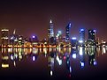
Critique By:
Artie Colantuono (K:12275)
9/7/2003 4:12:30 AM
This is a very strong framing job...and your selection for exposure is excellent...you let the sun blow out a bit too hold some detail and texture in the buildings, pier and statue...very good choice...your perspective on this is perfect and the colors are obviously bold yet soft...nicely seen and captured beautifully...
|
| Photo By: Kaj Nielsen
(K:15279)
|
|
|
Critique By:
Artie Colantuono (K:12275)
9/7/2003 3:29:10 AM
WEll thank you Mark Williams for bringing this up to the top...This is an excellent macro...the negatice space is well balanced by that which is positive...the lighting is impeccable as well as the colors being both rich and vibrant....finally a macro with some "Balls"...really appreciate how you let the branch reside in the background and underplayed with light so you see it there and it justifies the bloom but it stays out of the picture so to speak to allow the bloom to take center stage...Great job Uncle Frank...
|
| Photo By: Uncle Frank
(K:1642)
|
|
|
Critique By:
Artie Colantuono (K:12275)
9/7/2003 3:17:30 AM
Your concept here is excellent as well as your framing being good and your lighting...this is obviouly not designed to be straight catalog shot but rather an ad shot "Lifestyle" ...romancing the masculinity of the watch and you've succeeded wonderfully....Yukon is copying Brietling huh!....myonly nit on this would be the silver legs are a bit to hot in this..there greyness should be under the grey value of the watch...Excellent concept and executed with class....good job...
|
| Photo By: Pierre Demers
(K:103)
|
|
|
Critique By:
Artie Colantuono (K:12275)
9/7/2003 3:09:04 AM
WEll a Phil image I missed...white on white on white with some more white thrown in for good measure...AJG's point is well understood but I do like the effect you achived by vignetting it...The attitude of the bride is very pensive and you've captured it well and your lighting treatment on this is excellent...another excellent Phil image...the professionalism is really showing Phil...very well done...
|
| Photo By: Phillip Filtz
(K:1792)
|
|
|
Critique By:
Artie Colantuono (K:12275)
9/7/2003 3:01:41 AM
One of your other images came up in random which led me to view what you've posted...you definitely have a flair for shooting fashion and people. In this image while most things are really excellent the effect of shooting, particularly a woman, with the lighting in an upward direction tends to give a bit of a ghostly effect to the image...realizing that this was only an experiment...What I'm most impressed with your work is twofold...your framing stlye and your obvious relationships with your models....both are excellent...your lighting while it is good it needs work and since you admitted that you are well on your way to being successful and believe me you will be... In some of your other images like the one titled fashion (the girl on a tilt....high key) that image is excellent the high key is perfect as you did it so don't second guess yourself...however the softar or softening filters will turn a high key image even higher...While I don't object to using softars and I do own them, even the beach and girl (your vacation) would be incrediable if you didn't soften it and I read you have the same image without the filter, I'd love to see it...In the Advertsing business most AD's would prefer the images unsoftened even if the brief describes it to be, they would prefer to do that softening post process...they want to control the degree of softness...you can always present it both ways but I'll bet they'll always pick the unsoftened version and than post process it...You have an obvious talent and looking forward to seeing your new work as you seem ot be progressing in leaps and bounds....
|
| Photo By: Pierre Demers
(K:103)
|
|
|
Critique By:
Artie Colantuono (K:12275)
9/7/2003 2:26:14 AM
Ms. Smith :-) You have started with a nice idea here but it needs to be reworked a bit, I don't mean fix it in PS but actually reshoot it...the grapes on the border near the top of the fruit layout are blown out and it is a bit distracting...the red flower if you need it to be there than get some light to the center of it so it doesn't appear to be empty...the candles mix with the fruit is a nice idea but the negative space between the fruit and the candles is dividing this picture in half...bring them in directly behind the fruit layout...so in this way there will be no space from where the fruit ends and the candles begin...The fruit is dryish but it works for this concept which as I stated earlier in this is very good and you did an admirable job with this but if you could go this far than I believe you can make this a killer presentation and bring your original idea to fruition...good luck with it and I hope you undertake the reshoot...I'll bet it will be stellar....
|
| Photo By: Verna Absolutestockphoto
(K:2836)
|
|
|
Critique By:
Artie Colantuono (K:12275)
9/6/2003 4:51:27 AM
Thank you Luke Luther for bringing this image back to the top...it seems another Great AJG image got by me while I was away from this site for a couple of months...Arthur fistly gotta love that name...Image wise now...Nothing less than "Major Balls"
Framing perfect.....lighting equally perfect...concept layout and execution also perfect...Trully a polished top notch marketable image but you knew that would be the effect thats why you set it up...
|
| Photo By: Arthur John Grossman III
(K:1214)
|
|
|
Critique By:
Artie Colantuono (K:12275)
9/6/2003 3:06:05 AM
So do you remember asking me in a e mail...."how do I get to the next level?"
"THIS IS HOW" good for fashion, product or corporate...nailed it...."works" "Balls" way to go Phil............"WAY TO GO"
|
| Photo By: Phillip Filtz
(K:1792)
|
|
|
Critique By:
Artie Colantuono (K:12275)
9/6/2003 2:53:51 AM
Good potential here Rory...light is hot but could work if you fill in more of the right to soften the overall contrast a bit...light the background to provide seperation or use a reflector or additional light to back light her (rim) a bit which would also add seperation...or you could do both...end result; still a hot looking image which is what you are going for but with a more dimensional less flatish look...try it you'll like it...
|
| Photo By: Rory Armstrong
(K:5)
|
|
|
Critique By:
Artie Colantuono (K:12275)
9/6/2003 2:38:08 AM
Debra this is very nice light and a very sexy mood....the fan palm adds a lot to the contrast of the image...big and powerfull vs soft and subtle, yet vibrant sunset...I suggest you level the horizon as it is off to the right almost 2.75 degrees...this would cause the palm to lean more to the left but I've never seen one grow straight yet so it will not negatively affect your image...love the reds to pinks to lilac in the sky... nicely seen and executed (except for the level)...
|
| Photo By: Debra Griffin-Ibrahim
(K:7119)
|
|
|
Critique By:
Artie Colantuono (K:12275)
9/6/2003 2:07:16 AM
That's what you get for keeping your eyes open...a very clever abstract...nicely done...
|
| Photo By: luisa vassallo
(K:28230)
|
|
|
Critique By:
Artie Colantuono (K:12275)
9/6/2003 1:56:35 AM
Your framing (composition) is very nice here and your lighting while a bit hard works beautifully for your final image...glad you left the fruit wet it really adds to the freshness and the overall appeal...colors are alive and vivid...If you enjoyed doing this I'll suggest the next time add a piece of glass over the black material on the table top only, not for the background, use uncolored clear or smoked maybe 1/4 to 3/4 inch thick...this will give a base to the fruit in the table and create a soft and delicate mirroring of the fruit while also permitting some illumination to the very underside of the fruit adding depth and more shaping, less of a floating effect....You did an excellent job on a rather difficult image for most people to get to look palatable and sexy...Very well done....good impact...
|
| Photo By: Jac & Lea
(K:354)
|
|
|
Critique By:
Artie Colantuono (K:12275)
9/5/2003 4:34:51 AM
Ted this just came up in random and I never saw it before...brilliant...
|
| Photo By: Ted Williams
(K:324)
|
|
|
Critique By:
Artie Colantuono (K:12275)
9/5/2003 3:55:47 AM
Jamie this is a pretty nice nite scene...the glow around the lights is caused by over exposure to bring out the ambient structures so the film is actually burnt out in those areas, the horizon is level as evident to your verticals being porperly vertical...you are right however, a bit earlier in the evening and you'd have the right mix of ambient and nite lights...you can lesson the overall effect in this is if you crop out some of that top since is holds very little there...all in all you did an admirable job with this and your framing (other than the top) is very good...this image seems well thought out and you executed it very well especially since you yourself already realized a bit earlier would have helped you...good thinking and good and a good job...
|
| Photo By: Jamie Ferguson
(K:6284)
|
|
|
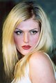
Critique By:
Artie Colantuono (K:12275)
9/5/2003 3:45:31 AM
Pretty decent portrait, light is a bit hot but not objectionably so althought softer light would have soften her up a bit, the camera left light is casting a slight shadow of her hair onto her face but at least it's not a hard edge one...I like how you framed her and your pose...
|
| Photo By: Antonella Nistri
(K:21867)
|
|
|
Critique By:
Artie Colantuono (K:12275)
9/5/2003 3:38:34 AM
nice light and very strong graphic abstract...well seen...nicely framed and thought out...
|
| Photo By: Roland Le Gall
(K:7018)
|
|
|
Critique By:
Artie Colantuono (K:12275)
9/5/2003 3:35:08 AM
Very moody image, I wouldn't crop it as per your attachment...it really stands up very well in full frame...the lighting is columned and muted which is good for the content...I think your framing as shown is really quite good. (Only wish the duck wasn't so close to the carriage but I guess if you shot the duck it would have just floated there anyway)...Nicely executed and thought out...
|
| Photo By: altur .
(K:6087)
|
|
|
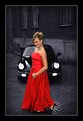
Critique By:
Artie Colantuono (K:12275)
9/5/2003 3:25:35 AM
Torben Thorhauge, this is a classic commercial image...fashion, as you catagorized it, maybe, maybe not... lifestyle definitely, car ad possibly as a lifestyle approach and you handled the lighting very well but your frame is too much. You definitely dont need all the space around it since it is negative space and whats in it doesnt't add to your image's saleability....I took the liberty to cut into your image as an example of bringing the model and prop into the front more....Well executed image and looking forward to more....
|
| Photo By: Torben Thorhauge
(K:122)
|
|
|
Critique By:
Artie Colantuono (K:12275)
9/5/2003 3:09:28 AM
this is a very elegant and yet moody image...the lighting is bang on and your framing in this is really great....image suggest calm and peace yet lonely and even anxiety...a trully well executed image brought yo life byyour imagination....very well done....
|
| Photo By: Ingrid Mathews
(K:7277)
|
|
|
Critique By:
Artie Colantuono (K:12275)
9/4/2003 5:20:44 AM
Very good attempt here Eolo, as you mixed an odd set of props they really don't appear to conflict with the overall picture and actually work ok with it, ...however as Petros pointed out the light fall off is really hurting this as well as the flatness (lack of detail in the hair...It appears that you hit this with one light off camera but high and left of the camera position..This would not work well for commercial usage due to lack of polish in the final presentation...I've seen other work of yours and know you could do much better....If I may suggest a reshoot, if possible...loose the frame behind her head... and balance the light better...even if you want to use directional light it shouldn't be tell tale from left to right and top to bottom....If you were going for a spot light effect on the top of her you would still need more light on the rest of here to balance off the image and still have a spotlight look...either use a focusing fresnel or snooted light for the desired effect...really good attempt and diverse from the work I've seen but definitely demonstrates talent on your part...your stylist did a nice job but loose the picture frame and your makeup artist also did nicely but if she is so made up with the bikini and silver stilletos than her nails should have a color on them to either match the makeup or one of the suit colors....
|
| Photo By: Eolo Perfido
(K:91)
|
|
|
Critique By:
Artie Colantuono (K:12275)
9/3/2003 4:52:33 AM
great image, very funny...and well captured...is that a Winston Light?
|
| Photo By: Jur Igruh
(K:3)
|
|
|
Critique By:
Artie Colantuono (K:12275)
9/3/2003 4:45:22 AM
Karen if your new to studio portraits or an old timer this is still pretty damn good....you framed her really well and relaxed her enough...most of the job is done...your frontal lighting is good and works for her....however you need to get light to the background or use a large reflector to back fill her a bit to relieve her off the background, notice how the hair is merging with the dark background set up...If you lite the background but still metered it to stay dark it would relieve her also if you put the reflector there behind her it would create a small rimming effect to her and woul pull her out a bit more...the lighting color is complimenting her skin tones well...remember to never use a silver reflector or inserts in your lighting on dark skin people and especiialy blacks as it tends to ashen the skin...Lastely look at her rear elbow and touch up that drish area....again you did a very good job on this and look forward to more...
|
| Photo By: Karen Siebert
(K:12076)
|
|
|
Critique By:
Artie Colantuono (K:12275)
9/3/2003 4:23:15 AM
This just popped up in random...what an interesting way to frame her...you didn't choose to playuo the obviously most forward part of her but left it more to the imagination of the viewer...the causal look she gave you for this shot looks almost like the little dutch girl...you lit her beautifull with the right amount of punch and yet held it soft and more subtle...This is an excellent example of the use of natural light and a potato masher to generate a very warm soft light usually only attributed to big studio lighting rigs...Arthur you've concieved and excellent image and executed it with a great deal of "Panashe" (bet I spelled that wrong) Excellent job...soft portrait with "BALLS"....P.S. even the Madras peasant top works to compliment her tones....
|
| Photo By: Arthur John Grossman III
(K:1214)
|
|
|
Critique By:
Artie Colantuono (K:12275)
9/3/2003 4:10:37 AM
This is an extremely well executed image...the framing is right on and the lighting is perfect...Well seen and a great job on the capture.....
|
| Photo By: Cristiano Corte
(K:10836)
|
|
|
Critique By:
Artie Colantuono (K:12275)
9/3/2003 3:41:26 AM
Stefano Mannucci, your composition is exquisite and the light is trully stunning...the rhythmn in this image is very compelling as the almost abstract patterns move in symetry and asymetrically...This is by far one of the top 3 landscapes I've seen on this site in a very long time....Excellent perspective, colors, balance and appeal...This image has major "BALLS"...Congratulations on an exceptional image...very well concieved and an amazing job at the execution of it...
|
| Photo By: stefano mannucci
(K:4793)
|
|
|
Critique By:
Artie Colantuono (K:12275)
9/3/2003 3:14:46 AM
nicely lit TK...also like most of the framing......background works because it looks like he is hard at study or work and a very pensive expression....now the other shoe drops...The perspective of the lens works great for the pose and as mentioned by Andy, the blur of the fingers is a nice touch or lead in HOWEVER the distortion of the WA lens at this proximity makes the side of his hand and the forearm appear huge...it subsequently pulls the eye right to the lower right corner...I'll give you this you're defintely getting a ton better on getting to the point in your images and thats the most important thing right now for you....if given the chance to do a reshoot with this guy do everthing the same but let him leave out the hand...
|
| Photo By: Terrence Kent
(K:7023)
|
|