|
|
Critique By:
Daniel Taylor (K:3495)
3/4/2004 8:10:17 PM
Good composition and lighting. I would be curious to see the same building at different angles. Nice work!
BTW, if you really want to get crazy and experimental, this would be a good building for the following type of treatment:
http://www.thenightskye.com/images/mono/mono_gallery/troy/f ull/bodie12.jpg
http://www.thenightskye.com/gallery_mono2.htm
http://www.lostamerica.com/
|
| Photo By: Kelly Anbach
(K:4375)
|
|
|
Critique By:
Daniel Taylor (K:3495)
3/4/2004 8:03:17 PM
My opinion is pretty much in line with the others here. I really like the composition but not the lighting/time of day. It's a good shot, but would be excellent with better light. You should try to capture it again at sunrise/sunset (whichever puts the sun at the most favorable angle), during a storm (picture the sun lighting the buildings with a dark grey background storm), or at night. I would also choose a slide film for this. Which depends on lighting. For this exact shot Astia 100F. Under more favorable lighting Provia 100F or Velvia 50. For a night shot, Provia 100F.
Catch this with the right light on Provia and you'll have an award winner. I'm curious to know if you stumbled on this location/perspective, or planned it out. Good eye in either case!
Regarding your question on the Canon 70-200 (posted under one of my images):
The f/4L and f/2.8L are virtually identical in all respects. Their MTF scores and curves are very similar, with the f/4L actually edging out the f/2.8L (barely). The f/4L is lighter and costs less, and the f/2.8L gives you an extra stop. That's the only difference.
Due to weight you might want a tripod collar for the f/2.8L, while you can shoot the f/4L off a camera mounted to a tripod.
I got the f/4L to save money and because I knew I would be carrying it a lot.
Thanks for your comment on my image. Hope this helps!
|
| Photo By: Kelly Anbach
(K:4375)
|
|
|
Critique By:
Daniel Taylor (K:3495)
2/23/2004 11:19:32 PM
Nice cityscape. I like that you got the moon in there. The moon is casting its reflection on the water. It would be interesting to see if another exposure combination could enhance that effect.
|
Photo By: Lori Stitt
(K:75282)

|
|
|
Critique By:
Daniel Taylor (K:3495)
2/23/2004 11:15:16 PM
Great capture. Lots of fine details and soft lighting, plus the unique angle. Good work!
|
| Photo By: Lori Stitt
(K:75282)
|
|
|
Critique By:
Daniel Taylor (K:3495)
2/23/2004 11:14:17 PM
Beautiful flower shot! I like the subtle lighting on the top and the way the filter altered the tone. It is a bit surreal, but that works well in this case.
It's best to have your background when you take the shot, which means a black backdrop. You can also light/expose the flower so that the background is heavily under exposed.
BTW, thanks for the comments on my images!
|
| Photo By: Lori Stitt
(K:75282)
|
|
|
Critique By:
Daniel Taylor (K:3495)
1/25/2004 6:16:34 PM
Great industrial capture. Good perspective and composition, as well as color. Nice work!
|
| Photo By: Hermen Pen
(K:9168)
|
|
|
Critique By:
Daniel Taylor (K:3495)
1/25/2004 6:07:54 PM
Oh...so you wanted the night shot look! Well then, why didn't you say so??? :-)
It does take on a pretty eerie appearance, so if that was your goal you accomplished it. You asked how to make the eyes look real though, so I assumed you were disappointed with the night shot look.
The eyes, to me, look about right for this style. In what way were you hoping to make them different?
|
| Photo By: Lukas Kurik
(K:292)
|
|
|
Critique By:
Daniel Taylor (K:3495)
1/23/2004 1:29:43 PM
Nice shot :-)
|
| Photo By: Luigi Piccirillo
(K:142)
|
|
|
Critique By:
Daniel Taylor (K:3495)
1/21/2004 8:39:39 PM
What can I say? A classic shot executed to perfection. 7's across the board.
|
| Photo By: Chris Wenzel
(K:1165)
|
|
|
Critique By:
Daniel Taylor (K:3495)
1/19/2004 8:02:49 AM
Good capture. I like that you chose to put the subject off center. It shows off the color in the wall without reducing the emphasis on the subject. Nice work.
|
| Photo By: Glenn R. McGloughlin
(K:3716)
|
|
|
Critique By:
Daniel Taylor (K:3495)
1/19/2004 4:14:00 AM
I think the fact that you're using night shot is the problem. Even after manipulation the photo looks very off to me. The flat, pale skin tones; the sort of "glowing" eyes; looks more like a scene from a scary movie.
Photography is essentially painting with light, and with night shot you're trying to paint with the green boosted light of night vision technology. When you have poor light it doesn't matter how expensive your camera or how good your Photoshop skills. You can't manipulate away bad light (or in this case no light) and replace it with good.
This would have worked so much better with some candlelight and a tripod and "normal shot" mode. Or a diffused flash, maybe bounced off a nearby wall or ceiling.
An article on usefilm drives home the importance of light and visual elements. It's a good read.
http://www.usefilm.com/photo_articles/46/A_Photographer's_E ye.html
Hope this helps!
|
| Photo By: Lukas Kurik
(K:292)
|
|
|
Critique By:
Daniel Taylor (K:3495)
1/19/2004 3:58:35 AM
Nice shot. I hope you were at 300mm! A neg film would have handled the contrasty light better, but you did pretty good considering how difficult that must of been to meter.
|
| Photo By: Chelsea Burke
(K:5750)
|
|
|
Critique By:
Daniel Taylor (K:3495)
1/19/2004 3:54:52 AM
Really nice capture of a nice winter day (there are a few I guess). I like your choice in angle and focal length. The trees seem huge, the snow and sky very pretty. Good job.
|
| Photo By: Chelsea Burke
(K:5750)
|
|
|
Critique By:
Daniel Taylor (K:3495)
1/19/2004 3:52:40 AM
Interesting technique to overlay the slides. Nice image.
|
| Photo By: Chelsea Burke
(K:5750)
|
|
|
Critique By:
Daniel Taylor (K:3495)
1/19/2004 3:50:30 AM
Nice image. I like how it seems like one bird is looking up at the moon. Good shot!
|
| Photo By: Chelsea Burke
(K:5750)
|
|
|
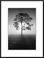
Critique By:
Daniel Taylor (K:3495)
1/19/2004 3:42:15 AM
I can't think of anything I would change or which might improve the shot. The composition is perfect, the tonality and color just awesome. A very beautiful image. Very good work on your part.
|
| Photo By: Chelsea Burke
(K:5750)
|
|
|
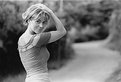
Critique By:
Daniel Taylor (K:3495)
1/17/2004 6:20:35 AM
Awesome portrait! The lighting, the pose, the look on her face...really great job!
|
| Photo By: marília campos
(K:517)
|
|
|
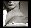
Critique By:
Daniel Taylor (K:3495)
1/17/2004 6:11:48 AM
This is an excellent crop and photo. I like the mystery created by hiding her face. Lighting and texture is very good, her lips really stand out. A very sexy portrait.
|
| Photo By: marília campos
(K:517)
|
|
|
Critique By:
Daniel Taylor (K:3495)
1/17/2004 12:07:13 AM
This is a very good photograph. I'm glad you stuck out the cold to get it. I would offer constructive criticism, but I can't find anything to criticize. Great work!
|
| Photo By: KEVIN TEMPLE
(K:8657)
|
|
|
Critique By:
Daniel Taylor (K:3495)
1/16/2004 5:41:48 PM
I really like this shot. I like how the color of the stocking offsets the black outfit. Good pose to.
I've been looking through your portfolio and I was wondering...do you need anybody to help hold lights or anything? ;-)
|
| Photo By: ppdix
(K:17069)
|
|
|
Critique By:
Daniel Taylor (K:3495)
1/16/2004 5:34:57 PM
I like the dramatic lighting in this shot. Nice setup and portrait. I also agree with another poster about not air brushing your shots, I prefer to see the detail in the skin and hair.
|
| Photo By: ppdix
(K:17069)
|
|
|
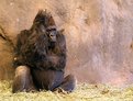
Critique By:
Daniel Taylor (K:3495)
1/16/2004 5:30:22 PM
Nice composure and lighting, great exposure on the cub's face. Nice shot!
|
| Photo By: Harry Eggens
(K:14804)
|
|
|
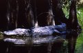
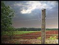
Critique By:
Daniel Taylor (K:3495)
1/16/2004 5:26:33 PM
A very interesting shot and composure. I like the scene and really like the way you've captured it, though I do agree Jim that it looks over sharpened. You have a good eye to have caught this.
|
| Photo By: Marcos Duarte
(K:15402)
|
|
|
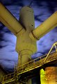
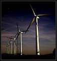
Critique By:
Daniel Taylor (K:3495)
1/16/2004 4:53:56 AM
This is really good. 7's across the board. Stephen's post had some good suggestions. The house doesn't bother me much, but the image would be better without the telephone mast.
While the slight star trails don't bug me, I would love to see a version with long trails. I'm not sure if you could capture a tight pinpoint version without having to put up with noise, i.e. you would probably have to push to 800 or 1600 to get a time that fully arrests star motion.
The colors in the sky and the tone of the moonlight reflecting off the turbines is just awesome. Great work!
|
| Photo By: Keith Naylor
(K:13064)
|
|
|
Critique By:
Daniel Taylor (K:3495)
1/16/2004 4:45:41 AM
What a beautiful bridge! And you captured it extremely well...great perspective and composition, lovely colors and tonality. Very good work!
|
| Photo By: Gerson Standke
(K:255)
|
|
|
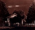
Critique By:
Daniel Taylor (K:3495)
1/16/2004 4:42:46 AM
Very spooky, twilight zone like image (to me any way). Nice work!
|
| Photo By: Sarah Nader
(K:87)
|
|
|
Critique By:
Daniel Taylor (K:3495)
1/16/2004 4:41:55 AM
Good eye, composition, and capture!
|
| Photo By: Jingle Chong
(K:57)
|
|
|
Critique By:
Daniel Taylor (K:3495)
1/16/2004 4:39:44 AM
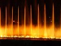
Great shot! I love the blue reflection off the water. This is one that belongs framed on a wall some where. Beautiful.
Just one question: I can't seem to find "slow" or "narrow" on any of my cameras ;-)
|
| Photo By: Ari O
(K:990)
|
|
|
Critique By:
Daniel Taylor (K:3495)
1/16/2004 4:25:52 AM
Good composition and DoF. Really nice portrait.
|
| Photo By: Raffaele Bonivento
(K:442)
|
|
|
Critique By:
Daniel Taylor (K:3495)
1/16/2004 4:23:17 AM
Great capture. Love the color, tonality, and shapes. This would make a great print with black mat and frame. Nice!
|
| Photo By: Terje Hellesø
(K:40)
|
|