|
|
Critique By:
Kim Culbert (K:37070)
10/13/2010 5:00:15 PM
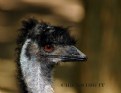
Wow, Dave, an amazing capture! Tack sharp and definitely tells a story! Seriously, a 16-35 lens? How close were you?
It's a great shot!
|
| Photo By: Dave Holland
(K:13074)
|
|
|
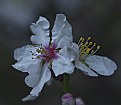
Critique By:
Kim Culbert (K:37070)
2/18/2010 4:55:33 AM
This seems a little blue, and a little underexposed, but the detail within the flower is great.
|
Photo By: Tony Smallman
(K:23858)

|
|
|
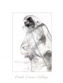
Critique By:
Kim Culbert (K:37070)
2/18/2010 4:54:18 AM
Beautifully seen, and well balanced... much like a dancer for certain!
|
| Photo By: Tony Smallman
(K:23858)
|
|
|
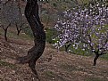
Critique By:
Kim Culbert (K:37070)
2/18/2010 4:53:39 AM
Hey Tony! Thanks for the comments on my smoke art... I'm having a blast doing it!
This has such a beautiful softness to it... very painterly. The colours are muted and blend together nicely, but I wonder if maybe just a little more sharpness on the main trunk might add a little more strength to keep my eye centered in the photo?
|
| Photo By: Tony Smallman
(K:23858)
|
|
|
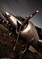
Critique By:
Kim Culbert (K:37070)
12/10/2009 10:32:28 PM
Nice use of HDR in this image... makes the metal look so 3D. The angle seems a bit harsh though... I can see that you wanted to get it all in there, and angling the camera that way made it fill the frame, but it feels a little too tight to me.
|
| Photo By: Fran Evenpic
(K:402)
|
|
|
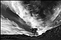
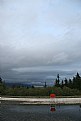
Critique By:
Kim Culbert (K:37070)
9/23/2009 9:58:55 PM
Love that dramatic sky... makes the whole image! I kinda wish the tree wasn't so centered though.
|
| Photo By: Jo T
(K:2305)
|
|
|
Critique By:
Kim Culbert (K:37070)
9/23/2009 3:01:26 AM
The depth of field in this image is amazing... such sharpness really creates strong lines that lead through the image. Congrats!
|
| Photo By: Matt Lara
(K:460)
|
|
|
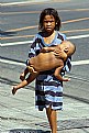
Critique By:
Kim Culbert (K:37070)
9/21/2009 2:15:09 AM
Great composition with the boy, the splash of colour, and the great texture of the wood and iron surrounding him. Well seen.
|
| Photo By: larry concepcion
(K:474)
|
|
|
Critique By:
Kim Culbert (K:37070)
9/21/2009 2:13:01 AM
I think that this is maybe a little too sepia toned... it makes it kinda drab, which I imagine that in colour it was vibrant. As well, the shed takes up half of the image, effectively splitting the image in two. Looks like a lovely scene, but for me, it doesn't have the impact it needs.
|
| Photo By: The Pilgrim
(K:64977)
|
|
|
Critique By:
Kim Culbert (K:37070)
9/21/2009 2:08:22 AM
Look at the mop on the top of its head!! I had to laugh out loud! Great sharpness and depth of field!
|
| Photo By: The Pilgrim
(K:64977)
|
|
|
Critique By:
Kim Culbert (K:37070)
9/21/2009 2:06:23 AM
Ooh, this looks like a multiple exposure shot... but it's just the HDR that makes it look that way. Very cool treatment!
Great diagonal lines of the power poles and of course, awesome colour.
Thanks for your recent comment on my smoke art.. much appreciated! (although I had to reload it, as I had a spelling mistake! LOL)
|
| Photo By: The Pilgrim
(K:64977)
|
|
|
Critique By:
Kim Culbert (K:37070)
9/20/2009 6:51:07 AM
Thanks so much for the compliment! It was my first night doing shots, so I'm looking forward to some more learning!
|
| Photo By: Kim Culbert
(K:37070)
|
|
|
Critique By:
Kim Culbert (K:37070)
4/1/2009 7:02:28 PM
Sweet baby! I think that the blurring of the background is maybe a little too much though... maybe toning it down a bit would take away the emphasis from the bg and put more focus on your sweet little girl.
|
| Photo By: Meigy Capogreco
(K:1392)
|
|
|
Critique By:
Kim Culbert (K:37070)
4/1/2009 7:00:48 PM
A heartstring puller for sure. Excellent capture.
|
| Photo By: larry concepcion
(K:474)
|
|
|
Critique By:
Kim Culbert (K:37070)
4/1/2009 6:59:34 PM
Too cute! I like the surfer hair as well!
The lighting seems a little dim... is it just my computer or would bumping the levels bring out just a bit more contrast?
|
| Photo By: Tell Asner
(K:61)
|
|
|
Critique By:
Kim Culbert (K:37070)
10/18/2008 4:20:52 AM
I think I like the BW better... her gaze seems stronger when not competing with the colours of her clothes.
|
| Photo By: Sethu S
(K:1243)
|
|
|
Critique By:
Kim Culbert (K:37070)
10/18/2008 3:46:16 AM
I agree that the emotion here is pulling and strong... she's got such a commanding look about her. I just wish her eyes were more in focus. I think the 1/60 shutter didn't help...
|
| Photo By: Sethu S
(K:1243)
|
|
|
Critique By:
Kim Culbert (K:37070)
10/18/2008 3:43:19 AM
Hey, it's the red chair!!! Almost as good as a red canoe! This is SFU, right? I like how rejected the chair looks, all by its lonesome on the roof. Just think maybe it needs a little more contrast to pump it up.
|
| Photo By: Becky V
(K:9699)
|
|
|
Critique By:
Kim Culbert (K:37070)
10/10/2008 8:37:10 PM
Wow, that is amazing that you added the rays in afterwards... very convincing! Looks like a beautiful spot to take a moment.
There seems to be some digital noise in the trees though... I'm not sure if there's any way in PS to remove it.
|
| Photo By: KEVIN TEMPLE
(K:8657)
|
|
|
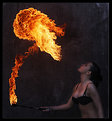
Critique By:
Kim Culbert (K:37070)
10/10/2008 6:19:50 PM
This is stunning... the use of the HOT flames, and the COOLNESS of the background... it works so well together.
|
| Photo By: herwig b
(K:558)
|
|
|
Critique By:
Kim Culbert (K:37070)
10/10/2008 6:14:43 PM
Look at you, being a gangster in an alley... LOL. Love the grain and grit.
|
| Photo By: Martin Mora
(K:4666)
|
|
|
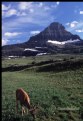
Critique By:
Kim Culbert (K:37070)
10/10/2008 6:12:39 PM
LOL at your comment! I'm sure they meant it with the highest respect for your image!
What a beautiful setting! And it looks like you are so close to the deer and it hasn't even noticed. (okay, and looking at your lens you used...is this your own personal trained deer?)
|
| Photo By: Dave Holland
(K:13074)
|
|
|
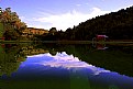
Critique By:
Kim Culbert (K:37070)
10/10/2008 6:08:35 PM
Beautiful reflection on the pool, and I love the fact you can see the bottom lines on the pool under the water.
I find the blown out clouds at the top don't do anything to the photo for me, and wonder if you have thought about cropping about 1/4th of the top of the image off. I think it strengthens the lower half and gets rid of the too white clouds. But, a beautiful shot... well captured!
|
| Photo By: shpetim berisha
(K:510)
|
|
|
Critique By:
Kim Culbert (K:37070)
4/7/2008 3:49:02 PM
I bet this would look great enlarged and on a wall... this usefilm gallery doesn't do it justice.
|
| Photo By: Martin Mora
(K:4666)
|
|
|
Critique By:
Kim Culbert (K:37070)
4/7/2008 3:48:00 PM
She is stunning! Her eyes just POP from this image.
A little hot on the nose, but otherwise the lighting is great.
|
| Photo By: Martin Mora
(K:4666)
|
|
|
Critique By:
Kim Culbert (K:37070)
4/7/2008 3:46:52 PM
Wow, super sharp, and an interesting shot that you don't see very often. I love the swell of water behind him, filling the frame.
|
| Photo By: Ken Phenicie Jr.
(K:6273)
|
|
|
Critique By:
Kim Culbert (K:37070)
4/7/2008 3:42:56 PM
Very captivating eyes, and great use of the whole frame.
|
| Photo By: Edgar Monzón
(K:827)
|
|
|
Critique By:
Kim Culbert (K:37070)
1/24/2008 7:46:10 PM
I really like these photos that show comparision between parent and child... they will tresure this for years to come and look back at how small those feet really were.
I would maybe look at cropping a little off the top and a little off the right so that the feet weren't completely in the centre.
|
| Photo By: Mary Brown
(K:71879)
|
|
|
Critique By:
Kim Culbert (K:37070)
1/24/2008 7:43:40 PM
Not at all.. I wouldn't change a thing in here. The silhouette is a stunning contrast to the vibrant colours of the sky. You did a fabulous job stitching them together.
|
| Photo By: Mary Brown
(K:71879)
|
|
|
Critique By:
Kim Culbert (K:37070)
1/23/2008 6:53:47 PM
Your style is certainly unique, and fresh! I like the shadows and layering here... it has a very 3D feel. Is this quite a few different shots of grafitti layered on top of each other? You did an unbelievably awesome job in separating the layers. I would love to know more about this process!
|
| Photo By: Gustavo Scheverin
(K:164501)
|
|