|
|
Critique By:
Michael Hilliard (K:559)
9/28/2005 8:45:08 AM
Wow - I just love macro shots, and this one is amazing!
I love the way that the lines in the flower point your eyes toward the bee. The texture on the bee itself is wonderful, and the way you can see the sunlight on his body (and that of the flower as well) is marvelous. Also I like the extremely shallow depth of field, the wide aperture allowed by your macro lens works wonders here; also, the blurring of the sky in the background whites it out almost completely, letting the background fade into negative space at the top of the frame - nicely highlighting the "positive space" filled by your subject, the bee. And finally, the colours are excellent and have a good warm feeling.
Wonderful shot, I can't wait to look at your other material.
|
| Photo By: Anna Bergel
(K:614)
|
|
|
Critique By:
Michael Hilliard (K:559)
9/27/2005 5:44:02 AM
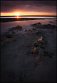
Well this is, of course, a beautiful image - the colours are wonderful, and I think it's framed quite nicely.
I agree with the reviewer that said the rocks "pointing" towards the sun adds very nicely to your composition. I don't agree, however, with the reviewers who have stated that you should crop the image due to "the lower part of the image lacking in interest".
First of all, while the art of photography is subjective (therefore, you could even consider my opinion balderdash, if you like) I do believe what Mr. Palmer, and others, were referring to was a lack of subject matter or, "empty" space in the lower area of the image. However, what this "empty" space does quite well, is emphasize the concept of positive and negative space in an image - a subject being highlighted by the "empty" space around it - by drawing your eye to the subject of the image, in this case, the last moments of a beautiful sunset.
See the attached photograph of Alfred Stieglitz (a subject worth acquainting yourself with) as an example of positive and negative space. Notice how the black area's draw your attention to the the subject's (Stieglitz) face; in my opinion, the image would be nothing if the "blank" areas were taken away.
In the end, I like the image, and I would keep it just the way it is, I wouldn't even crop it to the first foreground object (the first visible rock) as was previously suggested, as I like it exactly as it stands - "blank" areas and all.
With Kindest Regards - Mike Hilliard.
|
| Photo By: Glen Stowell
(K:277)
|
|
|
Critique By:
Michael Hilliard (K:559)
8/11/2005 1:52:26 PM
Amazing! I love the high-backed chair ("Throne", that is  in the middle of the shot, the composition is spectacular. I love everything about this shot, I'm at a loss for words. Truly an outstanding work, you should be very proud. in the middle of the shot, the composition is spectacular. I love everything about this shot, I'm at a loss for words. Truly an outstanding work, you should be very proud.
I'd started to be rather discretionary with placing images in my favourites, but I couldn't help but add this one as soon as I saw it . Thanks for sharing it with me - Mike.
|
Photo By: Efisio Mureddu
(K:13104)

|
|
|
Critique By:
Michael Hilliard (K:559)
8/11/2005 6:54:59 AM
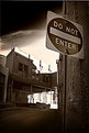
Strange isn't it? I also found it odd that my picture was added after several other pictures that had already been submitted before I'd uploaded mine. It was about halfway down the page, instead of at the top... Curious, eh?
As for the curves, I agree - a levels adjustment and some blurring in the grainy areas would've improved it alot - and I was tempted to do so, but I decided against 'Photoshopping' it at the last minute, in the hope that people would be able to give me hints on how to improve the initial shot itself so it wouldn't need PS in the first place (or at least not as much .
Thanks again for taking the time to look and comment, I really appreciate it, and I also am glad I got a chance to see your portfolio - well done.
|
| Photo By: Michael Hilliard
(K:559)
|
|
|
Critique By:
Michael Hilliard (K:559)
8/11/2005 6:36:09 AM
Hey, Wez! Thanks for taking the time to look and comment on my picture. I also recieved my pentax from a family member (one of my uncles), who gave it too me when he heard that I was getting interested in photography and planning on taking a course where I would need a 35mm film camera, and I've really been enjoying learning to use it. Also, if you don't mind, out of curiosity - what would you have done differently in framing the shot? Just wondering. At any rate, thanks again for taking the time to look, and also for giving me a chance to see your portfolio - rather impressive.
|
| Photo By: Michael Hilliard
(K:559)
|
|
|
Critique By:
Michael Hilliard (K:559)
8/8/2005 6:27:01 AM
Wow again . I'm impressed to hear that everything (particularly the lighting and the setting/background) was original, not prepped or edited in, you are either very talented, very lucky, or most likely, both. Also converting to B&W was an excellent choice, it definitely enhances this shot and gives it that much more depth and meaning - it makes it much more poignant and dramatic, to be sure. Again, congratulations on a job well done.
|
| Photo By: Andrzej Krok
(K:63)
|
|
|
Critique By:
Michael Hilliard (K:559)
8/7/2005 7:53:45 PM
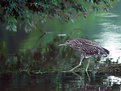
Wow, I really like this shot. The detail is wonderful, and everything looks good. But what I like even more than the detail, colour, light, and composition (although I thought all those aspects were given good treatment here) and all those other aesthetics, is the "emotional" effect this image has. You can almost sense the immature innocence of the heron, and you can almost feel his timidity in crossing the sunken log. Congratulations on a very nice shot - Mike.
|
| Photo By: Bob Botts
(K:414)
|
|
|
Critique By:
Michael Hilliard (K:559)
8/7/2005 7:38:30 PM
Thanks Sena, I'm glad you took the time to look.
|
| Photo By: Michael Hilliard
(K:559)
|
|
|
Critique By:
Michael Hilliard (K:559)
8/7/2005 7:36:43 PM
This image is interesting, and "Abstracts" was an appropriate category to file it under - from this perspective the bell looks more like a giant toggle switch . I do think the light is a little too intense for my taste, but that's just my opinion. Like I said, "interesting".
|
| Photo By: Jánosi Bálint
(K:2818)
|
|
|
Critique By:
Michael Hilliard (K:559)
8/7/2005 7:32:31 PM
Nice. The colours are amazingly crisp and vivid, and the landscape is goregeous. This makes me think of something you'd see in a tourism magazine. Good shot - Mike.
|
| Photo By: Gerry Pacher
(K:7303)
|
|
|
Critique By:
Michael Hilliard (K:559)
8/7/2005 3:45:16 AM
Thank you, Mark - I really appreciate your taking the time to review my pictures, and I really appreciate the in depth critique and advice you gave me. As you can tell, I'm still really new at this and so I really appreciate the help. Thanks again!
|
| Photo By: Michael Hilliard
(K:559)
|
|
|
Critique By:
Michael Hilliard (K:559)
8/6/2005 5:47:42 AM
Thanks for commenting. I also enjoyed the opportunity to see your portfolio, I liked it a lot. Thanks again, Mike.
|
| Photo By: Michael Hilliard
(K:559)
|
|
|
Critique By:
Michael Hilliard (K:559)
8/6/2005 4:09:25 AM
Thanks, Dan. I love Chicago, and I'm hoping to return with my youth group in the fall, if I can afford the time off. It's such an amazing city with so much to offer - I could easily spend all day walking up and down Michigan Avenue - among the many other amazing sites the city hosts.
|
| Photo By: Michael Hilliard
(K:559)
|
|
|
Critique By:
Michael Hilliard (K:559)
8/5/2005 4:41:34 PM
While I don't think this is the worst photo I've ever seen, I do unfortunately have to say that I don't think it's very good.
First of all, everything else aside, the initial shot could've been done better. The seemingly askew background may work towards the emotion you were trying to convey, but my complaint is more towards the subject, and particularly her hand. Assuming your intent was to show her blowing an "intoxicated" kiss, it's not clear from the position of her lips and cheeks that she's blowing at all, her mouth simply apears to be slightly ajar. Also, this may be more of a subjective point of critique, but in my opinion, her hand is too indistinct and could've used more focus, and most likely placed a little better to convey your message.
Now, I'm sorry but there is little good I can say about the colouring - the most positive thing is that the eyes are, as someone else noted, done with a semi-unique approach that you don't commonly see with eye manipulation; unfortunately, while it is somewhat unique - it looks terrible here, and doesn't fit your image, regardless of the theme. Also, the lips are quite sloppy - you should take the time to do a much more detailed and accurate colouring. Masking is the best way I've found to do this, but whatever method you use, you should zoom in much more tightly and use an appropriate brush (not airbrush in this instance, as you seem to have, unless of course you make the brush size much smaller so you don't see the "splatter" when zoomed out) so that it looks tight and not smudged or sloppy.
Also, I don't know what happened to cause what almost looks like lens flare on your subjects forehead... perhaps you accidentally painted there, I don't know, it just looks bad.
Finally, the colours are far to bright and vivid. I don't know that this image was a good choice for colouring at all, as the darker an image is to start with (shadows etc.) the harder it is to paint colour and still have it look good. That said, you probably still could've gotten away with it had you used much more muted colours, and done a better job painting/masking it on.
I'm sorry that my review has been so negative, but I wouldn't be doing you a favour by sugar coating it - sorry. The idea wasn't bad, just try to develop it better next time - and feel free to keep experimenting, it could turn out better next time. Good luck.
-----
Below is an example of how you might do the colouring differently. Here's what I did:
First I desaturated the entire image, returning it too B&W.
Next I used the clone tool to fix the smudges around the subjects lips and the spots on the forehead.
Next, I duplicated the layer and masked out everything but the eyes and the lips.
Now, for the actual colouring, as with everything in Photoshop, there are a million and one different ways of doing this, but since I was in a hurry, the one I chose, was to:
A) change the blending mode for the masked layer to "Colour" - again, other options will work, this is just the one I used this time.
B) simply grab the paint brush, select a colour and paint over the selected areas (lips one colour, eyes another).
After all that, I played around with what I had - I increased the brightness and contrast, adjusted the hue and saturation of the colouring I'd done.. etc.
Now, in the end - my image still isn't perfect. For one thing, I wouldn't have coloured this image in the first place, and I still don't care for the initial photo itself. Also, because I didn't want to take too much time on this critique, the colouring still could be done better if I'd spent more time on the masking and painting, but you should still at least get an idea for how it can be done differently, and obviously the same approach can be used for colouring other images.
|
| Photo By: Andrew duggan
(K:68)
|
|
|
Critique By:
Michael Hilliard (K:559)
8/5/2005 3:26:41 AM
Wow. Excellent shot, the colour is great (Photoshop?), and I also like the focus on the hair and whiskers. The reflection on the eye is unfortunate, but there's not really anything you can do about it - other than Photoshop, of course . Thanks for sharing this incredible shot, I love it.
|
| Photo By: Mark Sherman
(K:15669)
|
|
|
Critique By:
Michael Hilliard (K:559)
8/5/2005 3:17:52 AM
Wow, my first thought when I saw it: Oh.. I like this. I really like this shot, the composition, focus, lighting etc. all seem to work nicely, and black & white is perfect. The title does a great job of tying everything together too. I am curious as to the lighting, is it natural light? Also, did you P.S. this at all, or is everything original/untouched (particularly the clear black background)? Just curious, regardless of how it was done, it's still a great shot. Thanks for showing it, keep it up.
|
| Photo By: Andrzej Krok
(K:63)
|
|
|
Critique By:
Michael Hilliard (K:559)
8/5/2005 3:10:29 AM
Very nice, I like the "head game" that this picture plays on you - well done. The expression on your face also enhances the mood of the picture, you look very intent and focused, and I get the feeling from looking at you that you were "framing" the shot in your head, about to press down on the shutter - well, that's what it made me think anyway. Congrats - Mike.
(P.S. - nice job on the PS too)
|
| Photo By: Brian Watters
(K:244)
|
|
|
Critique By:
Michael Hilliard (K:559)
8/5/2005 3:02:13 AM
Wow, this is an amazing shot, and a beautiful example of when it is a good time to use B&W for a landscape shot. The composition is wonderful, everything from the powerful and moving clouds in the sky, to the glassy water, to the foot prints in the sand and silhouetted people on the beach, it truly is amazing. Another thing that dazzled me was the amazing reflection of the sky in the tide on the shoreline, and also the bright light reflected in the water. This truly is a beautiful shot, thanks for sharing it. Best of luck, Mike.
|
| Photo By: Dorival Moreira
(K:329)
|
|
|
Critique By:
Michael Hilliard (K:559)
8/4/2005 5:53:45 AM
Wow! I can't think of anything better to say - I'm amazed at such a beautiful shot, it's incredible.
|
| Photo By: Arthur Kornienko
(K:9686)
|
|
|
Critique By:
Michael Hilliard (K:559)
8/4/2005 5:49:30 AM
I can't say anything better than what's already been said, and I agree with it all completely. This really is a great shot, thanks for showing us.
|
| Photo By: Rob Graziano
(K:6678)
|
|
|
Critique By:
Michael Hilliard (K:559)
8/4/2005 5:46:39 AM
I really like this - everything from the lighting, to the composition, to the colour - it all turned out quite well. Good job, and good luck. Keep up the good work.
|
| Photo By: David Stokely
(K:1010)
|
|
|
Critique By:
Michael Hilliard (K:559)
8/4/2005 5:43:26 AM
Very interesting, I like it; it has almost a "Twilight Zone" effect.
|
| Photo By: Vadim Melamedov
(K:1466)
|
|
|
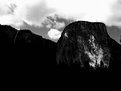
Critique By:
Michael Hilliard (K:559)
8/4/2005 5:38:01 AM
The composition of this shot is great, not only is it balanced and focused, but it also lends to the "emotion" of the shot too - reflecting the larger-than-life aspect of the rock face. I also like the sharpness of the detail in the rock. My problem with this shot however, is there's simply way too much shadow. Far too much of the image simply turns to an indestinguishable black shape. Finding a way to illuminate more of the picture would've enhanced it greatly. Good luck.
|
| Photo By: Ryan McMillen
(K:1218)
|
|
|
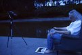
Critique By:
Michael Hilliard (K:559)
8/4/2005 5:32:24 AM
Wow, this is a really interesting shot, the combination of elements is quite intriguing, they all lend to a very dream like feeling. I like the overall effect the image has on me. The (almost?) monochrome blue was a nice touch too, although the camera is a little hard to make out. I might change the title though - "What Dreams May Come" perhaps? Good work, keep it up.
|
| Photo By: danilo parra
(K:549)
|
|
|
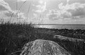
Critique By:
Michael Hilliard (K:559)
8/4/2005 5:20:19 AM
This is a well composed shot, it has a fairly good balance of foreground and background material, and it feels fairly balanced. There does seem to be quite a bit of grain in the picture (especially noticeable in the sky/clouds). Also, everytime I look at this particular shot, I can't help but think that it would've looked much better in colour rather than B&W; too many of the darker areas blend together without there being colour to set them apart, and I just think the whole shot would've benefited. Anyway, it's a nice shot, I just would have liked it better in colour and without the grain. Good luck.
|
| Photo By: Tim Fray
(K:179)
|
|
|
Critique By:
Michael Hilliard (K:559)
7/26/2005 5:18:21 PM
Thank you very much Ian (and all of the others that have commented), I really appreciate all of the support found here. I really look forward to submitting more images in the future. I've just about used up my first roll of film on my ME Super (Kodak MAX Versatility, 400 colour film), and I can't wait to get it developed. Right now I'm mostly just guessing at f-stops and exposure settings (leaving it on 'Auto' mostly, until I learn how to set it more on my own), but I'm hopefull that many of them should still turn out well. Thank you again, Michael.
|
| Photo By: Michael Hilliard
(K:559)
|
|
|
Critique By:
Michael Hilliard (K:559)
7/25/2005 12:19:56 AM
Thanks for the comment Ellie, I appreciate it.
|
| Photo By: Michael Hilliard
(K:559)
|
|
|
Critique By:
Michael Hilliard (K:559)
7/23/2005 7:08:17 AM
Even more than the shadows, I really like the composition; the way the way you have the feathers spaced does a great job of making the eyes on the feathers look like real eyes of some sort, as though they're staring out at something - it's a nice effect.
|
| Photo By: P D
(K:559)
|
|
|
Critique By:
Michael Hilliard (K:559)
7/23/2005 7:03:09 AM
This is a really nice shot - I love the light especially! Great picture, you should be proud.
|
| Photo By: Matthew P Shultz
(K:116)
|
|
|
Critique By:
Michael Hilliard (K:559)
7/23/2005 7:01:57 AM
I like this picture for the title as much as anything else - great pun .
|
| Photo By: Matthew P Shultz
(K:116)
|
|