|
|
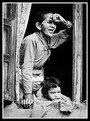
Critique By:
E A (K:727)
10/7/2004 6:18:29 PM
Excellent job of capturing the textures.
|
| Photo By: William T
(K:133)
|
|
|
Critique By:
E A (K:727)
10/7/2004 6:15:26 PM
ah, so it's a composite? regardless, well executed. Though I'd hav eliked to have seen the chopper shot at a slightly slower shutter speed just to express some of the motion in the rotors.
|
| Photo By: Chris Spracklen
(K:32552)
|
|
|
Critique By:
E A (K:727)
5/5/2004 9:13:36 PM
Is there some blurring going on there, or is it an artifact of web compression? If you added the blurring... take it off. She doesn't need it. Gorgeous girl, well done portrair (though the cutoff eye bothers me a little... just seeing the white...)
|
| Photo By: Rildo Democh Arantes
(K:461)
|
|
|
Critique By:
E A (K:727)
5/3/2004 6:21:07 PM
Helmut, this is one of the best travel portraits I've seen on Usefilm yet. Kathmandu is a street shooter's dream, and you've certainly done well with it. Great capture.
|
| Photo By: Helmut Schadt
(K:780)
|
|
|
Critique By:
E A (K:727)
5/3/2004 5:23:52 PM
Beautiful simplicity, and lovely color. How do you like the 10D? I've got a 1D mkII on order and am thinking of a 10D as a second body.
|
| Photo By: Neil D.
(K:192)
|
|
|
Critique By:
E A (K:727)
5/3/2004 5:11:21 PM
Definitely attention-grabbing - I want to know about what's happening here. Very effective use of line and contrast to demand the attention of viewers; the sort of image that begs for a story.
|
| Photo By: prozaiczna ptifurka
(K:89)
|
|
|
Critique By:
E A (K:727)
4/2/2004 9:27:53 AM
THIS is the sort of empty space I love... it has texture, it has context, yet still sparse. Great feel to this one, bold colors, nice rendering of texture.
|
| Photo By: Yuri Bonder
(K:268)
|
|
|
Critique By:
E A (K:727)
4/2/2004 9:25:21 AM
Felipe, I really like this - extremely surreal, abstract image that manages to be so tastefully.
|
| Photo By: Felipe Rodríguez
(K:9200)
|
|
|
Critique By:
E A (K:727)
4/1/2004 6:54:08 PM
that's an impressive shot. great scene, well executed, a wonderful landscape photograph.
|
| Photo By: John Lamb
(K:9687)
|
|
|
Critique By:
E A (K:727)
4/1/2004 6:52:56 PM
beautiful, sir... ah. New Zealand... an amazing place.
|
| Photo By: John Lamb
(K:9687)
|
|
|
Critique By:
E A (K:727)
4/1/2004 6:50:13 PM
those look like the tuners on my old Barclay...
man, I hope they're holding pitch better than the ones on my guitar. 
|
| Photo By: John Loreaux
(K:86210)
|
|
|
Critique By:
E A (K:727)
4/1/2004 6:13:41 PM
i'd maybe use the burn/shadows tool to match the dark tones of the tops of the lights to their poles... i think it'd look a little more natural and really finish the image...
|
Photo By: KEVIN TEMPLE
(K:8657)

|
|
|
Critique By:
E A (K:727)
4/1/2004 6:12:14 PM
is the glow a result of post-exposure editing? Nice tasteful use again of simplicity, angle, and space.
|
| Photo By: KEVIN TEMPLE
(K:8657)
|
|
|
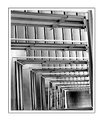
Critique By:
E A (K:727)
3/31/2004 3:10:31 PM
It's funny, this sort of shot is one we see so often, but well done examples like this always look good. It's a shape echoed from nature in architecture. Lovely toning... it really suits the image very well.
|
| Photo By: William T
(K:85)
|
|
|
Critique By:
E A (K:727)
3/31/2004 3:06:21 PM
Second reaction:
looking at it more, i like the empty space immedietely around teh stairs. I still want to see some sort of complimentary/contrasting angle/shape...i like empty space, but I keep getting distracted by it in this case (the vast space in the lower right.) ... something more to relate to/interact with the stair spiral, which is such a great form, and the white spaces.
|
| Photo By: H.Keith Wills
(K:87)
|
|
|
Critique By:
E A (K:727)
3/31/2004 3:03:27 PM
First reaction: I'm assuming you made some levels adjustments here... I might suggest a little *less* blow-out, if that's the case. I think you can maintain a stark, modern, eye-catching look while still maintaining the look of a photograph as opposed to a graphics piece. Did you cut out and completely eliminate something to the left of the frame? If the wall surface was white or similarly light and had even a slight texture, it could be retained slightly to "ground" the image without losing the surreal nature. As is it's very eye catching, but needs more to hold focus as a photograph.
|
| Photo By: H.Keith Wills
(K:87)
|
|
|
Critique By:
E A (K:727)
3/31/2004 2:57:07 PM
Nice tones - you've got an eye for angle, texture, and tonality.
|
| Photo By: KEVIN TEMPLE
(K:8657)
|
|
|
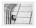
Critique By:
E A (K:727)
3/31/2004 2:56:04 PM
Nice composition here, Kevin. I'm not sure about the group of people - it does seem as if there should be SOMETHING there, but I'm not sure what. They keep it from being a more abstract image, but if you can repeat this shot in similar lighting conditions, might be worthwhile. It seems very close, and is a really nice work, but I wonder if you could make even more out of it.
|
| Photo By: KEVIN TEMPLE
(K:8657)
|
|
|
Critique By:
E A (K:727)
3/30/2004 3:01:36 PM
Very interesting use of light/effect. What was your technique?
|
| Photo By: Tamara L
(K:1387)
|
|
|
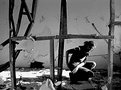
Critique By:
E A (K:727)
3/12/2003 6:57:01 PM
I like the composition and lighting for this shot, however, the digitized image has a few things I'd change. It looks a little oversharpened to me for this sort of shot - i can see the makeup and lipstick! I think maybe it's the background color, but for some reason, the red (blood vessels) in her eyes is being highlighted a little.
That said, there's two things that are very easily altered, whereas all the critical factors of this image are strong. Nice work.
|
| Photo By: Chris Lawrence
(K:124)
|
|
|
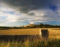
Critique By:
E A (K:727)
3/8/2003 10:26:33 PM
Stunning. This is one of my favorite landscape photos in a long time. I spent a few weeks in 2001 in that region and wish I'd come back with a landscape photo as good as this.
|
| Photo By: Suvomoy Mitra
(K:8369)
|
|
|
Critique By:
E A (K:727)
3/8/2003 10:21:14 PM
While I agree with Pat, I've seen a lot of photos of this lighthouse from that same spot, and getting that sailboat in there is what makes this one different and memorable. I like it just sailing out of the frame; very relevant to the main subject.
|
| Photo By: Aaron Gustwiller
(K:171)
|
|
|
Critique By:
E A (K:727)
1/22/2003 10:45:15 PM
Composite? I too find the horizon disorienting, and the proportions a little strange... regardless, striking image!
|
| Photo By: Moises Levy
(K:782)
|
|
|
Critique By:
E A (K:727)
1/21/2003 7:58:57 AM
Heh, I immediately thought of Ian as well. Great shot, and I like the warm toning.
|
| Photo By: Elizabeth van Hulst
(K:283)
|
|
|
Critique By:
E A (K:727)
1/19/2003 2:50:38 PM
This really is a beautiful picture.
|
| Photo By: Raymond Andringa
(K:963)
|
|
|
Critique By:
E A (K:727)
1/19/2003 2:47:45 PM
Excellent photograph. The angle and the white sky behind them really conveys the sense of empowerment.
|
| Photo By: Wallace Rollins
(K:149)
|
|
|
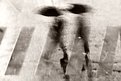
Critique By:
E A (K:727)
1/19/2003 2:39:52 PM
Wow. Great image. I'd like to see a version where the red-tone would match in the doorway and the sign, and the figure would be sharp, but under the circumstances, you made a very atmospheric photograph. Isn't photography 'illegal' in the red light district? I remember reading that it was a good way to get yourself beat up and your gear taken away.
|
| Photo By: Miguel Lasa
(K:62)
|
|
|
Critique By:
E A (K:727)
1/19/2003 2:35:50 PM
I like this version more; it's more convincing while still a bit otherworldly. The near-monochrome of the image is really great, and a strong composition as well.
|
| Photo By: Miguel Lasa
(K:62)
|
|
|
Critique By:
E A (K:727)
1/19/2003 2:31:24 PM
Cheryl, this is a great portait. Mary Ellen Mark and Sally Mann came right to mind, more so Mark; it's on surface levels a very direct, basic portrait, but the subtleties in your choices of composition and an obvious ability to connect with your subjects sets it apart. Excellent work.
|
| Photo By: Cheryl Jacobs
(K:122)
|
|
|
Critique By:
E A (K:727)
1/19/2003 2:11:08 PM
I also like it but feel it benefits from a slight crop from the right - there's a lot of space there, some of which is needed to maintain the graphic nature of the image, but as is I think there's just a little too much.
Well seen, though, and I like how you included the bit of wall crumble on the left - those small intrusions into a frame usually offset the balance of the image, but in this case, anchors it and keeps the image space defined.
|
| Photo By: Keith Loveday
(K:348)
|
|