|
|
Critique By:
Vesa Nopanen (K:871)
2/18/2004 10:40:29 PM
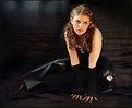
That flash created reflection on her skin is too rough. More indirect flash, or some other light too might have been better. Or at least I don't like that flash reflection.
They are quite intimate, woman seems to be almost laughing. Luckily her eyes are closed so it seems she is more enjoying her time.
I'd crop picture from right until the border touches her hand to tighten the mood.
|
| Photo By: Niklas Wibom
(K:53)
|
|
|
Critique By:
Vesa Nopanen (K:871)
2/18/2004 3:11:50 AM
Very nice portrait. I do like her stature and the way light is presented behind her head. I'd extend picture a bit more down, now I feel her leg gets terminated a bit too early.
Using stairs in background is nice and gives this more on location feel. However I think it would look better if model would be separated from background bit more with larger aperture - or appropriate lighting.
Picture has clear lines that make this quite harmonic and balanced. She is very well located, although marble in the stairs makes exposure more difficult, I feel her clothes are a bit too dark. Contrast is nice but now there is something in the mix I don't quite like - maybe her face is the victim in exporuse from battle between marble and black clothing.
|
| Photo By: Paulo Gama
(K:5067)
|
|
|
Critique By:
Vesa Nopanen (K:871)
2/18/2004 2:58:27 AM
It is good how well model's tiredness comes forward in this one. She is bored and wants to go home. She is brave and tries to do what photographer tells her to but unnatural stances and poses wear her out.
Very effective, could well symbolize how futile all posing for fashion is and how their models don't always have fun.
|
| Photo By: Birgit Heidrich
(K:142)
|
|
|
Critique By:
Vesa Nopanen (K:871)
2/18/2004 1:45:53 AM
I think this is a very good photograph. She has very sure stature and distracting stare, an aspect of maddness is slightly displayed in her eyes. She is fanatic of what she believes and is ready defend it - she already has (bloody knife) and has crossed the line. She is looking forwards and not caring what happens behind her.
Three dimensionality is strongly present and well set up. The cross, her figure and background fit in together and create a sense of depth. Lighting is great and she poses with certainity - her pose does not seem unnatural.
|
| Photo By: Magic Zyks
(K:451)
|
|
|
Critique By:
Vesa Nopanen (K:871)
2/17/2004 3:58:53 AM
She's got attitude. Her personality is very powerful and she does not want to listen to anybody ordinary. The angle of photo emphatizes this, as well as the lighting somewhat. I don't like that her hair is lost in the background but to her eyes light fits perfectly. Her clothing is somewhat loose collection of pieces but they creates this feel that she makes her own style and her own way - and listens to no comments.
Composition works very nicely, her pose - thumbs resting on pockets - tells a lot of her personality, or at least what photographer wants to show. Leatherpants of course highlights her made hardness.
But in the inside she maybe is very emotinal and deep personality - pink belt and that shirt has some 'weakness' in them.
|
| Photo By: Tomi Glad
(K:3)
|
|
|
Critique By:
Vesa Nopanen (K:871)
2/17/2004 12:47:13 AM
The most uninteresting feature here is how snow combines with background. And overall this is closer to abstract than real picture.
I like the sense of depth in the background, it has good composition and nice contrast (very nice actually, the river water combines with snow and contrast works). But I think background should be a bit more brighter. Snow feels like added (with flash I quess) and does not get that depth feel that is present in the background.
|
| Photo By: Stan Pustylnik
(K:6768)
|
|
|
Critique By:
Vesa Nopanen (K:871)
2/17/2004 12:39:45 AM
He surely has view of years. A bit tired but still fresh and looking forward. Lighting created here is surperb and brings our very details of his face.
In my opinion that light on his left in background should be a bit more grayish, now it is trying to divert focus from the face into it too much.
He is very well aware of his skills and has nothing to fear or hide. Very nice portait.
|
| Photo By: Roger Cotgreave
(K:15892)
|
|
|
Critique By:
Vesa Nopanen (K:871)
2/13/2004 1:34:04 AM
Very good feel on this one. I like her pose and stare to nothingness. Her figure is very well balanced and lighting highlights her features nicely. Softening detaches her from reality and creates her as a ghost of memory and past seen briefly by the window.
I'd crop a bit from left and add it to the right.
|
| Photo By: Pascal Renoux
(K:4077)
|
|
|
Critique By:
Vesa Nopanen (K:871)
2/12/2004 10:07:23 PM
Very nice sense of depth. I like that blue hue overall in the picture, gives out sense of coldness that makes outbreath steam.
Water below seems like going down the whirlpool thus deepening the depth. Ice construct is very nice, but some extra light could do good for it. I like the iceconstruct also becouse there are clear variations in depth of ice gorges and hills.
|
| Photo By: Stan Pustylnik
(K:6768)
|
|
|
Critique By:
Vesa Nopanen (K:871)
2/12/2004 10:02:29 PM
What I like in composition is that area is very clearly divided into two parts. But divide done this way brings ice maybe too close to picture center and that does not fit properly. Maybe camera could have tilted a bit more to create more diagonal divide.
Light is not there as it could be , I'd love to see some more light playing inside ice structure and reflecting from water. Snow has some reddish hue and it does not seem, in my opinion, to belong to this picture.
Sense of movement from running water is very nice.
|
| Photo By: Stan Pustylnik
(K:6768)
|
|
|
Critique By:
Vesa Nopanen (K:871)
2/12/2004 9:57:45 PM
Very nice composition. Strong divition into separate areas (windowframes) combines into strong experience. Very excellently found detail created by the nature.
Ice melts away and paints the background picture, or artist uncovers long lost painting done by very old master by removing dull, common everyday one look 'art' veil from it. Cold tones in front and beatiful warm colors in background create this very lighthearted viewing experience.
|
| Photo By: Stan Pustylnik
(K:6768)
|
|
|
Critique By:
Vesa Nopanen (K:871)
2/12/2004 9:53:23 PM
Stan, no I have not visited that site but I copied the URL. I give it a look someday.
|
| Photo By: Stan Pustylnik
(K:6768)
|
|
|
Critique By:
Vesa Nopanen (K:871)
2/12/2004 12:25:35 PM
Stan, yes I am from Finland. And yes, that kind of images should not be too hard to find in here - as long as one would really know how to distinguish a real art from piece of ice.. =)
|
| Photo By: Stan Pustylnik
(K:6768)
|
|
|
Critique By:
Vesa Nopanen (K:871)
2/12/2004 12:16:25 PM
Very nice composition and very well placed flower. It has a very gentle and fragile feel, like a strong wind would fly it's all apart.
Background is very beautiful and supports flower like a dream. Tehnically very well made picture with touch of emotion to fire up feel and smell of flower.
|
| Photo By: Per Johansson
(K:339)
|
|
|
Critique By:
Vesa Nopanen (K:871)
2/12/2004 12:13:12 PM
A butterfly trying escape from her prison? That background brings me feel, that she has been trapped without a way out. Silhuette works very well, although I think I'd prefer if her legs would have been tightly together or sligly crossed to create more elegant figure.
Lighting is nice and background wall has lots of details t concentrate to - as opposed to butterfly form.
Wings of course create the feel of movement to espace.
|
| Photo By: Andi Ionita
(K:765)
|
|
|
Critique By:
Vesa Nopanen (K:871)
2/12/2004 11:24:01 AM
Very nice crop and composition of elements in this one. You have divided the picture area into two parts where upper one has extremely strong sense of movement and lower part is as still as frozen ice. Very nice tenstion between these two parts. What is motionless ultimately swallows movement and triumphs in this one.
Also light is great and sharpness - in many ways - is well managed and visible. On top of that I like that icetower on the right, it elaborates this picture and without is this would feel much less balanced.
|
| Photo By: Stan Pustylnik
(K:6768)
|
|
|
Critique By:
Vesa Nopanen (K:871)
2/12/2004 3:44:00 AM
This is very strange. Close window seems to be tilted to left and window outside to right.. Creates a confusing feel to look this.
But that blue color tone is quite captivating. Makes one wonder where that window leads to and who is watching.
|
| Photo By: nenad pesic
(K:1944)
|
|
|
Critique By:
Vesa Nopanen (K:871)
2/12/2004 3:31:34 AM
I think this may be a bit tilted to the left. Or it might be that the shoreline creates that illusion.
For some reason I'd like this in color. As BW picture this does not have that kind of contrast as it could have, but it is more grayish and quite plain in tones.
I like the setting, it feels like a great background for something. Maybe a lone human standing/sitting there and watching waves. Or just a chair doing the same. That way there would be a subject where picture could be focused onto.
|
| Photo By: Anneliese du Toit
(K:0)
|
|
|
Critique By:
Vesa Nopanen (K:871)
2/12/2004 2:17:00 AM
Very interesting name but so is the picture. I have grant that I would have not looked into this without both of those present.
I like yin/yang -thinking and colors are very vivid and unreal. With some imagination I can see figures in colors. Or are they there?
I dont' like the background, for space picture it should be darker I think.
|
| Photo By: orchid tropic
(K:5431)
|
|
|
Critique By:
Vesa Nopanen (K:871)
2/12/2004 1:05:39 AM
Quite exceptional crop and setting. Her jewelry over do her pose, as she is advertizing them and being herself just the stand for those pieces.
I like the light and her face is very nicely lit. Very nice pose.
|
| Photo By: Islam Abdelsamie
(K:142)
|
|
|
Critique By:
Vesa Nopanen (K:871)
2/12/2004 12:16:07 AM
Very nice reflection in her eyes. Composition is also very nice, I like the way you left so much empty space in the picture. Also black background combined with her hair fits in nicely.
What I miss is a bit more light in her eyes, especially in the left on (from viewer's point of view). She has a intense stare. A bit more side light could bring our her face's features maybe a bit better, or would it?
|
| Photo By: Silvia Festa
(K:6008)
|
|
|
Critique By:
Vesa Nopanen (K:871)
2/11/2004 11:41:30 PM
Very strong feel with picture's name. Soldier admiring a dead flower in his dirty hand. There is some beauty in fields of death.
Lighting supports picture quite well and minimalistic style gives imagination lot of space to fill in blanks - and yet give a good frame in the story.
|
| Photo By: David Gugushvili
(K:12)
|
|
|
Critique By:
Vesa Nopanen (K:871)
2/11/2004 11:38:49 PM
Tomasz, oh yes. =D Very strange mistake. But, maybe she married a Mafia boss whose relative just died? 
|
| Photo By: Werner Berghofer
(K:59)
|
|
|
Critique By:
Vesa Nopanen (K:871)
2/11/2004 11:07:58 PM
You have captivated the mood and visual look of an old photograph very well. I don't like the way makeup is done on her lips but I guess you intended them to be that way.
Contrast is very good, overall feel is quite dark. Maybe she attended wedding of her husband just a days earlier. Very sad feeling kind of is present is this picture.
|
| Photo By: Werner Berghofer
(K:59)
|
|
|
Critique By:
Vesa Nopanen (K:871)
2/11/2004 10:14:12 PM
Interesting. Headless woman watching headlessly spinning world.
I think this picture has two meanings. One is slightly more sexist - some people think of women that they are just objects that should dress nicely and be a bit provocative, use high heels and be silent. Basically archetype woman, from their point of view, has no need of their brains.
Other aspect is that this world is quite chaotic. Like chicken running without it's head, people rush along the streets. If one stops to look what is going on one might feel as headless as this model dummy.
Composition of this picture is quite nice. Neck points towards crossing lines in nice angle and people give sense of movement in this picture. Lighting is well managed, I like the way white has not burned out and yet there is a very good contrast to darker areas.
|
| Photo By: Brian T. Ach
(K:1742)
|
|
|
Critique By:
Vesa Nopanen (K:871)
2/11/2004 4:02:25 AM
Very nice colours and long exposure time really makes nature fly. Composition works nicely, there is strong sense of motion from water and sky, the hut and the hill balance picture and make it calmer - stop the motion and give eye a rest. I like the dynamics of this one.
|
| Photo By: Le Yip
(K:13)
|
|
|
Critique By:
Vesa Nopanen (K:871)
2/11/2004 3:02:31 AM
Very nice composition. Strong dynamics of movement, excellent placement of photo elements (bushes and the moon are nice additions) and stream of colours flashing across the picture towards the arch when sun is painting the colours in reddish hues.
The arch itself is very well placed and I like the perspective view of it. Too bad it seems a bit unsharp for me. Maybe it is due compressing.
|
| Photo By: Allen Zentgraf
(K:0)
|
|
|
Critique By:
Vesa Nopanen (K:871)
2/11/2004 2:39:38 AM
Very nice crop and well done lighting. I like the way only small part of sharp and everything else has shades of black. Very dark picture but enough shades and light in the right place. Composition is very good, even the placement of eyeglass is perfect - it does not create visual distortion of light.
|
| Photo By: Jean-François Dupuis
(K:70)
|
|
|
Critique By:
Vesa Nopanen (K:871)
2/11/2004 2:22:59 AM
Very intimidating and strong sense of massivity in that castle. Angle of photo is excellent, the sky and the lighting support castle's power over the man. Placement is great, I like the idea how castle walkway divides picture somewhat into two parts. Dark contrast works nicely and yet dark colors have lots of shades without making this picture feel too black.
|
| Photo By: Zelda Zabrinsky
(K:3036)
|
|
|
Critique By:
Vesa Nopanen (K:871)
2/10/2004 3:44:11 AM
It is like looking into the stars. It may be something like this earthmen will witness someday when they encounter their wonders in space. Gigantic leftovers of a star all quiet lying in zero gravity. Or perhaps it has something in there, right there where dust has circled the dark spot.
This also has some dynamic movement, like shooting stars. I like composition of this image, it fires up imagination and placement races gaze towards left upper corner of picture. Great abstract.
|
| Photo By: John Orban
(K:725)
|
|