|
|
Critique By:
Deb Mayes (K:19605)
9/12/2004 1:44:12 PM
Becky, this is simply wonderful. Beautiful composition and colors, and perfect choice of what to hold in focus. Lovely work!
|
| Photo By: Becky V
(K:9699)
|
|
|
Critique By:
Jorg Reif (K:16020)
9/12/2004 8:02:21 AM
Lovely extreme closeup, I like those never ending variations on the abstract power of nature in close ups. Another great example. Best regards Jorg
|
| Photo By: Becky V
(K:9699)
|
|
|
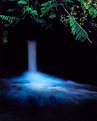
Critique By:
Jorg Reif (K:16020)
9/12/2004 7:59:13 AM
Hi Becky V, beautiful moody waterfall scene, like the oversaturated lush green. Reminds me of my my "Hobbits World". Good shot. Best regards Jorg
|
| Photo By: Becky V
(K:9699)
|
|
|
Critique By:
Jorg Reif (K:16020)
9/12/2004 7:57:05 AM
Wonderfully simple and beautiful macro. Best regards Jorg
|
| Photo By: Becky V
(K:9699)
|
|
|
Critique By:
Jorg Reif (K:16020)
9/12/2004 7:54:52 AM
Hi Becky V, impressive macro, like the very contrasting but elegant color composition and the new view. Good shot. I do understand your pain, I have a lot of trouble, too with sharpening. I have uploaded the last week at least twenty versions of photos which look perfectly ok on my screen and appear as a horrible spotty soft jumble on the upload site, so I deleted them again. On the other hand other pics from the same series turned out allright after posting. I am completely lost, too. I think I have to wait until the Articles site is up again. There is supposed to be a guideline for resizing and sharpening for web posts in it. Anyway, coming back to you: nice portfolio, I will browse a little more in it. Please check my post in the Photo Forum, Suggestions, General.
Thanks and best regards Jorg
|
| Photo By: Becky V
(K:9699)
|
|
|
Critique By:
arwa abdullah (K:34415)
9/11/2004 12:02:59 AM
Great wild life image! nice colors and composition
|
| Photo By: Becky V
(K:9699)
|
|
|
Critique By:
Bart Aldrich (K:7614)
8/18/2004 4:29:55 PM
A lovely setting. Yeah, Velvia 50 can be cotrasty in midday sun. Regards
|
| Photo By: Becky V
(K:9699)
|
|
|
Critique By:
Dirck DuFlon (K:35779)
6/28/2004 4:57:27 PM
Man, that green really whaps you right in the eye, doesn't it?  I think I'd actually de-saturate this a little, although I love the green! I like the composition here, with the heron looking so natural in his/her environment, and so completely still! It would have been cool if you had been able to get all of his/her reflection, unless that introduced other elements. I think I'd actually de-saturate this a little, although I love the green! I like the composition here, with the heron looking so natural in his/her environment, and so completely still! It would have been cool if you had been able to get all of his/her reflection, unless that introduced other elements.
By the way, I just saw your nomination of me in the Donor Only forum - not likely to happen, but I'm *hugely* flattered that you think so!!! Thanks Becky!
|
| Photo By: Becky V
(K:9699)
|
|
|
Critique By:
Dirck DuFlon (K:35779)
6/28/2004 3:38:02 PM
I like this a lot, Becky! Even though I know what it is, for some reason I keep seeing some kind of a forest of mushrooms, or one big mushroom with a bunch of stems, or... ehem... something....
I think you did an outstanding job with such a difficult image - huge contrasts between the shadows and bright sunny spots, yet you still have some detail behind the little waterfalls. The only thing that does catch my eye too much, though, is the blown-out splash of water that falls out into the sunny area (and the little hair on the negative inside that splash
I tried toning it down a little (by cloning some texture into it.) What do you think?
|
| Photo By: Becky V
(K:9699)
|
|
|
Critique By:
Dirck DuFlon (K:35779)
6/28/2004 2:59:14 PM
Becky, this is absolutely fantabulous! I love everything about it! This was so nicely seen and composed - the wonderful complementing colors, the way the dark piece of the background at right balances the larger portion of the plant on the left, the selective focus zeroed in on just the right part of the petals - about to burst open... all these things work together to make this an outstanding macro.
I'm putting this one in my favorites!
|
| Photo By: Becky V
(K:9699)
|
|
|
Critique By:
Stefan Engström (K:24473)
6/28/2004 3:54:22 AM
I came across what I think was a great blue heron this evening and found it backlit by the late sun. It was fascinating to move laterally and see how it changed color with different lighting. The hard light is a little too much here for me - it makes it difficult to get shadow detail...
|
| Photo By: Becky V
(K:9699)
|
|
|
Critique By:
Kevin H (K:22502)
6/28/2004 12:33:08 AM
Love this picture as it really show us the bird in its own habitat. The colors are really saturated and as you mentioned, you are lacking details in the bird but still makes this shot excellent.
|
| Photo By: Becky V
(K:9699)
|
|
|
Critique By:
Becky V (K:9699)
6/27/2004 4:46:58 PM
Thanks everyone. Kim - I don't know when I'll be back, but judging from the state of the dock and boats, I don't think they're going anywhere anytime soon! I completely understand your comment about the rail distortion; it was something I thought long and hard about. It's difficult when altering a photo in this way to strike a balance between photograph and "painting". I distorted both sets of railings because I felt the photo didn't look painterly enough if I left them as is. No one could draw lines that straight with a free hand (unless they used a ruler!)
Such is my dilemma: too far or not far enough?
|
| Photo By: Becky V
(K:9699)
|
|
|
Critique By:
Angelo Villaschi (K:49617)
6/23/2004 5:35:52 PM
Flower shots from the best angle: flower-level.
Well done for the hard work, as it has paid off beautifully. This is a very high-impact shot.
|
| Photo By: Becky V
(K:9699)
|
|
|
Critique By:
Stefan Engström (K:24473)
6/23/2004 4:31:35 AM
An unusual submission from you and a departure I like very much. I can really relate to your comment about this image! The bright white spot dominates too much IMO and I would suggest to go so far as to clone it. Sometimes the only way to defeat an evil is to conjure a greater evil :-) I like the balance between a recognizable subject and something that just speaks to me about dynamics and transition.
|
| Photo By: Becky V
(K:9699)
|
|
|
Critique By:
Ameet Mallapur (K:1575)
6/21/2004 9:37:15 AM
please excuse my ignorance,
i think this picture is fantastic!!!!
but i couldn't tell what it was...
my first guess was a forest, until ofcourse i read what Robert wrote.
The individual stream of water looked like tree barks to me..
i think you should be happy with what you have here and not worry about it.
It's GREAT!!
|
| Photo By: Becky V
(K:9699)
|
|
|
Critique By:
Robert Stokes (K:4509)
6/21/2004 1:53:52 AM
Yeah, I can see where this could be a tough one to get balanced, with the bright light in the foreground on the shadowy recesses behind. I like the individual streams of water and the way they burst onto the rock. The tight composition is something not seen as often with these water shots but I tend to like it better this way.As I scrolled the page up and down I noticed a possibe cropping, pretty much the bottom third where most of the bright stuff is, that may work.
|
| Photo By: Becky V
(K:9699)
|
|
|
Critique By:
Gian Luca Demarchi (K:35)
6/21/2004 1:20:29 AM
Good Shot!
|
| Photo By: Becky V
(K:9699)
|
|
|
Critique By:
Kim Culbert (K:37070)
6/14/2004 7:31:23 PM
This is such a well seen capture... and the light on the foliage and the boats is breath-taking. I like what you've done in PS, although I wonder if maybe the smudging is a little too heavy? The railings have a weird movement to them, and although it fits with the theme I find it perhaps a bit too much, because those railing are what guide my eye into the image from above.
Still, what a magical moment, caught on film. Even if you do go back, I'm not sure if you'll be able to capture all these wonderful elements again.
Very peaceful and serene.... makes me want to sit on a cabin dock for hours!
|
| Photo By: Becky V
(K:9699)
|
|
|
Critique By:
Becky V (K:9699)
6/14/2004 6:59:20 PM
Thanks Stefan. The thing with the red spot on it is an upturned rowboat. The completely red other thing is a canoe tilted on its side.
Are you unbugged now? :p
|
| Photo By: Becky V
(K:9699)
|
|
|
Critique By:
Stefan Engström (K:24473)
6/14/2004 4:09:31 PM
I think your salvage job went pretty well. I am kinda dense sometimes, but I just don't know what that thing (with the red spot in it) on the dock is. It is bugging me no end. The good news for the blurry look is that we get to see the big patches of color that form a harmonious and well-composed scene.
|
| Photo By: Becky V
(K:9699)
|
|
|
Critique By:
Gloria Fusco (K:7054)
6/13/2004 9:16:43 PM
I can just imagine how beautiful and peaceful this scene was when you photographed it. I certainly can understand why you wanted to salvage it. The colors are beautiful...and the green in the water unbelievable...your composition looks very good...if possible I would go back and try it again.....Gloria
|
| Photo By: Becky V
(K:9699)
|
|
|
Critique By:
Becky V (K:9699)
6/13/2004 9:16:10 PM
Thanks for the comments everyone. I feel fuzzier than a new pair of bunny slippers!
|
| Photo By: Becky V
(K:9699)
|
|
|
Critique By:
Audrey Reid (K:5872)
6/11/2004 12:16:27 PM
Becky, I second all that Stefan says, this is indeed very nice work. The composition is clean, simple but strong. I also love the perfectly blurred background and colours. Think this will also work well in B&W.
|
| Photo By: Becky V
(K:9699)
|
|
|
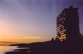
Critique By:
Kevin Lanthier (K:3477)
6/11/2004 10:02:45 AM
Heya - thanks for following my (impending) Pinetree 6 series - I had to comment on this one because this is EXACTLY what I was looking at this morning (except there were more cars) and I never would have thought to take this picture. You, however, did, and made it work wonderfully. I had my camera in the car and everything, too... just goes to show how one photographer will see something where another will not. Queen of Surrey, right?
|
| Photo By: Becky V
(K:9699)
|
|
|
Critique By:
Kim Culbert (K:37070)
6/11/2004 1:27:11 AM
Beautiful lines in this one, Becky! I know that I've already looked at it and told you what I thought but seeing it again on here I just had to comment on the wonderful colour in the background. In this print there are some great subtle blues in the lower right which really add a great contrast to the yellows and greens.
Looking good!
|
| Photo By: Becky V
(K:9699)
|
|
|
Critique By:
Stefan Engström (K:24473)
6/9/2004 11:02:16 PM
I like how the two parts move in and out of the focus plane, and the curves of the plant makes it seem almost dance-like. The background is excellent with its cross-diagonal, and composition is flawless in other respects too. I think it is time you drop " Painfully amateurish" from your bio. This doesn't hurt at all.
|
| Photo By: Becky V
(K:9699)
|
|
|
Critique By:
Paul's Photos (K:35235)
6/9/2004 7:26:18 PM
Excellent.. very nice colors.. there is a softness that I like yet the image is strong. I like how the flower splits and takes up the entire image..good work
|
| Photo By: Becky V
(K:9699)
|
|
|
Critique By:
Kim Culbert (K:37070)
6/8/2004 2:07:38 AM
Hey, MarySue says it's okay to shoot a baby duck here and there... *grin* The colours in the slide are really vibrant and I think that it translated fairly well to the screen. The layers of green have nice depth to them and are evenly lit (who is that assistant?? she rocks!) hahahhaha
|
| Photo By: Becky V
(K:9699)
|
|
|
Critique By:
Sven Burkhard (K:3467)
6/1/2004 9:36:38 PM
Thanks for your comment on my picture from the French Beach at Vancouver-iland. You make a lot of grat pictures. I like the most of them, becous they are somthing different to al the others. Very nice colour here. I like the effect that you can see the sunlight in the windows.
Regards, Sven
|
| Photo By: Becky V
(K:9699)
|
|