|
|
Critique By:
Beverly Gustafson (K:1572)
10/30/2002 6:25:36 PM
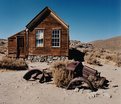
What a great place to go exploring. I love the way the color of the old rusted car matches the old buildings. Well seen. I really like this.
|
| Photo By: Dan Sanford
(K:300)
|
|
|
Critique By:
Kame Kame (K:92)
10/30/2002 4:37:40 PM
I like both shots, but agree with Vincent that this is the more appealing of the two. I love the limited palette and the feeling of space and texture.
|
| Photo By: Dan Sanford
(K:300)
|
|
|
Critique By:
José Nunes (K:2)
10/30/2002 3:18:53 PM
I like it, i think the cars goes well with the houses.
|
| Photo By: Dan Sanford
(K:300)
|
|
|
Critique By:
Dan Sanford (K:300)
10/30/2002 3:03:43 PM
How's this?
|
| Photo By: Dan Sanford
(K:300)
|
|
|
Critique By:
Dan Sanford (K:300)
10/30/2002 2:04:04 PM
I don't really like the red sky, I prefer the blue.
|
| Photo By: Dan Sanford
(K:300)
|
|
|
Critique By:
Les Anderson (K:555)
10/30/2002 1:30:25 PM
|
| Photo By: Dan Sanford
(K:300)
|
|
|
Critique By:
Vincent K. Tylor (K:7863)
10/30/2002 10:40:20 AM
This one rolls over the other in my opinion! The junked old car does the trick. Great eye here.
|
| Photo By: Dan Sanford
(K:300)
|
|
|
Critique By:
Les Anderson (K:555)
10/30/2002 9:24:30 AM
This is a great picture. If you have PS look at it in Sepia it really makes it more rustic.
Hope to see more similar photos.
I will try to download a sepia from my software. Hope it works.
I tried another time and it did not work
|
| Photo By: Dan Sanford
(K:300)
|
|
|
Critique By:
Samuel Downs (K:7290)
10/28/2002 7:49:27 PM
Dan, Nice Fall shot. I love the colors and the curve of the road. I would have removed the wires (distracting a bit). Sam
|
| Photo By: Dan Sanford
(K:300)
|
|
|
Critique By:
Sue O'S (K:12878)
10/28/2002 12:04:43 PM
This road calls to me and it's your composition that does it. The colors are marvelous and the wiggle in the road is priceless. I really like this.
Personally, I might have considered "Stalinizing" (i.e. "removing unwanted elements") the sign and the overhead wires using photoeditting - at least, the wires.
|
| Photo By: Dan Sanford
(K:300)
|
|
|
Critique By:
Sue O'S (K:12878)
10/28/2002 11:57:40 AM
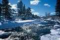
I think a closer crop helps this image, even though it's already close. I feel more comfortable with the fronds by the edges than with the tree dead center. It's a cool scene. The colors and the mood are engaging.
|
| Photo By: Dan Sanford
(K:300)
|
|
|
Critique By:
Petra Engle (K:1282)
10/17/2002 5:10:06 PM
I really like this picture. It has a sense of mystery. I like the blue overtones and misty look of the water against the sharp leaves and rocks.
|
| Photo By: Dan Sanford
(K:300)
|
|
|
Critique By:
Aiman Nassar (K:11961)
10/17/2002 9:04:07 AM
Dan
I was going to add a comment on your last posting, then I went through your portfolio.... I love all of it... this is my first one to talk about... love the contrast, the composition, texture, and the soft shadow
a
|
| Photo By: Dan Sanford
(K:300)
|
|
|
Critique By:
Dan Sanford (K:300)
6/28/2002 11:57:04 AM
Attached is the original. I have no room on the right.
|
| Photo By: Dan Sanford
(K:300)
|
|
|
Critique By:
Howard M. Parsons (K:3496)

6/28/2002 9:40:31 AM
Very nice colors. HoweverI am somewhat uncomfortable with the composition; the tree is dead center and the human figure way to the right. I think it would be improved if the tree and figure were further to the left, at about the third points of the picture width. Cropping it won't help; the treetop then comes to close to the left border. The proportions of the frame suggest it was already cropped; is there any additional space to the right on the original shot? If so, try adding it back in (if possible).
|
| Photo By: Dan Sanford
(K:300)
|
|
|
Critique By:
Kim Culbert (K:37070)
6/16/2002 6:52:33 PM
Yep, I think the dog definitely centres the image.. gives it a purpose. Nice capture!
|
| Photo By: Dan Sanford
(K:300)
|
|
|
Critique By:
Jake Sieg (K:673)
5/12/2002 8:35:10 PM
when i first look at this my eyes just follow the stairs and its just so awesome how it all ends up at the lighthouse. goodjob
|
| Photo By: Dan Sanford
(K:300)
|
|
|
Critique By:
Koen B (K:3279)
5/3/2002 2:28:08 AM
A bit fuzzy, but that doesn't have to be a problem I think. Cool !
|
| Photo By: Dan Sanford
(K:300)
|
|
|
Critique By:
rosanna jerkins (K:159)
4/28/2002 9:39:45 AM
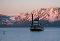
Dan, this picture captures the feeling of cold, crisp, clean, the very way I see it when I've been to Tahoe/Truckee. IMHO this is a great photo! Do you want to change the color for purposes other than to relate time and place?
=) Rosanna
|
| Photo By: Dan Sanford
(K:300)
|
|
|
Critique By:
Dan Sanford (K:300)
4/26/2002 2:24:49 PM
North west of the city of South Lake Tahoe a few miles on the Nevada side. It was about a month ago and it was 29 degrees outside.
|
| Photo By: Dan Sanford
(K:300)
|
|
|
Critique By:
rosanna jerkins (K:159)
4/26/2002 12:28:46 PM
Love the mood. where was this taken? I can hear the silence and feel the cold from this early morning shot.
|
| Photo By: Dan Sanford
(K:300)
|
|
|
Critique By:
Dan Sanford (K:300)
4/26/2002 9:06:40 AM
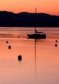
You are probably right, but then it wouldn't have that beautiful red tint to it. And an hour later I was 50 miles away. I'll give it a try again next time I'm up there. Thanks for the comment, I always like to hear others opinions.
|
| Photo By: Dan Sanford
(K:300)
|
|
|
Critique By:
chris meyer (K:597)
4/26/2002 2:48:07 AM
You can't beat early or late day light. However, I think waiting an extra hour or so may have helped this photograph. Had some of that light reached the boat, I believe a more effective photograph would have been achieved.
|
| Photo By: Dan Sanford
(K:300)
|
|
|
Critique By:
chris meyer (K:597)
4/26/2002 2:42:39 AM
I prefer the original landscape composition. I don't like how the added contrast blended the mast into the background.
|
| Photo By: Dan Sanford
(K:300)
|
|
|
Critique By:
Dan Sanford (K:300)
4/25/2002 4:30:58 PM
Oh, I forgot to mention, no filter.
|
| Photo By: Dan Sanford
(K:300)
|
|
|
Critique By:
Dan Sanford (K:300)
4/25/2002 4:29:56 PM
I increased the contrast some which added to the color. Attached is the original picture.
|
| Photo By: Dan Sanford
(K:300)
|
|
|
Critique By:
Jeroen Wenting (K:25317)
4/25/2002 4:04:00 PM
Whop. Great light (or lack of it :-) ).
Did you use a filter to get that tone or is it natural? Looks magnificent.
|
| Photo By: Dan Sanford
(K:300)
|
|
|
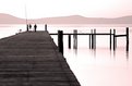
Critique By:
Dan Sanford (K:300)
4/24/2002 11:18:43 AM
I took the picture with the people in it on purpose. I think they add to the picture.
|
| Photo By: Dan Sanford
(K:300)
|
|
|
Critique By:
Debbie Groff (K:9569)
4/19/2002 7:16:45 AM
Love the composition. Very well done! Just wonderful!
|
| Photo By: Dan Sanford
(K:300)
|
|
|
Critique By:
Toni Martin (K:5092)
4/11/2002 11:34:21 AM
Dan, the photo would look much better with only the black border around it. Try it. I love the errieness about it.
|
| Photo By: Dan Sanford
(K:300)
|
|