|
|
 Sheila Carson
{K:5924} 11/21/2005
Sheila Carson
{K:5924} 11/21/2005
|
Hi Kathy!
Great shot! I like what Margarett suggested with coloring the leaves a little bit. I just did that yesterday on my "Angels" post. I had a big bright spot on one side so I painted it a little bit darker.
I was just reading about how shooting at that time of day (11:00-3:00) doesn't work very well when shooting in color, but often times you can get away with it in black and white. I like both versions, but I could see what the photographer was talking about when I saw your black and white version. You definitely don't notice the blown out tree as much in the black and white.
We are very excited about the cafe! Finally, a place to go that we KNOW will be serving great food! Yeah! :)
|
|
|
|
 Tracey Main
{K:7290} 11/18/2005
Tracey Main
{K:7290} 11/18/2005
|
Grandson is doing great and will start on some real shots soon, looking forward to finding some time...Trace
|
|
|
|
 Kathy Hillard
{K:25721} 11/18/2005
Kathy Hillard
{K:25721} 11/18/2005
|
Thanks Tracey! Sepia is good too! There are lots of choices, aren't there? How's the grandson?
|
|
|
|
|
Roberto Okamura
{K:22851} 11/18/2005
|
Beautiful landscape Kathy!
Little over-esposed in color version, but well done in sepia.
Best regards!
Roberto.
|
|
|
|
 Ahmed Ismail
{K:19853} 11/17/2005
Ahmed Ismail
{K:19853} 11/17/2005
|
Beautiful shot Kathy! I like the composition and the details of the rocks on the sides of the path. Although I like the B&W as well, I tend to lean towards the color version. Margaret's edit has made it even better.
|
|
|
|
|
Tracey Main
{K:7290} 11/17/2005
|
What a great capture and the trees to me are not distracting, I like both but maybe the color the best, this was taken on the perfect angle to capture the bend and the gate (bridge)I darkened the trees slightly and of coarse my favorite sepia to see what you think. all up I thought a great post..Tracey
|

|
|
|
|
|
Tracey Main
{K:7290} 11/17/2005
|
What a great capture and the trees to me are not distracting, I like both but maybe the color the best, this was taken on the perfect angle to capture the bend and the gate (bridge)I darkened the tress slightly and of coarse my favorite sepia to see what you think. all up I thought a great post..Tracey
|

|
|
|
|
 Mark Longo
{K:12760} 11/17/2005
Mark Longo
{K:12760} 11/17/2005
|
I like Margaret's ingenius solution the best. Looks like she may have also increased saturated the overall greens in the shot, which I think helps adds appeal.
I might have tried a little selective blurring of the blown leaves to soften their edges a little as the high contrast pattern they make detracts attention from the rail and path a bit and the busy high contrast there was a bit diffucult for me to look at. But Margaret's addition of color to the leaves also has the effect of lowering their contrast, which I think softens the image in a nice way. Her solution is great!
Mark
|
|
|
|
 Mohamed Banna
{K:34237} 11/17/2005
Mohamed Banna
{K:34237} 11/17/2005
|
great landscape shot
love the lighting here and the rocks
perfect and well captured
love that Sudie remind u :)
|
|
|
|
 NN
{K:26787} 11/17/2005
NN
{K:26787} 11/17/2005
|
I think the b&w works better here. Margaret did a fantastic job with the colour version. In any case, a very well composed shot!
|
|
|
|
|
Riny Koopman
{K:19998} 11/17/2005
|
Like the color version very much..Can feel the beautiful atmosphere trought your capture and gives an attractive an good elements balance! My best regards from cold Holland. Riny
|
|
|
|
|
Darlene Boucher
{K:15739} 11/17/2005
|
I like the color version Kathy, it is amazing! Your composition is so perfect and the colors are so "real!" Gives me the feeling that I am on the path, wonderful! Darlene
|
|
|
|
|
sherif hussein
{K:13815} 11/16/2005
|
Great shot Kathy ,Both shots are wonderful but I would prefer the colored version .
Regards
Sherif
|
|
|
|
 Robert Kocs
{K:89085} 11/16/2005
Robert Kocs
{K:89085} 11/16/2005
|
Lovely both version but I prefer the b&w version! I think this is very fine and soft tones content. Full of emotion and so fleshly! Thank you dear for your sharing us! Well done dear Kathy! 7+++
All my best wishes!
Robert
|
|
|
|
 Endre Novak
 {K:12666} 11/16/2005
|
Nice work, especially the b/w works for me:-)
Endre
|
|
|
|
|
Chris Spracklen
{K:32552} 11/16/2005
|
I much prefer the colour version, Kathy. I think it's a much stronger image.
Nice composition and textures.
Best regards, Chris
|
|
|
|
|
Kathy Hillard
{K:25721} 11/16/2005
|
Oh, Margaret...I like what you did here alot! Actually, I have done that very thing before, and I don't know why I didn't try it with this image...:( Thanks so much for your time! What a great tool this Usefilm is!!!
Kathy
|
|
|
|
 Gustavo Scheverin
{K:164501} 11/16/2005
Gustavo Scheverin
{K:164501} 11/16/2005
|
Muy lindo paisaje.
Felicitaciones!
|
|
|
|
 stingRay pt.4 .
{K:250401} 11/16/2005
stingRay pt.4 .
{K:250401} 11/16/2005
|
I like the shot as it is but appreciate the other views. The 'blown out' part is just the direction of lighting and has a part to play in the glorious scene. The rock details are great as are the colour tones. Well done Kathy, I love it. I spent a long time looking at the shot and the variations from friends, read all the help offered and reached the conclusion that UF is a wonderful place of camaraderie. Best wishes..Ray
|
|
|
|
 Michael Schuier
{K:4804} 11/16/2005
Michael Schuier
{K:4804} 11/16/2005
|
Beautiful shot. I want to go walk down it. It looks like a very beautiful place. I personally like B&W more, but the contrast is better in your color. Maybe just add some contrast in the B&W.
Michael
|
|
|
|
 Rashed Abdulla
{K:163889} 11/16/2005
Rashed Abdulla
{K:163889} 11/16/2005
|
very beautiful and i did enjoy the b/w version alot,very best regards my friend.
|
|
|
|
|
Margaret Sturgess
{K:49403} 11/16/2005
|
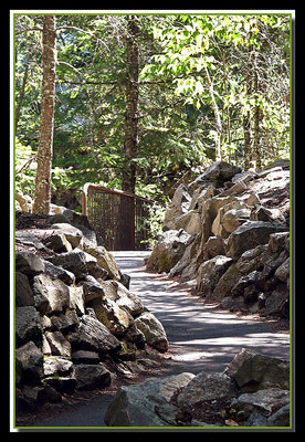
Kathy I like the colour version, the path leads the eye nicely through the scene, up into the trees. The shadows onthe path are great, and a nice mix of textures. As far as the tress/lightness is concerned, it does take away some of the feel of the lovely rich greens etc. I had a play. Took the two halves separately. On the tree layer, I find when something is blown out, the burning tool/ or colour balance cannot help. SO I usually with the paint brush in a fairly low opacity paint some colour in the really blown out bits. Then you are work on it with colour balance,burning etc. Did the painting very quickly and roughly, but hope it gives you an idea.
Margaret
|

|
|
|
|
 Yahya El Hosafy
{K:8369} 11/16/2005
Yahya El Hosafy
{K:8369} 11/16/2005
|
i think the colored version is better Kathy.
the tones are almost so homogenious. so i guess there wont be much contrast in it. i think contrast is the major thing in b/w photos.
very nice photo.
|
|
|
|
 Kelly Duntley
{K:13889} 11/16/2005
Kelly Duntley
{K:13889} 11/16/2005
|
Paths and benches. What is wrong with these pictures. NOTHING!!! Nothing is every wrong with them. I like the sun in the trees. The front half of the path is shaded and it just looks like you are turning the bend into the sunshine. Love it.
Kelly
|
|
|
|
|
Kathy Hillard
{K:25721} 11/16/2005
|
Hi Ina,
Thanks for the nice comments, and thanks for taking the time to mess with this image. I think the image loses something when it is cropped down. I guess I like the height of the trees in it. The blown out area doesn't seem to bother anyone so far....maybe sometimes you just live with it...like you said...that is what the scene looked like that day. Anyway...thanks again!
If you don't mind my asking, what do you do that takes you away from home so often?
One more thing...last night Susie and I took a PS class and the instructor showed us how to dodge and burn in a different way that works much better. If you are interested I can send you the instructions. My email is khillard48@cs.com
Kathy
|
|
|
|
|
cytte
{K:2089} 11/16/2005
|
Hi Kathy,
Great capture
i think the B&W is much better and suit for this image.
regards
cytte
|
|
|
|
 Ina Nicolae
{K:44481} 11/16/2005
Ina Nicolae
{K:44481} 11/16/2005
|
Hi Kathy, first of all, I don't find the blown-out tree bothersome (I sometimes actually like the full sun and blown highlights to suggest the way we see - as in you picture of Susie's yard with the leaves). Having said this, since your alley and rocks also have strong contrasts, and the rail, and the pines, this tree is not so obvious, the pattern of light is fairly uniform, and the viewer focuses on these closer elements first, then on the strong lines of the rail, and lastly - above these elements.
In order to fix blown highlights, you did the best: switch to B & W or sepia. That takes care of it, therefore I like the sepia version better. I don't like dodging and burning, because it kills the lighting (maybe I don't know how to do it right?), and it ends up looking dull on such a large area. Small areas can be cloned, but this is too big. So I'd take the desaturated approach. I'll be curious to hear some experts! Here's a quick crop, I cut some of the light areas, used curves & saturation.
|

Cropped |
|
|
|
 Ann Nida
{K:45248} 11/16/2005
Ann Nida
{K:45248} 11/16/2005
|
Haha cop out Susie choosing both. I reserve the right to do the same or that privilege for family only. LOL :)
I ike the colour and the B&W. The B&W seems less bright especially in the sepia tone. I was wondering if you used curves to cool down the entire image would that work? It seems to be bright all over so maybe that would work. I'll have a play and will let you know if I come up with anything.
I just love pathway and road shots. I always want to see where they lead me. I have a portfolio for just such shots and have many in my collection but I haven't posted many here yet. Will do some day. I do like the composition and your DOF is great as is the detail and clarity. Great job and nice pic. Will get back to you later if I can help with the brightness.
Also thank you for your support and encouragement here and for all your comments to my images.
Cheers - Ann :)
|
|
|
|
 Susie OConnor
{K:34798} 11/16/2005
Susie OConnor
{K:34798} 11/16/2005
|
I'm glad you remembered this! You probably have a few more too....I'm having a tough time deciding between the two. The b/w looks more like a painting and has an entirely different feel to it. I'm kinda leaning toward it, but the color really grabbed me from the thumbnail. So I choose....both! :) Very pretty...good job.
|
|
|
|
 Robin W
{K:16308} 11/16/2005
Robin W
{K:16308} 11/16/2005
|
No help from me Kathy :( but I do like the color version...love the way the path leads us through the image...glad you remembered you had this one!
|
|
|
|
|
Kathy Hillard
{K:25721} 11/16/2005
|
I'm having a problem uploading the b&w. This is another stab at it.
|

|
|
|
|
|
Kathy Hillard
{K:25721} 11/16/2005
|
B&W Version
|
|