|
|
|
Joshua Rainey
{K:5069} 3/9/2004
|
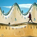
A great abstract with meaning...
|
|
|
|
|
Afzal H Mohamed
{K:909} 9/24/2002
|
Love the picture...much as i would like to restrain myself, i just have to fall into the trap so neatly laid out by petros and say that the nikon logo is a harsh distraction in this picture. Somehow canon is so much more soothing to the eyes!
cheers!
|
|
|
|
|
John Myers
{K:4308} 9/23/2002
|
thankyou both for the comments!:)
oh petros, you silly human, when will you ever learn that nikons are better than canons
;)
|
|
|
|
|
Petros Stamatakos
{K:12101} 9/23/2002
|
I think that this photo could be dramatically improved if you used Photoshop to clone out the "Nikon" sign, and then used the text tool to write "Canon"...
(John, you should get quite a few comments on this photo now... )
|
|
|
|
 Sue O'S
{K:12878} 9/23/2002
|
Well, I'm not sure why this has so many views and no comments.
This is a nice abstract, John. Forethought in experimentation. Good work!
|
|


