|
|
 Nick Karagiaouroglou
 {K:127263} 10/18/2006
|
Thank you for the nice comment, Giuseppe!
Nick
|
|
|
|
 Giuseppe Guadagno
 {K:34002} 10/18/2006
|
The angle is great Nick!
Giuseppe
|
|
|
|
 Nick Karagiaouroglou
 {K:127263} 10/18/2006
|
City shaping is so easily done with a computer, isn't it? ;-)
But if that trend helps lowering the number of grey suits that I see running through the streets, then be it also diving masks and waterproof suits. (But please, not the grey ones! ;-))
|
|
|
|
 Annemette Rosenborg Eriksen
{K:55244} 10/18/2006
|
:-)))) From where I sit safe and warm in front of the computer it really IS a minor change! The residents in that street however would probably think otherwise;-)Imagine putting on a divingmask and waterproof suit when going to work in the morning. Hmm a new trend?
|
|
|
|
 Nick Karagiaouroglou
 {K:127263} 10/18/2006
|
Well, what do you mean "changing a bit"? The place is now a flood! ;-)
As about mermaids, dolphins and crazy guitar players, hmmm, let me seek for adequate collage parts... oh yes, here they are! Hehe! :-)
Take care,
Nick
|
|
|
|
 Annemette Rosenborg Eriksen
{K:55244} 10/18/2006
|
hihihi see how interesting a photo can get when changing it a bit?!:-) Now we just need a mermaid, some dolphins and a crazy man playing guitar in a boat going down that way! No no don´t do that!! I was just kidding!
Take care,
Annemette
|
|
|
|
 Nick Karagiaouroglou
 {K:127263} 10/18/2006
|
Why not?
There be your road-river! Contacting now the municipal bureau for a new proposal concerning the color of the roads.
Poor city, what else will Annemette think of? ;-)
Take care,
Nick
|

Road-River |
|
|
|
 Annemette Rosenborg Eriksen
{K:55244} 10/18/2006
|
Yes this is good and the final photo unless of course we make the road to a river with the same colour as the umbrella-haha!
Take care,
Annemette
|
|
|
|
 Nick Karagiaouroglou
 {K:127263} 10/18/2006
|
Hi Annemette!
I made the umbrella brighter and the person a bit more visible using exposure and luminance/contrast corrections. The person is so tiny and so the corrections are not so striking for the photo as a whole, but I have the impression that in this case the subtle visibility of the person fits much better the scene.
What an ongoing creative process! Thank you very much for that!
Cheers,
Nick
|

The final version (?) |
|
|
|
 Annemette Rosenborg Eriksen
{K:55244} 10/18/2006
|
Dear Nick
Yes! The one on the left is exactly what I had in mind!! Maybe you can make the umbrella brighter or maybe choose a brighter blue and add on it to emphasize the person. No matter what this is what I thought of, and I´m glad that you like it, too:-)
Best wishes,
Annemette
|
|
|
|
 Nick Karagiaouroglou
 {K:127263} 10/18/2006
|
Hi Annemette!
Answering both your comments in one. First of all I have to thank you for the never ending ideas. It is this creative process that shows that arts is not only thinking about the already finished work, but also about the next work, the new.
From your two ideas I definitely tend to the one with anything black except the road and the wall at the left. It is indeed very dense. The person at the depth becomes more important then. But I should find out how to make it a bit more visible because it can be hardly seen in the darkness.
So here we have the next evolutionary steps according to a crazy viking maid's ideas!
Thank you so much and don't stop but keep it up!
Nick
|

Ideas 3 |
|
|
|
 Annemette Rosenborg Eriksen
{K:55244} 10/18/2006
|
I can see that it´s difficult cropping it just as I think. Something else to do then is to make everything black on the right and the top, the sky, house etc. Maybe the person would be interesting to have in the photo then?
Take care,
Annemette
|
|
|
|
 Annemette Rosenborg Eriksen
{K:55244} 10/18/2006
|
Thank you so much for keeping up with this crazy viking maid and her silly ideas:-)) The left one is excellent now, but the cropped photo needs even more cropping leaving the upper right part of the photo out so you can only see the road itself and the dark wall on the left and the lines that go through the photo. I´m certain that this will look more dense, fascinating, abstract:-)It turns the photo from being grey and gloomy into something quite different if you know what I mean.
Best wishes,
Annemette
|
|
|
|
 Nick Karagiaouroglou
 {K:127263} 10/17/2006
|
What I do for being sweet... ;-)
OK, second try! I still like the dark sky, but the crop.. Oh well, the depth is gone and it is a completely different photo now. It has something special though I can't say what.
Many many thanks again and best wishes.
Nick
P.S.: Could it be that the crop conveys more of the feeling of the own steps than the distance of the road to go?
|

Ideas 2 |
|
|
|
 Annemette Rosenborg Eriksen
{K:55244} 10/17/2006
|
Dear Nick
The one on the left you need to erase the white shiny lines and the one on the right you must crop further down leaving no person, house or sky!:-) I´m sorry. I should show you myself, but you´re always so sweet showing examples:-)
Best wishes,
Annemette
|
|
|
|
 Nick Karagiaouroglou
 {K:127263} 10/17/2006
|
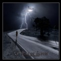
Thank you so much for the ideas, Annemette! So let's see how your twisted mind perceived this photo - let's twist again! ;-)
I think the one with the black sky is rather unusual. The light of day on the street under a dark sky!
Which one does that crazy viking maid prefer?
Cheers,
Nick
|

Ideas |
|
|
|
 Annemette Rosenborg Eriksen
{K:55244} 10/17/2006
|
Ah this one I would love to see cropped leaving only the road beneath/half of the photo almost taken away in the top or maybe making the sky black! I think that would make it very fascinating either way:-) Just a suggestion from a crazy vikingmaid:-)
Best wishes,
Annemette
|
|
|
|
 Nick Karagiaouroglou
 {K:127263} 10/17/2006
|
Thank you very much for the nice detailed comment, Doyle. The hard thing is to get the colors well under that low light, and I can only be glad that I had the SSC wideangle with me at that day.
Best wishes,
Nick
|
|
|
|
 Nick Karagiaouroglou
 {K:127263} 10/17/2006
|
Thank you very much for your nice comment, Jan!
They spread all that grain over the street when it freezes but still I wouldn't like to live there and have a car in my living room once in a week. ;-)
Cheers,
Nick
|
|
|
|
 Nick Karagiaouroglou
 {K:127263} 10/17/2006
|
Thanks a lot DaniaL!
Nick
|
|
|
|
 Doyle D. Chastain
 {K:101119} 10/17/2006
|
This is well composed Nick! I like this one. The colors feel real . . . there is an emotive impact to the capture and the eye seems unerringly pulled into the comp towards the central left area of linear convergence. Very nice work.
Regards,
Doyle I <~~~~~
|
|
|
|
 Jan Hoffman
{K:39467} 10/17/2006
|
Good framing and composition. Excellent mood shot and you feel like you are really there.
I wonder how many cars have skidded on the road when it was icey into that yellow house?
--Best to you, Jan
|
|
|
|
 Dania Loulah
 {K:1545} 10/17/2006
|
beautiful
DaniaL
|
|
|
|
 Nick Karagiaouroglou
 {K:127263} 10/17/2006
|
Thank you very much for your nice comment, Megan!
Best wishes,
Nick
|
|
|
|
 Megan Irwin
{K:1666} 10/17/2006
|
This is very cool. I love the lines and the colours. Well done.
|
|


