|
|
 Doyle D. Chastain
 {K:101119} 8/30/2006
|
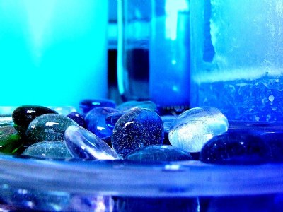
It's certainly an improvement . . . the blue hue has helped to hide some of the distractions nicely. Still can't help but imagine a different crop though. You have a LOT of negative space on the top left and right here!
I have attached a crop suggestion for your consideration.
Regards,
Doyle I <~~~~~~
|

How About this for an Idea? |
|
|
|
 Klaas Baas
{K:15111} 8/30/2006
Klaas Baas
{K:15111} 8/30/2006
|
I like this one more than the other one Carlen, the other one has vertical lines which I don't like.
The blue makes this image look very cool to me.
Take care:)
Klaas
|
|
|
|
 Carlen Boersema
{K:6789} 8/30/2006
Carlen Boersema
{K:6789} 8/30/2006
|
Thanks Shirley!
|
|
|
|
|
Carlen Boersema
{K:6789} 8/30/2006
|
yeah, a lot actually. It's a secret filter of mine.
|
|
|
|
 Shirley D. Cross-Taylor
{K:174151} 8/29/2006
Shirley D. Cross-Taylor
{K:174151} 8/29/2006
|
I do like this one better, Carlen.:)
|
|
|
|
 James Cook
{K:38068} 8/29/2006
James Cook
{K:38068} 8/29/2006
|
Cool blue. Did you do a little color work on this one?
|
|