|
|
 Efisio Mureddu
 {K:13104} 5/23/2006
|
To Steve: i know Gimp and PS, i used it in the past shots but recently i go to the traditional darkroom processes so it's a little bit difficoult... but i'll try.
Thanx a lot
E.
|
|
|
|
 Steve Aronoff
{K:18393} 5/22/2006
Steve Aronoff
{K:18393} 5/22/2006
|
I don't know if you're aware of this, Efisio, but there is a really good free open source photo editing program available on the web. It's called The Gimp. It's available at www.gimp.org. There's another good free photo editing program called Photofiltre available at www.photofiltre.com. I don't think either one is available in Turkish, but that might not be a problem for you.
Steve
|
|
|
|
|
Efisio Mureddu
{K:13104} 5/22/2006
|
Thanx Steve, i think your suggestions are right, i'll try to reprint this shot with a different cut and using the split-grade print to became the horse more bright (very difficoult without photoshop :)).
Sorry for the delay in reply.
E.
|
|
|
|
|
Steve Aronoff
{K:18393} 5/12/2006
|
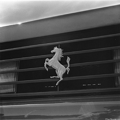
Efisio, there are two elements to this photo that most draw my eye: the horse, and the bright light peaking over the edge of the hood (bonnet). I think the photo would be improved by concentrating on those two points with a different composition. I think the lighting issue can be dealt with effectively with a levels adjustment. I've added a rough idea of what I think would be an improved treatment below.
Steve
|

suggested change |
|
|
|
 Morc Piantedos
{K:21834} 4/26/2006
Morc Piantedos
{K:21834} 4/26/2006
|
..sei ingestibile :-)
|
|
|
|
 Massimo Di Maggio
{K:-53658} 4/25/2006
Massimo Di Maggio
{K:-53658} 4/25/2006
|
Sia in questa sia nell'altra, nulla da dire sulla nitidezza, ho qualche dubbio sui toni, mi sembrano un po' piatti.
|
|
|
|
|
Efisio Mureddu
{K:13104} 4/25/2006
|
To Hugo, i think u centered the problem of this shot.
More highliths on the logo will work better.
Agree with u.
Thanx :)
E.
|
|
|
|
 Hugo de Wolf
{K:185110} 4/24/2006
Hugo de Wolf
{K:185110} 4/24/2006
|
Hi Efisio, I don't really mind the dark edge, it only makes the transition between the car and the sky a bit more intence, which I think works well in this image.
On the other hand, I find the overall tonal range a bit limited; the Ferrari logo could've some more glimmers and highlights, but it seems a tad grey. Also, the contrast between the black grille, the red paint and the shiny logo is something which I think screams out to be captured in colour. The B&W reduces the agressive / high end feel of the car...
Cheers,
Hugo
|
|
|
|
 Maurizio Massetti
{K:30463} 4/23/2006
Maurizio Massetti
{K:30463} 4/23/2006
|
Personalmente preferisco quella con la scritta "Ferrari", ma questa e' comunque di buona qualita', con le stesse tonalita' e con un taglio sicuramente originale...
|
|
|
|
 Nicola Barbieri
{K:18000} 4/23/2006
Nicola Barbieri
{K:18000} 4/23/2006
|
Eh, la Ferrari....un'opera d'arte di cui tu hai saputo ricavare un particolare bello quanto la "modella"....ciao, Nicola
|
|
|
|
 Massimo Mulas
{K:1536} 4/23/2006
Massimo Mulas
{K:1536} 4/23/2006
|
Ma nel riflesso sotto sei tu?
|
|