|
|
Critique By:
Robert Kocs (K:89085)
7/30/2005 6:22:57 AM
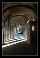
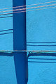
Wow! Risky composition but original idea Mark! I love it! Mixed up gothic design with modern, upshot this fantastic abstract vision! Great work!
Best regards!
Robert
|
| Photo By: Mark Wlaz
(K:4564)
|
|
|
Critique By:
Jeanette Hägglund (K:59855)
7/29/2005 7:55:57 AM
YES! Nicely seen and perfect composed 
Jeanette
|
| Photo By: Mark Wlaz
(K:4564)
|
|
|
Critique By:
Roberto Arcari Farinetti (K:209486)

7/28/2005 4:34:48 AM
Hi Mark..
here one other optimal composition in one particular light much and difficult one! perhaps the perspective situation is much beautiful one, a human presence would have given a more "alive" touch.. but the architecture is this.. well done!
my ebst wishe, roby
|
| Photo By: Mark Wlaz
(K:4564)
|
|
|
Critique By:
Roberto Arcari Farinetti (K:209486)
7/28/2005 4:22:26 AM
hello Mark..
a nice idea compositive and colors effect!
I like it, so much, also the colorsthe lines and the contrast with same they!
my best wishes
roby
|
| Photo By: Mark Wlaz
(K:4564)
|
|
|
Critique By:
Marian Man (K:80636)
7/27/2005 12:34:52 PM
great abstract dear Mark!!!!! fine composition and colors!!! very well done!!
best regards
Marian
|
| Photo By: Mark Wlaz
(K:4564)
|
|
|
Critique By:
Todd Miller (K:16464)
7/25/2005 10:08:21 PM
yep...i like it. colors, lines, compo...it's all quite nice. always on the lookout for potential abstracts it seems...great job Mark.
todd
|
| Photo By: Mark Wlaz
(K:4564)
|
|
|
Critique By:
Kevin Collier (K:19076)
7/25/2005 5:06:02 PM
Nicely done - the angles and the colors all fit - is that an upside down shadow of a car at the top?? k
|
| Photo By: Mark Wlaz
(K:4564)
|
|
|
Critique By:
Mr. M ... (K:5507)
7/25/2005 9:38:27 AM
Very nice and cloured abstract!
|
| Photo By: Mark Wlaz
(K:4564)
|
|
|
Critique By:
karen clarke (K:18893)
7/25/2005 3:09:40 AM
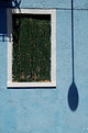
I like the concept of this. I am sure if this is what you were after, but it appears that you began reading the sign with your camera, and when you realized that it said stop, you stopped and snapped the image. I like the red line with the yellow color. Cool~
|
| Photo By: Mark Wlaz
(K:4564)
|
|
|
Critique By:
Mark Wlaz (K:4564)
7/22/2005 2:48:05 AM
Mohamed,
You are very kind. Thank you.
Mark
|
| Photo By: Mark Wlaz
(K:4564)
|
|
|
Critique By:
Mohamed Banna (K:34237)
7/21/2005 3:26:10 PM
beside i made a comment about this master piece,, but i found it again,, i add it to my favorites,, i like it
|
| Photo By: Mark Wlaz
(K:4564)
|
|
|
Critique By:
Mark Wlaz (K:4564)
7/21/2005 3:17:11 AM
Todd,
I think you are right. When I get a chance I'll rework this shot. I had a similar reaction myself, but I generally resist applying too much PS. But in some cases PS work is really the best thing for the image. Thanks again.
Veloc...ity
|
| Photo By: Mark Wlaz
(K:4564)
|
|
|
Critique By:
Mr. M ... (K:5507)
7/20/2005 6:17:30 PM
if we had any???
WOW!
Impressive!!! 
|
| Photo By: Mark Wlaz
(K:4564)
|
|
|
Critique By:
Colin Cartwright (K:15699)
7/20/2005 5:19:43 PM
You've worked the camera to fine effect here, Mark. This one stood out from your portfolio thumbnails.
I'm just learning photoart skills (I'm on to my fifth, and it's nearly killing me!). The blurring, together with the garish colours, create a fine abstract.
Colin
|
| Photo By: Mark Wlaz
(K:4564)
|
|
|
Critique By:
greg collins (K:12273)
7/20/2005 12:15:00 AM
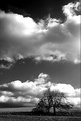
Very nice. These types of shots work well in B/W.
Greg
|
| Photo By: Mark Wlaz
(K:4564)
|
|
|
Critique By:
Mark Wlaz (K:4564)
7/19/2005 8:01:01 PM
Todd,
Well, one would think there is an easy answer to your question, but ...
It turns out what you are "saying in your head" is the way I generally pronounce my name. Simply, because it is easier on the receiver. The correct way, is to pronounce the W as a V. In this case it is Va-loz. (Just like the first portion of the word Velocity.)
Mark
|
| Photo By: Mark Wlaz
(K:4564)
|
|
|
Critique By:
Mark Wlaz (K:4564)
7/19/2005 7:56:10 PM
James,
I really like the image of yours that was featured on the Home Page today. I hope it brought a lot of folks to see your wonderful collection of images on UF.
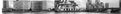
As for my stitched image, the printed version is roughly 18 inches long and perhaps 3 inches high. I have given it as a gift to a handful of friends, and it has always been well received. It was a fun project, although not one that I actually set out to do. My wife and I had left the Tate Museum (not Tate Modern) and as we walked, I clicked off the serious of photos. When we got home from the trip and I saw the series ... ah hah, the stitched image was about to be officially born. It was my first and only attempt at stitching ... a lot of work, but well worth it.
Best regards to you,
Mark
|
| Photo By: Mark Wlaz
(K:4564)
|
|
|
Critique By:
* James * (K:20200)
7/19/2005 8:54:44 AM
i agree with angelo. the stitching job is nicely done and i too would like to see a larger version of the photo in the future. the image has been taken from a different perspective, but then again london isn't a city of tall skyscrapers like hong kong or new york.
nice to see your image on the front page mark. warmest regards ~ james
|
| Photo By: Mark Wlaz
(K:4564)
|
|
|
Critique By:
Angelo Villaschi (K:49617)
7/19/2005 8:45:52 AM
Excellent job, Mark! I just saw this on the front page as part of your reward for an excellent critique.
I hope to see a bigger version of this once UF supports larger panoramas. At this size, it looks like a fairly nice stitch job.
|
| Photo By: Mark Wlaz
(K:4564)
|
|
|
Critique By:
Todd Miller (K:16464)
7/19/2005 2:58:48 AM
well Mark...i've seen this thumbnail before and haven't opened it til now. i was pleasantly surprised-for some reason the thumbnail didn't 'grab me.' the actual image has some nice layers and tones...although i'd think about bringing up the contrast or otherwise getting a little more saturation in the colors. might give it just a bit more 'grab.' just a thought.
and one unrelated question that i've been wondering for awhile-how do you say 'Wlaz?'
i know damn well it's not walloz...but that's what i say in my head everytime i see it.
|
| Photo By: Mark Wlaz
(K:4564)
|
|
|
Critique By:
Toshi (K:11924)
7/19/2005 2:50:48 AM
Great abstract - good colors and shadows! Nicely done
|
| Photo By: Mark Wlaz
(K:4564)
|
|
|
Critique By:
ricardo longhi-frantz (K:9628)
7/18/2005 9:58:27 PM
wow! very excellent work! lovely abstract lines and marvelous colors! loved a lot!
|
| Photo By: Mark Wlaz
(K:4564)
|
|
|
Critique By:
Sion Dalais (K:511)
7/18/2005 1:09:16 PM
noce photo good abstract photo art
|
| Photo By: Mark Wlaz
(K:4564)
|
|
|
Critique By:
Timothy Schirmer (K:7201)
7/16/2005 5:01:45 PM
Very unique, I like it. (-:
|
| Photo By: Mark Wlaz
(K:4564)
|
|
|
Critique By:
Angelo Villaschi (K:49617)
7/15/2005 6:43:20 AM
Very creative, Mark. Good idea and interesting results.
One sugestion I have is to try and get some part of the image still and sharp. That tends to enhance the blurred part, as the contrast between blurred and sharp is noticed.
Of course, sometimes it's best to have blur everywhere, so that was just a sugestion
|
| Photo By: Mark Wlaz
(K:4564)
|
|
|
Critique By:
Mark Wlaz (K:4564)
7/14/2005 10:00:30 PM
Many Thanks Jeanette. :-)
|
| Photo By: Mark Wlaz
(K:4564)
|
|
|
Critique By:
Mark Wlaz (K:4564)
7/14/2005 9:41:37 PM
Jeanette,
Thanks for looking at my latest postings, and I will definately take your suggestion and see if I can improve this image.
Best regards,
Mark
|
| Photo By: Mark Wlaz
(K:4564)
|
|
|
Critique By:
Mark Wlaz (K:4564)
7/14/2005 9:38:55 PM
John,
This particular shot was purely instinctive ... as I was in a hurry to get, by foot, across town. I can't even remember thinking about the shot, but just snapped it quickly before the moment was lost, and as I continued on my way.
Thanks so much for such generous praise, it is greatly appreciated.
Mark
|
| Photo By: Mark Wlaz
(K:4564)
|
|
|
Critique By:
Mark Wlaz (K:4564)
7/14/2005 9:35:17 PM
Marian,
Thanks so much for your kind remarks.
Burano was absolutely perfect for the type of images I like to capture. It was a great afternoon wondering around, observing, and snapping away.
Mark
|
| Photo By: Mark Wlaz
(K:4564)
|
|
|
Critique By:
AJ Miller (K:49168)
7/14/2005 8:58:22 PM
Hi Mark! I'm struggling to keep up with everyone at present but this one caught my eye as one of the best postings recently. Excellent B&W shot.
AJ
|
| Photo By: Mark Wlaz
(K:4564)
|
|