|
|
Critique By:
Andrew Lopez-Calvete (K:2441)
10/14/2003 11:17:30 AM
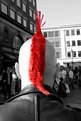
Lighting conditions were a little difficult, if I'd have gone down a stop then the right side would be underexposed. The light was so harsh that there is not a lot to burn in either, though I could sample the right 'hemisphere' and matt it in. I would normally agree on the centering thing but I actually like this. I was conciously going for a tourist postcard shot and the linear form of his hair looks OK centered.
The PS work consisted of a quick levels tweak, copying the background to a new layer, selecting a fine brush for the eraser and roughly exposing the hair through the copy layer. Total time expended.........10 mins (if that). Why, 'cause I hate this kind of shot!
Yannic, I'm glad we both agree that we hate this!! :0
|
| Photo By: Andrew Lopez-Calvete
(K:2441)
|
|
|
Critique By:
Andrew Lopez-Calvete (K:2441)
10/14/2003 5:31:58 AM
yeah, I was less than meticulous with this one, as I said, its just an experiment. More noticable is the fine tinge of skin tone on the right hand side of the Mohican!
|
| Photo By: Andrew Lopez-Calvete
(K:2441)
|
|
|
Critique By:
Andrew Lopez-Calvete (K:2441)
10/14/2003 4:51:41 AM
Okay, you know how I always bitch about overuse of PS? This doesn't count! Personally I use PS almost exclusively for tidying up shots and haven't done any creative manipulation for a fair while, but what you've created here shows both a strong understanding of the package and a sensitive approach to the subject. The manipulation adds plenty of interest and is virtually seemless. Everyone who believes that photo manipulation means taking a perfectly good image, adding motion blur, three art filters, plastic wrap and then a nice linen texture should look at this and learn.
Having said all of that there are some things that I PERSONALLY would have done differently, not that there is anything inherrantly wrong here, just a matter of taste:
1/ Lose the motion blur. This would mean that the left hand edge of the subjects hair wouldn't struggle to get a nice defined edge.
2/ The book effect is good but I would add a layer with a graduated fill constrained to a mask around the book/face. Then by making this your top layer and either making it either translucent or using a layer mode like screen, you would have a perspective associated with the book rather than the face.
3/ lose the reflected face and just give plenty of eye space to the front of the subject. Having said that I'm looking at this as an individual image rather than in contect with whatever you are trying to say with this piece.
Great shot!
|
| Photo By: Ben Goossens
(K:491)
|
|
|
Critique By:
Andrew Lopez-Calvete (K:2441)
10/12/2003 3:52:50 PM
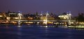
The 707 never ceases to amaze me! Great shot, and I'm glad its not just me that seems to be having a love affair with Hungerford bridge. I've spent a lot of time shooting skateboarders around the london Eye and always end up shooting more of the bridge than the skaters! I think part of the appeal is the way that two lovely shiny spans flank the grotty old charing cross railway bridge. I was in town on saturday, my GF and I met up with another usefilm member for a couple of drinks and a natter about f-stops and ND filters or whatever photographers are meant to talk about. Maybe you could get in touch and we could get the benefit of your presence on the next outing.
I'd love to see this as a big hi res print, the res here does it no justice but you can see tantalising hints of the detail this shot includes, especially around the central pier of the bridge.
I hope you don't mind but I attached a snap I took on saturday, there is some more interesting stuff on my portfolio and an unusual view of the eye (which has also suffered from the Usefilm upload scenario as you can virtually read the time on peoples watches in the pods when you print it out!).
Hopefully we can meet you and significant other at some stage and expand the London Chapter of usefilm.
|
| Photo By: Megan Forbes
(K:4617)
|
|
|
Critique By:
Andrew Lopez-Calvete (K:2441)
10/11/2003 5:27:05 PM
Odd isn't it? To be hounest if I had pasted him in I'd have done a more convincing job than this! I can't work out if it looks different enough to be an interesting efffect or just too artificial (probably the latter). I only posted it because I really value everyone's opinion who posts on UF.
|
| Photo By: Andrew Lopez-Calvete
(K:2441)
|
|
|
Critique By:
Andrew Lopez-Calvete (K:2441)
10/11/2003 4:30:33 PM
A bit overexposed and I think the vignetting is not added but the result of an oversized hood for the lens. I actually like the effect as it does look like it was shot with a pinhole as eric mentioned.
|
| Photo By: Natalie Papadopoulos
(K:5247)
|
|
|
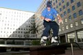
Critique By:
Andrew Lopez-Calvete (K:2441)
10/11/2003 3:13:43 PM
BMX'er as promised.
|
| Photo By: Michel Ayala
(K:0)
|
|
|
Critique By:
Andrew Lopez-Calvete (K:2441)
10/11/2003 3:12:33 PM
Okay, just to illustrate what I was talking about I went bacck to the south bank and shot some skaters with a 550 speedlight and a Sigma 17-35mm Asph lens. I also saw some BMX'ers aned took a shot especially for you! Its not great as they were under a bridge doing wall rides and stalls so the flash was picking up the whole scene and not just the riders. The attached skater shot is a better example. I'll post some more over the next couple of days on my portfolio if you are interested.
|
| Photo By: Michel Ayala
(K:0)
|
|
|
Critique By:
Andrew Lopez-Calvete (K:2441)
10/11/2003 2:50:24 PM
Charlie, any comparison to Andreas Gursky would be flattering, In fact I have another shot (attached) which I had a split second to get before people started walking past so I'm far from happy about clarity, exposure and composition, so I've never posted it here. It's a similairly confusing mass of colour and could be described as being a poor imitation of a 'gursky-esque' approach to colour and form. I post it here for amusement purposes (it really is terrible!)
Thanks for the feedback Charlie and also to Peter for leaping to my defense.
|
| Photo By: Andrew Lopez-Calvete
(K:2441)
|
|
|
Critique By:
Andrew Lopez-Calvete (K:2441)
10/9/2003 4:26:38 PM
Nice, and I'm not sure why. Did you try another shot like this with a diffused flash to lighten up the grill? Probably would have killed the lovely contrast you have here. A journo I know always says that if there are no photogrpahers standing somewhere there is a good reason for it. I bet you were all alone when you took this and disproved that theory and the rumour that photogs are pack animals!
|
| Photo By: ryan winton
(K:3027)
|
|
|
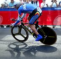
Critique By:
Andrew Lopez-Calvete (K:2441)
10/9/2003 3:51:56 PM
Ryan,
NOW THATS WHAT I'M TALKING ABOUT!!!
Bloody marvelous, exactly what I was talking about on your other post. Love it to bits and if you had the ranking feature tunred on I'd give it top marks. I'm definatley not posting my MTB shoot now, this is far to good!
I'm assuming from what you said that the grain is something to do with the compression to get it onto the site? If not are you 100% sure you were on 100 and not 1600 as its got grain like golf balls?! Time to get that one back to Canon if not! Also are you 100% on the aperture as the depth of focus (difficult to tell with the blurring) seems pretty close and a combination of 1/40 (1/45?) and f32 should leave a scene at EV 15 a bit under or at EV 16 a bit overexposed an this looks just about spot on. Actually thinking this through we are only talking about a stop and I know my 10d is pretty forgiving.
Sorry for all the questions I'm the inquisitive type!
|
| Photo By: ryan winton
(K:3027)
|
|
|
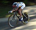
Critique By:
Andrew Lopez-Calvete (K:2441)
10/9/2003 3:33:54 PM
Love the shot, and I think the shadow is and interesting feature, but I find the crop on the top edge uncomfortably tight, unbalances the frame and cuts the heads of the audience. Part of me would also prefer this to be at a slower shutter and panned to give more of a sense of motion (anyone reading this who think bicycles are slow, go along to a race and you try to capture them at this quality, they really shift!). I'd also have taken it down a stop, I think the foreground would have coped and it would have given more contrats to the background.
Ryan, I'm very aware its easy to criticise and I'd love to end my comments with an "and my attachment shows how it should have been done" line, but I have to be forced at gunpoint to do action stuff and it normally sucks. I've got a mountain biking assigment in the diary, when I've made a hash of it I'll post some examples so you can pick them to bits!!!
|
| Photo By: ryan winton
(K:3027)
|
|
|
Critique By:
Andrew Lopez-Calvete (K:2441)
10/9/2003 3:25:40 PM
Thanks ken, by professional I mean I make a living from photography and graphic design. Thats not to say there aren't amateurs on this site who can frankly put me to shame with a G2! To be fair this is where I post experiments and bits of work in progress. I also really enjoy taking on the projects, which I find challenging because the brief is soo loose.
|
| Photo By: Andrew Lopez-Calvete
(K:2441)
|
|
|
Critique By:
Andrew Lopez-Calvete (K:2441)
10/9/2003 3:20:54 PM
Ken, I think a lot of people share your thoughts on this, but I still ike it in ethreal pastel shades. As I've said on other postings I tend to upload images that I'm experimenting with and want to get a wider consensus. I think in this case i have to accept that the consensus says contrast!
Thanks for the feedback mate!
|
| Photo By: Andrew Lopez-Calvete
(K:2441)
|
|
|
Critique By:
Andrew Lopez-Calvete (K:2441)
10/9/2003 10:24:29 AM
Odd, becuase I tried a difference layer with one of the previous images and the change was significant. I just can't fathom why its only B&W. I need to double check the difference between a desaturated RGB and a Greyscale to see if there is a problem with the mode.
Yep, trollys of MK, very similair, just Higher res and B&W!! I've attached a sample for anyone that doesn't know what the hell we are talking about!
|
| Photo By: Andrew Lopez-Calvete
(K:2441)
|
|
|
Critique By:
Andrew Lopez-Calvete (K:2441)
10/9/2003 6:50:30 AM
not too worried about the hands, in as much as it was a trade off between there being more foliage that out of focus people passing by and her face being in the bottom left corner of the upper right sixth of the frame. I was trying to get a feeling of her being above the street. To maintain this composition and keep her hands in shot I had to pull back and start to loose the feeling of height and the low 'horizon' created by the bottom of the trees. She was actually sitting on a platform so she was quite high up. I always have a UV filter on the lens for protection more than anything and I went into auto pilot whilst typing, its just a circ pol used for this shot!
|
| Photo By: Andrew Lopez-Calvete
(K:2441)
|
|
|
Critique By:
Andrew Lopez-Calvete (K:2441)
10/9/2003 6:19:53 AM
Andreas Feininger did it better! Okay it wasn't a self portrait.
I can see what you've tried to achieve with the flash by pointing the speedlight perpendicular to the lens and bouncing light off a reflector of some sort, however the droplets of water have picked up too much flare and caused the hazy sheen to the whole image. Also I think the auto focus has struggled to keep up with the layers of reflective surfaces, was it set on one shot or AI? Also I understand the use of 400 film becuase of the low light but the grain hasn't helped the clarity and hazyness of the image.
|
| Photo By: Karol Pokojowczyk
(K:3)
|
|
|
Critique By:
Andrew Lopez-Calvete (K:2441)
10/8/2003 1:58:38 PM
I have to get me a 717!! I've seen a lot of images shot on the sony and I have to say the quality is exceptionally good. I love your composition here, you have an obvious focus to the shot, but you haven't forgotten about the equally interesting background of monolithic pumpkins. I'd love to know more about the shot, is it set up? The pumpkins are obviously not growing where they stand, but is this how they are arranged by the producer for sale?
Depth of focus and exposure are spot on, and I like the 'pool of light' around the subject, is this manipulated or a characteristic of the lens/camera?
|
| Photo By: Milan KORMAN
(K:1052)
|
|
|
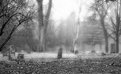
Critique By:
Andrew Lopez-Calvete (K:2441)
10/8/2003 12:08:58 PM
This is my favourite, but it doesn't show the amount of growth of ivy.
|
| Photo By: Andrew Lopez-Calvete
(K:2441)
|
|
|
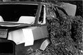
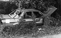
Critique By:
Andrew Lopez-Calvete (K:2441)
10/8/2003 12:07:22 PM
Yep, I hear you all on this one, unfortunately I stumbled across it with suprema 200 in the camera, went back with tri-x and the car was gone!! This is one of several shots taken of the car, the attached is more off centre, does it work better?
|
| Photo By: Andrew Lopez-Calvete
(K:2441)
|
|
|
Critique By:
Andrew Lopez-Calvete (K:2441)
10/8/2003 11:38:46 AM
As I mentioned before, the white square is an official notice from the council to remove the car. The frame is a little tight, mainly becasue I wanted to ultimately get in much closer when I cropped in PS. In retrospect I prefered it a little looser so I left it, but yes, you are right it would be better back a couple of steps. The bit of white in the left hand corner never bothered me, but now you mention it it does! I'll post a MkII version with suitable amendments. Thanks for the feedback Matej, helpful as always!
|
| Photo By: Andrew Lopez-Calvete
(K:2441)
|
|
|
Critique By:
Andrew Lopez-Calvete (K:2441)
10/8/2003 11:12:19 AM
The overexposed-ness (is that really a word, if not, it is now!) is soemthing that happens whenever I upload B&W images to the site. I've mentioned this on all the discarded series so far and I'm trying to fiddle with colour profiles and all sorts to get these images to not look washed out. The white box is a notice saying, you have 30 days to shift this heap or we'll do it and charge you for the privaledge, or something like that. Don't mess with Richmond borough council!!!
Thanks for taking the time to make constrcutive comments jake, its a rare thing these days!
|
| Photo By: Andrew Lopez-Calvete
(K:2441)
|
|
|
Critique By:
Andrew Lopez-Calvete (K:2441)
10/8/2003 10:08:56 AM
Still a good shot Kelly, but I prefer the original more and I've just realised why. Its not that this needs to be in B&W, it needs to be in A mono tone, not necessarily black. Because of the misty look you have given it the image looks older than it is, almost like an albumen print or a heliogravure. I think a nice selenium or sepia tint effect would suit this nicely. Alternatively, if you want to be really experimental desaturate the image and then use photo shop to hand tint it in pastel shades in order to get the authentic pre-colour film look. If you paint onto a semi transparent layer (say 35%) over the background layer in full rich colours, you should get the right effect. If you use some unnaturally vivid colours you'll get something reminiscent of a hand tinted dageurotype.
Like I said though, still a nice shot, I especially like to see people who are openly learning about photography and photo manipulation not using every single effect PS has to offer, the misty diffusion is subtle and works.
PS Marc got some of his advice right...put the camera in manual.......Thats all you need to know. Its hard at first but its the only way to learn. The only thing that you should need to have on auto is focus (years of sitting in front of my Mac have left me with far from perfect sight and Canon USM lenses do it sooooo much better and soooo much faster than I ever could!)
|
| Photo By: Kelly Anbach
(K:4375)
|
|
|
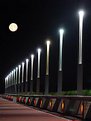
Critique By:
Andrew Lopez-Calvete (K:2441)
10/7/2003 10:44:09 AM
Its a shame that the moon is not part of the frame as it really makes this pic. Unfortunately the shadows on the bridge are the result of a light source camera right and out of frame, which we could asume to be the real moon. Having said that there is evidence of light on the foliage to the right of the shot but the position of the moon would have definately thrown at least a little shadow of the lamp posts.
Also, the shot is a little blurred because the shutter speed is less than the reciprocal length of the lens. Its only a rule of thumb, but its pretty trustworthy. If you are at 100mm, you need a speed of 1/100 or more or you have to use a tripod. Doubtlessly loads of photo theory experts will give me chapter and verse about the effect of apperture etc, but remember that the greater the aperture, the lower the depth of field and the more of the image that is blurred in the first place. Rules are for the assistance of thinkers and the strict adhearance of idiots, but generally this one is worth remembering.
|
| Photo By: Kai Aust
(K:330)
|
|
|
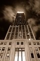
Critique By:
Andrew Lopez-Calvete (K:2441)
10/7/2003 10:21:10 AM
Is the blur in the sky the result of the 3 second exposure or a bit of PS work? I'm suprised at how sharp the entire frame is considering the stop you used. The overall effect is truely splendid, surpassing even your shot of the memorial lights (which was pretty damn fine!). Your next project is my favourite building in the whole world and one that I have never actually seen in the flesh......the chrysler building, If I may request a lovely picture to put on my wall alongside the one by Serge Lurie that my GF brought back form NY last time she was out there. Thank you very much ;-)
|
| Photo By: Tomasz Jakubowski
(K:354)
|
|
|
Critique By:
Andrew Lopez-Calvete (K:2441)
10/7/2003 8:51:34 AM
Wonderful perspective on a familiar landmark. All the better for the difficult lighting conditions which you have managed to deal with very well. (modern city skies are so poluted by light and fumes that its difficult to tell these factors from reciprocity failure! :-) )
Its a shame that, like every picture here, the very necessary compression means quality suffers. I recently posted a similairly unusual shot of the London Eye and felt very disapointed when the latice work supporting the structure became indistinct at 72 dpi and 640 pix. I'd love to see a really good sized print of this one.
Welcome to the group.
|
| Photo By: Peter Ertl
(K:-8)
|
|
|
Critique By:
Andrew Lopez-Calvete (K:2441)
10/7/2003 6:23:28 AM
We ought to start this as a new project Christian. Revenge of Bill Stickers or something like that!
|
| Photo By: Andrew Lopez-Calvete
(K:2441)
|
|
|
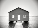
Critique By:
Andrew Lopez-Calvete (K:2441)
10/6/2003 2:49:03 PM
Morton, the embodyment of understated elegance! I love the angle you've got so the pier and the horizon meet perfectly, which adds a very eye catching element to such a simple frame. Initially you get pulled into the whole serenity of the scene, then part of you starts trying to resolve the perspective. Please tell me this is a tight crop or two stiched images and that you do not have a hasselbald X Pan as I will be very jealous and take back all that lovely beer I mailed you ;-)
|
| Photo By: Morten Jensen
(K:357)
|
|
|
Critique By:
Andrew Lopez-Calvete (K:2441)
10/6/2003 2:36:20 PM
Tobiah, excellent pointers from someone who obviously knows his action shots. With regard to the radio slaves you can get canon own brand ones which are fantastic but carry the usual Canon high price tag. If you think thats bad try getting a quote for a f1.8 fisheye from them......GULP!! Whilst I was shooting on the south bank I saw another photog with a 1ds, canon fisheye and two slaves, I bet his insurance company loves him!!
Ice pick, yeah very cool, Tobiah definately has an eye for this. I think he should contribute a 'how to guide' for the forum!
|
| Photo By: Michel Ayala
(K:0)
|
|
|
Critique By:
Andrew Lopez-Calvete (K:2441)
10/6/2003 1:56:30 PM
Richard. Yeah, you're right, but I'm a graphic designer so I live and breathe PS and tend to rely on it too much. I've been trying to be a bit more 'dogma' about the process and only touch levels and curves to get images looking right. However, just to prove I can do it, I've dodged the trees and also darkened the sky to make it more menacing. Thanks very much for the feedback, its nice to get something constructive for a change!
|
| Photo By: Andrew Lopez-Calvete
(K:2441)
|
|