|
|
Critique By:
Andrew Lopez-Calvete (K:2441)
10/28/2003 9:43:18 AM
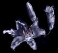
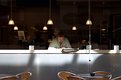
Paul, you've lost me! I thought after playing 'what is it' with that shot of the Eisenhower center I would be good at this game but I have noooooooo idea what this is!!
|
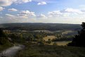
| Photo By: Paul Newberry
(K:276)
|
|
|
Critique By:
Andrew Lopez-Calvete (K:2441)
10/26/2003 1:37:26 PM
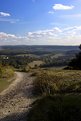
Thanks peter but its actually underexposed! The shot was basically an accident anyway but after looking at it I wanted to try and bleach out as much extraneous detail as possible, so my ideal would be to loose any defined 'edge' on the left side. I could mess with it more in PS but as I've said before, I'm trying to stop my relance on the digital darkroom to sort out image issues. This image is already a bit overprocessed but if I hadm]n't gone this far it would have been unusable. Posting this is more an excercise in the critique of serendipity than my own limited skills.
|
| Photo By: Andrew Lopez-Calvete
(K:2441)
|
|
|
Critique By:
Andrew Lopez-Calvete (K:2441)
10/24/2003 1:33:49 PM
POTD = photo of the day...it was a compliment!
|
| Photo By: Toini Blom
(K:2039)
|
|
|
Critique By:
Andrew Lopez-Calvete (K:2441)
10/23/2003 12:24:34 PM
Ask me at about 10:30am tomorrow George!
|
| Photo By: Andrew Lopez-Calvete
(K:2441)
|
|
|
Critique By:
Andrew Lopez-Calvete (K:2441)
10/23/2003 10:04:21 AM
Hang on.....I've got it on a short cut somewhere.....er, I think its option, er control........er shift.........mmmm, ah yes F7:
beautiful capturing, I am lovin of the vibrancy.
No its not that one.....er F2
Wonderful tones and contrastings
Sod it, hang on..........option control F10
http://www.ladyboylovenest.com/users/platinumclub/andrewlop ezcalvete/vip/html
er....sorry about that..er option, shift F3
Smart arse!
Yep thats the one!
Calvers
PS I'm glad its not just my pics that Lisa leaves sarcastic remarks on...how can one so gorgeous be soooooooooo cruel ;-)
|
| Photo By: Richard Marriner
(K:6657)
|
|
|
Critique By:
Andrew Lopez-Calvete (K:2441)
10/23/2003 9:54:33 AM
Richard, I swear you are using this site to 'come out'!!!
Big snogs (probably with tongues)
;-)
|
| Photo By: Andrew Lopez-Calvete
(K:2441)
|
|
|
Critique By:
Andrew Lopez-Calvete (K:2441)
10/23/2003 9:52:55 AM
Diane, thanks for the comment but as I keep on saying I'm rounding out my portfolio and trying to complete projects. Its not underexposed, the haziness is from the lack of a UV filter more than anything, coupled with a loss of contrast by merit of the small aperture. In an ideal world I would have exposed this a little more and used an 8ND grad to bring out the sky, but guess what, that was back in the studio attached to the lens that also had my 58mm UV!
I part of what I do for a living is retouch in PS. Usefilm is a bit of a playground where I experiment with things I don't normally do. I therefore try not to use PS for anything other than minor tweaks. Sure I could have burnt in the foreground, stuffed tons of contrast into the frame but thats going too far from what I shot and I'm trying to stop 'overprocessing' everything unless its to achieve an effect difficult/impossible to recreat in camera.
One small point, if I was to genuinely replicate Joe Cornish (it was a joke!) I wouldn't be using a 6.3MP digital SLR. I'd be lugging a big Ebony camera around with me. I know that equipment isn't everything but I think we all have to aknowledge that its foolish to try and match the results from two so radically different formats.
|
| Photo By: Andrew Lopez-Calvete
(K:2441)
|
|
|
Critique By:
Andrew Lopez-Calvete (K:2441)
10/23/2003 3:04:03 AM
Thanks suzanne but like I said "rounding out my portfolio", I've yet to shoot any wildlife yet, and if theres one thing I hate more than landscapes its wildlife.
Must run I have a horrible feeling I'm spending the night in a squat! (the things I do to get in print!)
|
| Photo By: Andrew Lopez-Calvete
(K:2441)
|
|
|
Critique By:
Andrew Lopez-Calvete (K:2441)
10/22/2003 11:45:14 AM
it sucks and it was cold and windy.
|
| Photo By: Andrew Lopez-Calvete
(K:2441)
|
|
|
Critique By:
Andrew Lopez-Calvete (K:2441)
10/21/2003 3:38:34 PM
Two equally obtuse comments from the cutest/wierdest women on Usefilm! ;-)
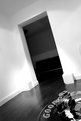
Yeah, the walls, I think the one in shot has a microscopic texture to it that is ruining the whole minimalist thing, I must get my interior designer back to sort that out LOL!
The other room has exactly what you would expect in a poncy freezing cold house.......hideously expensive glass table and a stylish but otherwise useless light fitting!
Just because both of you can't see your walls for the padding!
|
| Photo By: Andrew Lopez-Calvete
(K:2441)
|
|
|
Critique By:
Andrew Lopez-Calvete (K:2441)
10/21/2003 1:20:57 PM
Ah paul, I'm glad to see that you finally saved up enough for the licensed Christina Aguilera love doll you've been hankering after!
I've got the info from my printers, I'll mail you tomorrow with the details.
Calvers
PS. Hetty is back on friday, we ought to sort out dinner soon. I've got a job to write/shoot restaurant reviews for a local mag so I'm spoken for this saturday but maybe the weekend after?
|
| Photo By: Paul Newberry
(K:276)
|
|
|
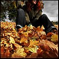
Critique By:
Andrew Lopez-Calvete (K:2441)
10/21/2003 12:16:48 PM
Why haven't you submitted this under autumn colour 2001....er appart from it being 2003?!!
Love the crop, doesn't need the face because its not about the face, I get it, i'm behind you, ignore all others.
Smashing stuff as usual, my only question is why is this not POTD? or should that be photo of the season!
PS is this straight out of the 100 or have you increased the saturation?
|
| Photo By: Toini Blom
(K:2039)
|
|
|
Critique By:
Andrew Lopez-Calvete (K:2441)
10/21/2003 11:59:30 AM
Thanks but I think it sucks! It looks better on my screen full res but it still sucks. I have a better version which I will have to load tomorrow as the site is saying I have exceeded my upload (which I haven't) humph.
Like I said, "rounding out my portfolio".
|
| Photo By: Andrew Lopez-Calvete
(K:2441)
|
|
|
Critique By:
Andrew Lopez-Calvete (K:2441)
10/17/2003 2:25:53 PM
I take my hat off to you.....I tried giving you a 13 rating on everything but all I ended up with is Biro marks on my screen.
You are the funniest man alive!
|
| Photo By: Richard Marriner
(K:6657)
|
|
|
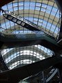
Critique By:
Andrew Lopez-Calvete (K:2441)
10/15/2003 3:56:35 PM
Wow, what a structure, could you add some info about what and where it is? I kept looking at it and trying to work out if it was a composite, or a fisheye, or what, but I guess its just the way the structure has been built. I love modern roof spans.
In all fairness it would be difficult not to take a good photo of such an incredible space!
|
| Photo By: Kai Aust
(K:330)
|
|
|
Critique By:
Andrew Lopez-Calvete (K:2441)
10/15/2003 3:52:17 PM
Check out paul newbury's folio, he has several of the man who cannot fly Mr Blaine.
|
| Photo By: J. Dodds
(K:16)
|
|
|
Critique By:
Andrew Lopez-Calvete (K:2441)
10/15/2003 3:46:32 PM
Guilty as charged! I have a Hoya half image filter which I bought thinking "oooh I could do soemthing really creative with that" and have never cracked the seal on it. Mr 'digital darkroom' here, is too hooked up with PS to belive that traditional methods can pay dividends (and be much easier in the long run). As somone else said it snot just that this is a brilliantly concieved picture but also the methodology that deserves praise. It really is one of those "why didn't I think of that" images.
Pity the light levels changed very subtley between exposures as I can very faintly see a slight difference in the wall where the filter was.
Brilliantly concieved and executed, truly deserving of POTD
|
| Photo By: Kostas Tzanetos
(K:22012)
|
|
|
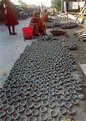
Critique By:
Andrew Lopez-Calvete (K:2441)
10/15/2003 12:48:21 PM
I agree with Ami on the cropping but only in respect of loosing that awful blown out sky at the top! If you exclude that, you are loosing a lot of head room and cramping the person making the bowls and I think that lessens the effectiveness of the picture. However, down to business!
1/ I think the film is not doing you any favours here, I'm assuming that it is run of the mill kodak. The colour saturation is not great and the contrast is weak. I strongly recommend trying a pro film (personnally I like fuji NPS 160 for everything that is in full light and not moving much, but try a few and see what you like). Always remember to use it and process it quickly and store it out of the camera in the fridge, otherwise you get a lovely colour cast to the highlights
2/ I think the scan is letting the image down, the res looks a bit low and the screen/ccd/print has a few imperfections.
3/ The Vivitar has TTl and not a lot else, where did you meter? The bowls look to give a nie even 18% grey surface to meter off but I'm not sure if the Viv has a very narrow spot meter, centre wweighted or whatever. I t looks like it could have taken a stop down.
4/ The focus is a little indistinct. Part of this is the aperture at 3.5. are you sure about this as this looks like an EV 11-13 scene and I would have guessed 1/250 at f4 for this.However, this is giving you a very short depth of focus (though the shot doesn't suggest the aperture was that wide). i would suggest at F11 1/30 or F8 1/60 depending on how steady your hand is and what the focal length of the lens was when the shot was taken. Both of these would increase the DOF and give more clarity across the field of view.
5/ Okay, now this gets confusing and I'd bore everyone to tears if I started rambling about it here....Hyperfocal Distance. This basically gives you the maximum clarity across the focal length selected. if you point your browser to http://dfleming.ameranet.com/hyperfocal.html there is a very good easy to understand explanation. I think there is a calculator there if your lens does not have the little scale under a plastic cover (ahhhh, thats whats its for!) which you can print and put in your camera bag.
Now that the criticisim is out of the way can I just end by saying that the technique used to capture the shot needs work but the eye that saw and composed it needs no help whatsoever. The composition, the recognition of a subject that is interesting anthropologically, works as a travelogue, and is just easy on the eye with that wonderful pattern, shows real talent.
have look around the forum, dammit, look in my portfolio! You'll find lots of shots perfectly exposed, composed, focussed and processed yet what they are of are as dull as dishwater, mainly because they lack any originality. A lot of people have a concept of what a classic 'arty' photo should be and simply recreate it, stuff like that is worthless (and I'm guilty so I can't cast the first stone). I'm actually convinced that Hasselblads only shoot two shots; nude on rock and long exposure beach/cliff with 0.9ND filter!
I think its very telling that you are one of the few people on the forum that have equal Charisma and Karma ratings, how many old hands do you see with a charisma of 100 and karma of 20,000? I think your rating speaks volumes.
I'm not aware of the local market for cameras and I applaud you for using an almost fully manual camera. However, if they are available, its worth looking for second hand stuff at this price point. In this country a Viv 3800n is about £150 (I think) and I recently saw a very nice canon F1 for less, a camera that is all but indestructable (not leica indestructable but not far off) and was once arguably one of the best cameras in the world.
To cut a long story short (too late!) its a great picture and I shall be adding you to my friends list so I make sure I see all your new posts as soon as they are available.
|
| Photo By: raju bhattacharya
(K:655)
|
|
|
Critique By:
Andrew Lopez-Calvete (K:2441)
10/15/2003 11:48:32 AM
White jacket in full sun, whatya gonna do? Theres not enough detail in the jacket to burn and any less exposed would have lost the detail in the background.The day Hoya make an ND filter the excat shape of her jacket I'll retake it :-)
Igor, just saw your pic called 'alone'...Wahey, I was right!!!
|
| Photo By: Andrew Lopez-Calvete
(K:2441)
|
|
|
Critique By:
Andrew Lopez-Calvete (K:2441)
10/15/2003 6:58:09 AM
I'll bung it in my diary. Anway, who told you I carry a rifle in my tripod bag, especially when I'm around westminster?!!
I'll get a keen shot at you one day Livingstone, you and your bloody congestion cameras....grrrrrrr :-)
Hang on, thats a joke about murdering someones wife and another about shooting Ken Livingstone in the same post. I'd like to make it clear that I'm not a 'psychopath', my analyst refers to me as simply 'disturbed' which is a much lesser condition.....argh the voices in my head, someone stop the voices in my head!
|
| Photo By: Andrew Lopez-Calvete
(K:2441)
|
|
|
Critique By:
Andrew Lopez-Calvete (K:2441)
10/15/2003 3:36:49 AM
1/ If the paintings are your own work, you are to be congratulated on some very fine work. Being a fan of Magritte and hopeless with a DeVilbiss (I discovered macs in 1993 and its been in a draw ever since...shame on me!) I'm genuinely impressed. Do you have your work on line as I'd love to take a look. Mail me at calvers@soma-design.co.uk.
2/ My only real concen with this image is the apple which you have matted onto the bench. It looks too flat and needs something to link it to the diegesis, a bigger shadow or reflection on the floor would help more than the shadow on the bench, but the crop excludes the floor around it. Personally I'd have just excluded it and left an almost uncomfortable balance of the frame. Indulge me and post a copy sans apple and I''ll give it 7/7 and add it to my favourites list.
Having said that its won competitions, who the hell am I to judge?!
Nice work.
|
| Photo By: Ben Goossens
(K:491)
|
|
|
Critique By:
Andrew Lopez-Calvete (K:2441)
10/15/2003 3:27:34 AM
It looks like your grainy shot syndrome has cured itself as this one looks 100% pin sharp. Best of the bunch from a 'newsworthy' perspective but I still love the one taken through the fence.
Hang on......is that cyclist centralised in the frame, oh, no its okay, his hubs are the focus and they are at nodes of the thirds grid! :-) Actually if you follow that theory the focus of this shot could be his arse (sorry, my canadian GF has told me to translate this for you....ass!), are you trying to subtely 'out' yourself via pedantic photographic theory?!
Great shot mate.
|
| Photo By: ryan winton
(K:3027)
|
|
|
Critique By:
Andrew Lopez-Calvete (K:2441)
10/15/2003 3:21:05 AM
Yeah, blown out arm, I actually experimented with putting a 1 pixel line across between it and the counter but thats cheating! I bracketed the shot and the one 2 stops down has better definition in that area but you loose his face, I might clip it out and matt it onto this image and re-post.
Thirds, yep, if you take that lower black line I guess it does run across the central horizontal third, I think my agro about thirds is everyones obsession with off centre composition, in the 50' and 60's it would have been plain odd to do it, now its the norm.
I think I'll give up and get a pop 3 at clones.com (calvers@clones.com?).
|
| Photo By: Andrew Lopez-Calvete
(K:2441)
|
|
|
Critique By:
Andrew Lopez-Calvete (K:2441)
10/14/2003 2:39:31 PM
George, classic shot though its tonally a little flat. You mention that you are new to the 10d, be aware that you are probably going to have to get used to running everyhting it outputs through PS to get everything perfect. Don't look at it as a deficiency of the camera but rather an opportunity to get into developing! PS is your digital dark room. Alternatively the Canon software is really good. For hurriedly prepared press stuff that is normally my first port of call and it can sort out most things fast and efficiently.
I took the liberty of having a five minute twiddle in photoshop and tweaked the contrast, levels, burnt the sky and then dodged some of the darker areas of the baot to balance it out. Please be aware that the file size and the time spent make my attachment far from a masterpiece but hopefully it gives you a rough idea of what I mean.
Two further comments would be the cropping of the stern of the (very fine) yacht (its not yours is it?!) Given the viewfinder crops anyway were you going for a tighter compostion? With a shot like this you can go either way, show the subject full frame or really be quite aggressive with your crop. If in doubt pull out! you can always crop down later.
I'd also question the desaturation of the image, I recon this would be even nicer in full colour with the saturation pushed up a little, levels sorted and a bit more contrast.
You asked about the Sigma 17-35mm. Its a lovely lens if not the most portable. It really is very heavy (but very robust) and pretty fat. Having said that, when it has the scalloped hood attached I almost could be mistaken for a proper photographer :-).
Over in the states you guys are lucky, new te lens costs £400, though I picked mine up nearly new for half that, probably what you'd pay in dollar equivalent. Its worth shopping around for a bargain. Overall its highly recommended, the focal length equates to roughly 28mm - 50mm on the 10D, so it means you get the bottom end of all those cheapy USM zooms back. Having said that at 17mm the aspherical lens does give a degree of distortion which I make maximum use of for action photography and I prefer it to a fish eye (Okay I can't afford a fish eye!).
If buying second hand make sure you look for a graunchy noice when you zoom and for dust inside the lens. Also, some earlier ones need to be chipped by sigma to work with the 10D (if you get one of these it will be stuck on f2.8 whilst everything else works) so best not buy it mail order. Also budget for a UV filter, it takes and 82mm which is a whole bunch more than the 58mm you are probably used to buying.
Buy one, stick it in your bag and you'll be a happy snapper
|
Photo By: George Black
(K:102014)

|
|
|
Critique By:
Andrew Lopez-Calvete (K:2441)
10/14/2003 1:14:21 PM
When I saw the preview of this I thought, "here we go, Blad user showing off and taking the ubiquitous 'arty shot' of heavy skies and a lighthouse".When I saw it I though "oh good, its someone trying to do the aforementioned shot with a 2MP digital camera, get the red pen out!" Then I saw it was a holga...gulp
...I eat my words before I can utter them, I actually think this is pretty bloody marvelous. I'm only going over to cutting edge Holga technology when Kodak make a 14MP digital back for them.
|
| Photo By: Ken Zheng
(K:17)
|
|
|
Critique By:
Andrew Lopez-Calvete (K:2441)
10/14/2003 11:25:20 AM
By the way, the Strangers On a Train title is an homage to Hitchcock and his film of the same name. In the opening sequence ( a fine example of his general to specific intros) you follow two sets of feet that finally touch on board a train and the action starts.
Ironically, after this shot was taken, I went on to murder the wife of the other person in carriage and mannaged to steal his lighter :-)
|
| Photo By: Andrew Lopez-Calvete
(K:2441)
|
|
|
Critique By:
Andrew Lopez-Calvete (K:2441)
10/14/2003 11:20:35 AM
Okay, off centre is cool, but I'm getting bored with rule of thirds and no centraalised framing. I'm shooting a lot of stuff at the moment with centred framing and it only looks bad because its 'old fashioned' and 'not creative'. Lifes one big experiment!
|
| Photo By: Andrew Lopez-Calvete
(K:2441)
|
|
|
Critique By:
Andrew Lopez-Calvete (K:2441)
10/14/2003 11:17:30 AM
Lighting conditions were a little difficult, if I'd have gone down a stop then the right side would be underexposed. The light was so harsh that there is not a lot to burn in either, though I could sample the right 'hemisphere' and matt it in. I would normally agree on the centering thing but I actually like this. I was conciously going for a tourist postcard shot and the linear form of his hair looks OK centered.
The PS work consisted of a quick levels tweak, copying the background to a new layer, selecting a fine brush for the eraser and roughly exposing the hair through the copy layer. Total time expended.........10 mins (if that). Why, 'cause I hate this kind of shot!
Yannic, I'm glad we both agree that we hate this!! :0
|
| Photo By: Andrew Lopez-Calvete
(K:2441)
|
|
|
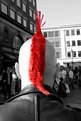
Critique By:
Andrew Lopez-Calvete (K:2441)
10/14/2003 5:31:58 AM
yeah, I was less than meticulous with this one, as I said, its just an experiment. More noticable is the fine tinge of skin tone on the right hand side of the Mohican!
|
| Photo By: Andrew Lopez-Calvete
(K:2441)
|
|
|
Critique By:
Andrew Lopez-Calvete (K:2441)
10/14/2003 4:51:41 AM
Okay, you know how I always bitch about overuse of PS? This doesn't count! Personally I use PS almost exclusively for tidying up shots and haven't done any creative manipulation for a fair while, but what you've created here shows both a strong understanding of the package and a sensitive approach to the subject. The manipulation adds plenty of interest and is virtually seemless. Everyone who believes that photo manipulation means taking a perfectly good image, adding motion blur, three art filters, plastic wrap and then a nice linen texture should look at this and learn.
Having said all of that there are some things that I PERSONALLY would have done differently, not that there is anything inherrantly wrong here, just a matter of taste:
1/ Lose the motion blur. This would mean that the left hand edge of the subjects hair wouldn't struggle to get a nice defined edge.
2/ The book effect is good but I would add a layer with a graduated fill constrained to a mask around the book/face. Then by making this your top layer and either making it either translucent or using a layer mode like screen, you would have a perspective associated with the book rather than the face.
3/ lose the reflected face and just give plenty of eye space to the front of the subject. Having said that I'm looking at this as an individual image rather than in contect with whatever you are trying to say with this piece.
Great shot!
|
| Photo By: Ben Goossens
(K:491)
|
|