|
|
|
sanjeev jain
{K:8763} 8/13/2005
|
wonderful it appears that
i collected the mud and
u created a figure out of it.
this is more close to what i saw.
thanks for the work u did for me
|
|
|
|
|
Carsten Ranke
{K:14476} 8/12/2005
|
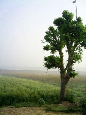
Sanjeev, I see your point and appreciate your intention. I find myself so often tempted to pull the sliders in PS too much than I should do... But if you use PS well dosed and selectively you can really increase the impact of your work -
what do you think if you create a gradient from front to background, that enhanced the depth and makes a natural feeling of increasing foggy tones towards the horizo ?
I adjusted levels and made a soft light blended color contrast enhancement on a background layer copy in PS, and masked the layer with a gradient from front to horizon so you get a more crisp tonality in the foreground and a foggy appearance in the background - as in real life ;-)
Cheers
Carsten
|
|
|
|
|
 Khaled Mursi Hammoud
{K:54005} 8/11/2005
Khaled Mursi Hammoud
{K:54005} 8/11/2005
|
I like the pastel colors of the photo and the mood a lot but I wish you didn't crop the right side of the tree and gave some space too (imho).
Anyway, the foggy enviroment is beautiful and moody... good work Sanjeev, I like your version with the soft colors more coz it's very moody this way,
Khaled.
|
|
|
|
|
sanjeev jain
{K:8763} 8/10/2005
|
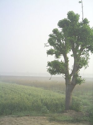
thanks for ur effort see the difference between the two tree i could have done the same thing that u did but then how would i have shown the green leaves the melting fog and the faint colour spread in the field. perfection from photshop is many times kills the image so i dont follow it and this is one of those crazy situation where my senses work finer than that of photoshop maria. thanks for ur comment and concern. but tell me how u like my explaination
|
|
|
|
|
Maria Weidner
{K:883} 8/10/2005
|
it's nice, but what about brighter colours? :)
|

|
|