|
|
 Roberto Arcari Farinetti
 {K:209486} 9/8/2006
|
relaly cool postcard and great colors!
best wishes
roby
|
|
|
|
|
Michael Alexander
{K:5293} 7/23/2005
|
Brad, I love the feel of this one, like you said, it?s got that vintage type Polaroid sort of over saturation to it. I liked how you burned in the edges also, very nice touch, adds dimension to the shot. it?s timeless? great shot!
~Mike
|
|
|
|
 Michele Beccia
{K:16550} 7/20/2005
Michele Beccia
{K:16550} 7/20/2005
|
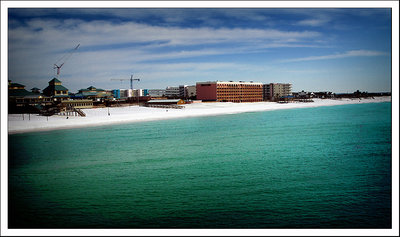
Very good I like the contrast between the sky and the sea. Very nice Brad!
|
|
|
|
|
Carolyn Wiesbrock
{K:14051} 7/20/2005
|
It really does have that vintage postcard feel, amazing work!
|
|
|
|
|
Kelly
{K:20268} 7/20/2005
|
the colour of the water is just gorgeous.. a great shot... CONGRATS on featured critique... well done..
cheers
kel
|
|
|
|
|
Tiro Leander
{K:19060} 7/17/2005
|
i think you've got an effect that makes this shot a bit "out of this world". The colors looks great, yes - cartoony. Congrats.
|
|
|
|
 Thilo Bayer
{K:50358} 7/16/2005
Thilo Bayer
{K:50358} 7/16/2005
|
Hi Brad,
the strange colors and the vignetting for sure add to the image. postcard? I'm not sure ;-) Probably of a weird character =)
nice work.
Thilo
|
|
|
|
 Ursula Luschnig
{K:21723} 7/15/2005
Ursula Luschnig
{K:21723} 7/15/2005
|
I find this view amazing...nobody around at the beach ...the water colours..and the mood you gave it.Just with the right hair of saturation :)
Cheers,Ursula
|
|
|
|
 Peggy Christine Skinner
{K:26936} 7/14/2005
Peggy Christine Skinner
{K:26936} 7/14/2005
|
Well your technique did achieve that postcard quality Brad. The saturation and deep colours of the sky and water offer a wonderful contrast to the pale beige of the sand. I love the rough texture of the water that gives it that 'reach out and touch it' feel.
|
|
|
|
 Jeanette Hägglund
{K:59855} 7/14/2005
Jeanette Hägglund
{K:59855} 7/14/2005
|
I WANT TO WALK ON THAT WHITE BEACH! No - a popstcard would not have the dark vignette!!!! It?s like snow in the summer :)
Jeanette
|
|
|
|
 Bradley Prue
{K:30678} 7/14/2005
Bradley Prue
{K:30678} 7/14/2005
|
Always nice to get favorable comments from someone whos' work I admire like yours, Karen..
Thanks very much!
|
|
|
|
|
Bradley Prue
{K:30678} 7/14/2005
|
Paola...I don't think your numbers go very high! You must work very hard to maintain...
And yes, Florida is an awesome place to visit, as long as it isn't hurricane season! Thanks for your nice comment!
|
|
|
|
|
Bradley Prue
{K:30678} 7/14/2005
|
The water is AMAZING, Kessia. Thank you!
|
|
|
|
|
Bradley Prue
{K:30678} 7/14/2005
|
Always a hoot to get a comment from you, Hugo! I agree that the vignetting is quite dark, I thought that it added to the over-saturation effect that I was looking for. Thank you so much, for your kind words, and for taking note!
|
|
|
|
 Gayle's Eclectic Photos
{K:91109} 7/14/2005
Gayle's Eclectic Photos
{K:91109} 7/14/2005
|
great! will i receive reply soon...huh? ;>
|
|
|
|
|
Bradley Prue
{K:30678} 7/14/2005
|
Thank you, Dina.. Panaramadoooo.
|
|
|
|
|
Bradley Prue
{K:30678} 7/14/2005
|
Your insight is always interesting, and soo welcome, Ian!
|
|
|
|
|
Bradley Prue
{K:30678} 7/14/2005
|
So....ya liked my heartfelt confession, eh Linda?? Thank U!
|
|
|
|
|
Bradley Prue
{K:30678} 7/14/2005
|
Thanks, Kev!
|
|
|
|
|
Bradley Prue
{K:30678} 7/14/2005
|
Thank you, Gayle. I've never done the "Holga" thing, but I see your point, with the vignetting. Yes, I got your hilarious E!
|
|
|
|
 Randy Lorance
{K:24769} 7/14/2005
Randy Lorance
{K:24769} 7/14/2005
|
Yes, the finish of this really does duplicate vintage post card, as well as the coloring. Good job Brad.
Randy
|
|
|
|
 karen clarke
{K:18893} 7/13/2005
karen clarke
{K:18893} 7/13/2005
|
Yes I agree with Gayle definitely better than any other postcards I've seen. I esp. love the color of the water. Pretty cool~
|
|
|
|
 B B
{K:30983} 7/13/2005
B B
{K:30983} 7/13/2005
|
Finally Brad, I was tired to do the count ...on your old photo;-))
I prefer to travel with you in this wonderful site.
I know a little bit the Florida and I like it.
Paola LL
|
|
|
|
|
Kessia & Morgan UVA
{K:7265} 7/13/2005
|
i like the colors a lot...the color of the water is amazing!! i definitely get that 'postcardy' feel to it. Kessia
|
|
|
|
 Hugo de Wolf
{K:185110} 7/13/2005
Hugo de Wolf
{K:185110} 7/13/2005
|
Hi Bradley, there doesn't always need to be a significance to a shot. Creating the vintage postcard feel somehow works; I'd date it mid 70's... The vignetting around the edges is a bit heavy, I think, but it is a creative postprocessing job. Nicely done!
Cheers,
Hugo
|
|
|
|
 Dina Marie
{K:-1410} 7/13/2005
Dina Marie
{K:-1410} 7/13/2005
|
I am loving the colors here whatever the heck you did to them! I also like the almost panaramic feel it has. great brad!
|
|
|
|
 Ian McIntosh
{K:42997} 7/13/2005
Ian McIntosh
{K:42997} 7/13/2005
|
Aha! Upped contrast AND darkened... top tip!
This is nice. I am reminded in your about of a book I saw once but never bought. ?boring postcards?, full of faded photos of ?exciting new shopping centres? in the u.k. and modernist buildings from the seventies. Seemed the genuine article. Not sure it wasnt, who cares, would make a good series. But this actually a charm.
Good ta see Brad.
|
|
|
|
 Linda Imagefree
{K:72276} 7/13/2005
Linda Imagefree
{K:72276} 7/13/2005
|
Cute about Brad, yeah fess up mister, tweaking the saturation ah hah!!! hehehe...very well done, love the vignetting and the white sand contrasted with that blue water..a beautiful postcard for sure..great colors and a great eye you have....very well done...:):)Linda
|
|
|
|
|
Kevin Collier
{K:19076} 7/13/2005
|
...I like it - I am a fan of vintage, hand colored postcards - this one does fit the mold - great work here - K
|
|
|
|
|
Gayle's Eclectic Photos
{K:91109} 7/13/2005
|
Love it! looks like a holgaroid with the colors and vignetting,Brad.......would make a cool postcard and better than most i see around...regards,gayle welcome back,Brad!
(did ya get a chance to read my email? ;> )
|
|