|
|
|
Bruno Caetano
{K:2940} 6/2/2005
|
This whole series is awesome. The way you use the light on the ribbon is amazing. I guess its these sort of exercices that make you better in understanding photography. :( im sooooo lazy.
Great portfolio
Bruno
|
|
|
|
|
Raf D
{K:9223} 6/1/2005
|
This is a super series Laurie!!! Incredible creativity, and while you may not be happy 100% with this, I think the shapes and forms here are very appealling. There's only one part with too much light, but in its own, it's also part of this composition. Incredible work!!! -- Kind regards, Rafael
|
|
|
|
 Roberto Arcari Farinetti
 {K:209486} 5/27/2005
|
eh eh eh.. Laurie, is so wonderful metallic mood my dear!
thanks for all.. roby
|
|
|
|
 Paul's Photos
{K:35235} 5/27/2005
Paul's Photos
{K:35235} 5/27/2005
|
Nicely done.. the lighting is blown out in some areas but I don't mind it actually... good work
|
|
|
|
 Linda Imagefree
{K:72276} 5/27/2005
Linda Imagefree
{K:72276} 5/27/2005
|
Laurie, I like the shapes, I found it interesting, I don't mind the minimal dof here, the contrasting textures are also very nice. Honestly, I found it rather nice to sit here and follow the patterns and shapes...kind of relaxing...and those bronze tones are also very nice. Well presented...:):)Linda
|
|
|
|
|
Laurie Gould
{K:11942} 5/26/2005
|
Alastair,
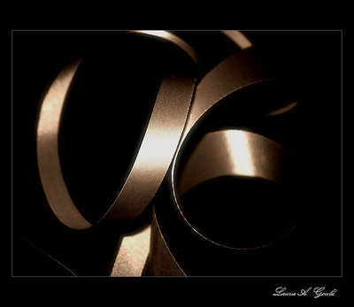
Thanks for your honest comments--they are appreciated. I almost didn't post this one because I wasn't as happy with it as I was with the other two. The lighting was overexposed in a few areas. I tried to fix it with PSP, but I just couldn't get it right. There actually are two types of ribbon here which now that I look at it is kind of difficult to see. But, that's why I went with the title. I have the hardest time coming up with titles for my images. Do you find the same? Somedays I just wish I could leave them all untitled, but I guess that would be a little lazy.
Well, its back to the drawing board with this image. That's the good thing about shooting things like ribbon--I can always set the shot up again and retry! :)
|
|
|
|
|
Alastair Bell
{K:29571} 5/26/2005
|
Hi Laurie! This is excellnt but definitely not quite as good as the others. With 'Ribbon' the eye flowed along the subject seamlessly and with 'Collapse' the title and the subject matched perfectly. In this image it seems more indistinct and muddled somehow. Intertwined suggests two ribbons weaving in and out of one another but that doesn't seem to be what the eye perceives - perhaps a better title may have been 'Tangled'? And the lighting isn't as good... the highlights on this seem to have been blown out a bit whereas on the others they were much better controlled... maybe under exposing the image by 1-2 stops would have helped? I usually find it better to underexpose then bring back in PS if I need to if the lighting is difficult. Oh dear... this all sounds so negative! Please don't be thinking this is a bad image as it is excellent even with the faults - its just that you spoilt us with the perfection of the previous two!!!
The aspects of this that I really like....
It seems there are two different textures on the ribbon - one side is smooth, the other patterned and I like the contrast of the texture. I also like the suggestion of the ribbon in the bottom left corner and the lower right side where it yurns fully side on and is just a thin row of highlights... And I love the tight DOF!
Really good shot Laurie, and thanks for sharing it!
Alastair
|
|


")


