|
|
 Patrick Ziegler
{K:21797} 1/15/2005
Patrick Ziegler
{K:21797} 1/15/2005
|
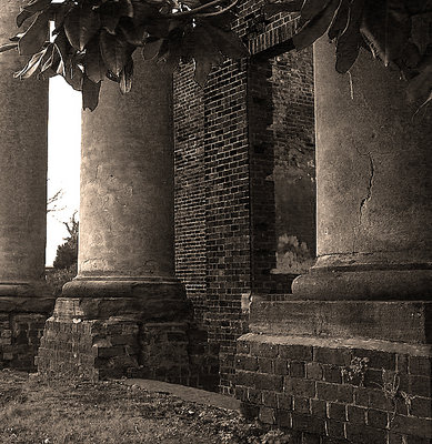
I like the color one. There something about that red brick color I have allways liked.
|
|
|
|
|
Stephen Bowden
{K:64141} 12/30/2004
|
This is super (although I liked the non serious too lol). The tones and textures are great Dottie :-)
Best wishes,
Steve
|
|
|
|
 Marco Maresca
{K:14418} 12/30/2004
Marco Maresca
{K:14418} 12/30/2004
|
Wonderful photo!Per me è meglio la versione Seppia!!! Ciao
|
|
|
|
|
Dorothy Di Liddo
{K:13787} 12/30/2004
|
Thanks for the coomment Howie, if you're ever in VA, you've got a place to stay & I'll take you there. Happy New Year. Dottie
|
|
|
|
 Howie Mudge
{K:27933} 12/30/2004
Howie Mudge
{K:27933} 12/30/2004
|
I like the angle of this building and the tones and contrast. I'd love to visit this place :)
|
|
|
|
|
A K
{K:8499} 12/30/2004
|
Beautiful scene.. love the colour tone too. Gives it warmth and depth.
|
|
|
|
|
Margaret Sturgess
{K:49403} 12/29/2004
|
Sorry I just don't know - you see I like them all
Margaret
|
|
|
|
 Trish McCoy
{K:15897} 12/29/2004
Trish McCoy
{K:15897} 12/29/2004
|
In my opinion I like the brown tones the best. it just gives it something more than the bw or color version. and the brick textures and the crack on the one side seem to stand out more. excellent work here.
|
|
|
|
 Marcus Armani
 {K:36599} 12/29/2004
|
Wonderful shot dottie, I love the old pillars and brick work, your perspective is perfect, I think I like the B&W more as old architecture of this nature, looks more rustic and beautiful....
|
|
|
|
 Paul's Photos
{K:35235} 12/29/2004
Paul's Photos
{K:35235} 12/29/2004
|
nice image.. like the tones and lighting.. good work
|
|
|
|
 Dave Stacey
{K:150877} 12/29/2004
Dave Stacey
{K:150877} 12/29/2004
|
I like the sepia best, Dottie! Apart from that the detail and textures are great, and your composition is perfect.
Dave.
|
|
|
|
 George Black
{K:102014} 12/29/2004
George Black
{K:102014} 12/29/2004
|
Very nice scene. I (slightly) prefer the sepia. Good work.
Regards,
--George
|
|
|
|
|
George Black
{K:102014} 12/29/2004
|
Very nice scene. I (slightly) prefer the sepia. Good work.
Regards,
--George
|
|
|
|
 John Loreaux
{K:86210} 12/29/2004
John Loreaux
{K:86210} 12/29/2004
|
This is excellent Dottie!
The tones are great and the has a Roman feel and mood!Love the antique effect!The columns are really large and I love the texture and crack in the one on the right!
The branches coming down into the photo frame this very well !Nice job My Friend!
Take care!GOD bless!...........JOHN
|
|
|
|
|
Cheryl Ogle
{K:24494} 12/29/2004
|
Very nice image. I like all the textures you captured here Dot - great eye candy. The contrast is fabulous. I like the sepia (because of the brick I think). Good work!
|
|
|
|
 Gustavo Scheverin
{K:164501} 12/29/2004
Gustavo Scheverin
{K:164501} 12/29/2004
|
Hermos foto Dottie!...para mí el sepia es la mejor elección.
Un abrazo!
|
|
|
|
|
Deb Mayes
{K:19605} 12/29/2004
|
Simply gorgeous, Dottie. :) Love the composition of this with the branch framing the ruins, and the textures and tones.
If I had to choose (lucky me, I don't have to), I'd probably go for the black and white version. The sepia is nice and suits the subject, but imho has been done to death, or maybe I've just looked at too many of them. ;) You did a fine job with it, so we'll chalk that up to my personal preference, with no reflection at all on your photo. (I have a hard time appreciating brown during brown season.) Print it and frame it, it's that good.
|
|
|
|
|
Rebecca Raybon
{K:26654} 12/29/2004
|
Great details and toning. The magnolia branch at the top, perfect for framing this. Beautiful image, Dottie.
|
|
|
|
 G G
{K:61359} 12/29/2004
G G
{K:61359} 12/29/2004
|
The sepia gives a little aged effect that I like in your shot. The details are great, and the perspective beautiful. This is a nice image Dorothy. Congrats
Fabrice
|
|
|
|
 Saeed Al Shamsi
{K:47735} 12/29/2004
Saeed Al Shamsi
{K:47735} 12/29/2004
|
I like the sepia version, wonderful overlapping columns and the angle view gives fantastic perspective. Saeed
|
|
|
|
|
Dorothy Di Liddo
{K:13787} 12/29/2004
|
Here's the original. And I know Deb, I need a gradient filter. Perhaps soon. :) I cropped it to rid the photo of the blank white skies.:( Enjoy... Dottie
|

|
|
|
|
|
Kevin Collier
{K:19076} 12/29/2004
|
neat shot - looks antique - I like the sepia better . K
|
|
|
|
 Chris Hunter
{K:25634} 12/29/2004
Chris Hunter
{K:25634} 12/29/2004
|
Ummmm...sepia. Adds a little bit of warmth to the cold structure, the leaves in the top add alot. Also the dual depth-perspective of the two brick walls is nice to view, and works almost as an illusion.
Cheers,
Chris
|
|
|
|
|
Ismael Videa
{K:363} 12/29/2004
|
Me gusta mucho, muy buen trabajo.
Ismael
|
|
|
|
|
Dorothy Di Liddo
{K:13787} 12/29/2004
|
Here's the B&W version, do you think the sepia or the B&W works best...Dottie
|

|
|