|
|
|
Joe Teng
{K:16723} 1/3/2005
|
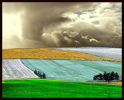
Great editing! But the sky and landscape do not looking matching.
|
|
|
|
 Len Webster
{K:25714} 12/31/2004
Len Webster
{K:25714} 12/31/2004
|
Interesting idea. Rather like a patchwork quilt of natural scenes.
|
|
|
|
 Marcio Janousek
 {K:32538} 12/29/2004
|
absolutely extraordinary work Kevin !!
powerful colours and lights ,
very artistic...
my fav.again..tanks
|
|
|
|
 Dino Lupani
{K:15142} 12/28/2004
Dino Lupani
{K:15142} 12/28/2004
|
SPETTACOLO ! Eccellente sotto tutti gli aspetti, bravissimo.
Ciao
|
|
|
|
|
Keith Naylor
{K:13064} 12/28/2004
|
OK - I'll lend you my 10D - ;-)
just a tad over the top if you don't mind me saying, however the composition is terrific.
K
|
|
|
|
|
Francesco Martini
{K:12249} 12/28/2004
|
fantastic landscape!!!!!!!!
|
|
|
|
 Neil Niamh White
{K:9165} 12/28/2004
Neil Niamh White
{K:9165} 12/28/2004
|
Sorry - I thought it was those GM crops causing the unusual colours. :)
It's very eye catching reagrdless of what else is said. And I guess it's effective in prvoking discussion.
Neil
|
|
|
|
 Tim Long
{K:9228} 12/28/2004
Tim Long
{K:9228} 12/28/2004
|
The UK is so much more colorful than I'd ever imagined. Hardy and Dickens weren't even close! Seriously, maybe excessive color contrast for me, but a striking fantasy light-painting that deserves attention (Unusual Vision, people!) Keep it up, Kevin. (Is that Danny behind the seventh bale?)
|
|
|
|
|
Jaroslav Dole?al
{K:785} 12/28/2004
|
Very nice colors ....
|
|
|
|
|
Alastair Bell
{K:29571} 12/28/2004
|
I like the photo but I'm afraid I'm not a fan of the overly vivid green foreground. It would be good to see this as a sepia toned print as I think the stormy sky would come up incredibly well and the patterns and textures would be more emphasized. A very interesting experiment! Thanks for sharing it!
|
|
|
|
|
Efi Keren
{K:754} 12/28/2004
|
i like the result of PS. for me you don't need to ask for excuse-i think PS is an art tool to express yourself. that what you've done
|
|
|
|
|
Marcello C
{K:169} 12/28/2004
|
Imho, there's too much difference between the sky and the land. ok for the effects, but it looks like 2 different pictures glued
|
|
|
|
 Pawel Sadowski
{K:288} 12/28/2004
Pawel Sadowski
{K:288} 12/28/2004
|
i know! it remembers me of hand colored B/W phtos. but... still the same as above.
|
|
|
|
|
Pawel Sadowski
{K:288} 12/28/2004
|
the shot is good, but with the colors it looks like composed in photoshop. not natural for a natural photo, to little unnatural for an interresting photoshop edit.
|
|
|
|
|
KEVIN TEMPLE
{K:8657} 12/28/2004
|
it is a fanticy shot hence the colours
|
|
|
|
 ISMAEL MARCOS
{K:10535} 12/28/2004
ISMAEL MARCOS
{K:10535} 12/28/2004
|
VERY WELL COMPOSED BUT NO NATURAL: EYES SEEK AND SEEK AND THE CAN?T STOP. THAT'S I FEEL.
SEE YOU.
|
|
|
|
|
Pawel Sadowski
{K:288} 12/28/2004
|
IMHO, the colors are to strong. They arent real, are they? Maybe because i dont like this kind of green, as in the middle :) Maybe the same, but in natural, strong colors?
|
|
|
|
|
KEVIN TEMPLE
{K:8657} 12/28/2004
|
Can you see Danny Brannagin behind one of them bales trying to pick up tips from the master.(If he would only ask I will show him how to!
|
|


")