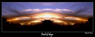
Hi Miguel, the mirrored image works well, no weird angles, and a very creative view. Good work, and great tones. I do like the presentation with the thin white line, but would've removed the text in the black; it removes the attention from the image itself. Besides, the title is written right below it... I think your name in the lower left corner would work, but I'd select a less elaborate font; it's barely readable:)
Ahh, mirrored image. I like it Miguel. The colours and the dark foreground allow for an image like this. Keep up the great work and continue the originality.