|
|
|
Carlheinz Bayer
{K:14220} 7/8/2004
|
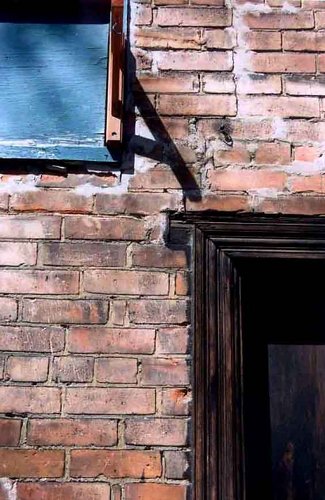
I like the square format, but admit that the other one works better. Great capture! C.
|
|
|
|
 Guido Frizzoni
{K:517} 6/20/2004
Guido Frizzoni
{K:517} 6/20/2004
|
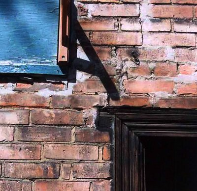
Nice work, good composition, but I think the original composition is more equilibrated: for me, the shadow in the "square" version is a little disturbing, creates too much tension.
Anyway, this demonstrates that there are so much different ways to see the world around us!
Cheers,
Guido
|
|
|
|
|
robert jedrusik
{K:806} 6/15/2004
|
hmmmm... the cut is o'k but that shot overturn ;-)
|
|
|
|
 Di Ciuccio Maurizio
{K:57398} 6/15/2004
Di Ciuccio Maurizio
{K:57398} 6/15/2004
|
uno scorcio interessante e piacevole..dettagli e colori molto belli..ottima composizione..ciao da mau
|
|
|
|
|
Lucy Bernadette
{K:5806} 6/15/2004
|
sorry, original here:
|

|
|
|
|
|
Lucy Bernadette
{K:5806} 6/15/2004
|
i was trying to square up the image, but don't know if i've been successful. i can't decide if the shadow in the middle helps or hinders. i've attached the original.
|
|