|
|
|
Christian Barrette
{K:21125} 6/23/2004
|
Hello Hugo.
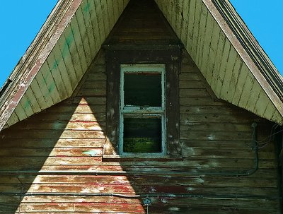
The idea I had while composing the shot was to have the cropped triangle of the roof continued in the triangle of light, and, as you have noticed, since this one was on the side, then to have the window well centered.
|
|
|
|
 Don Loseke
{K:32503} 6/13/2004
Don Loseke
{K:32503} 6/13/2004
|
This is interesting. The peeling paint. Great composition. VEry nice Christian. Don.
|
|
|
|
 Hugo de Wolf
{K:185110} 6/13/2004
Hugo de Wolf
{K:185110} 6/13/2004
|
Hi Christian, Very clever shot. Normally, omitting the top of the roof would've been someting to comment on, but the near conguent patch of sun makes up for it perfectly. The "triangle of light" adds a relative sense of depth and diagonal composition, eventhough the shot itself is dead on and centered.
The weatherbeaten texture is very well captured, both in the dark parts, as well as in the bright spots. The colour of the sky could use some saturation, IMO, but that's about it. Very effective solution.
Good work!
Cheers,
Hugo
|
|
|
|
 Roberto Arcari Farinetti
 {K:209486} 6/12/2004
|
fantastica.. many thanks
roby
|
|
|
|
 Laercio Gomes
{K:3645} 6/12/2004
Laercio Gomes
{K:3645} 6/12/2004
|
Trabalhou bem o foco e a sombras. Bonita foto.
|
|
|
|
 NN
{K:26787} 6/12/2004
NN
{K:26787} 6/12/2004
|
PS. Tomorrow I?ll submit my "angle" ;-)
|
|
|
|
|
NN
{K:26787} 6/12/2004
|
Nice work Christian! So many different lines, and extra parallel lines added by the lighting - well seen!
|
|