|
|
 RC. Dany
{K:64104} 3/24/2009
RC. Dany
{K:64104} 3/24/2009
|
Excellent .
|
|
|
|
 Efisio Mureddu
 {K:13104} 8/17/2004
|
Honestly i preafear this version of tripthic.
Maybe couse the life on the trains in motion is a subject really suggestive a full of inspirations and ideas.
I'm looking to your portfolio and i'm wondering and lerning.
Ciao Efisio
|
|
|
|
|
Paula Goddard
{K:8492} 7/16/2004
|
very good indeed! the only thing that bothers me a little bit is the pinkish light between the legs. it kind of sticks out. otherwise, really good! ajus! paula
|
|
|
|
 Mary Vareli
{K:15826} 7/7/2004
Mary Vareli
{K:15826} 7/7/2004
|
yes, the lines in modern times are stray and rebellious... ts ts... they are everywhere..
regards from sunny,dusty Greece!
|
|
|
|
 Hugo de Wolf
{K:185110} 7/7/2004
Hugo de Wolf
{K:185110} 7/7/2004
|
Hi Mary, this is the most hilarious comment. And I asked for it.... ) Remind me to pick it up the next time I start cleaning up....;o) Those lines are creating quite a mess.... ) Remind me to pick it up the next time I start cleaning up....;o) Those lines are creating quite a mess....
Cheers,
Hugo
|
|
|
|
|
Mary Vareli
{K:15826} 7/7/2004
|
________________________
I dropped a line,as you suggest in your bio!!
Great image, my favourite stle of images...ethereal and alive makes a great minimalsitic shot!!
I like your work!
|
|
|
|
 Jose Ignacio (Nacho) Garcia Barcia
{K:96391} 6/27/2004
Jose Ignacio (Nacho) Garcia Barcia
{K:96391} 6/27/2004
|
stunning 7
|
|
|
|
|
Claudia De Benedetto
{K:2220} 6/16/2004
|
this one I'll put it on my favorite !!! great composition and colors tone !!
|
|
|
|
|
Patty Morena
{K:16598} 6/15/2004
|
Hugo, this is absolutely beautiful.
Great abstract composition.
Very well done.
|
|
|
|
|
Maria Luisa Vial
{K:36017} 6/12/2004
|
Hi Hugo... Nice to be seen the third one... I like very much the color and the texture of the abstract... I feel the motion very diffently here.. It's like having to different motions that harmonize altogether... One has te waving or movement of the suitcase... and the other is from the man walking... It is not like the other two... but if I understan your point of the triptych... The realtion is only the motion... I like it very much....
Cheers,
Maria
|
|
|
|
 Tony Quinlan
{K:2094} 6/11/2004
Tony Quinlan
{K:2094} 6/11/2004
|
Outrageously good shot.
|
|
|
|
|
Hugo de Wolf
{K:185110} 6/10/2004
|
Thanks, Stefan! Very valuable input. I'll make the distinction between a series of three and a triptych. Well defined and clear explanation. Exactly in line with what I'm beginning to figure out. I'll guess that reduces the current threesome to a series.... I'll see what I can do, though, as I only posted the first...;o) Once more, many thanks; this made me place the triptych - series thing into a more clear perspective. Quite challenging!
Cheers,
Hugo
|
|
|
|
|
Stefan Engström
{K:24473} 6/10/2004
|
Yellow as train - thanks, I do feel better about this series now :-) And yes, I got the clown too. Wonder what the message is there.
I do think you succeeded with this triptych. The connections can be subtle, and anti-connections make an intersting theme too. When you show us a series of three images that hang toghether closely as indicated by titles or calling them triptychs, I at least would see it as a challenge to extract the common theme if it was not immediately obvious. And if it was immediatly obvious (depending on the photgrapher) I would start looking for alternative connections.
One thing I forgot to mention before, and this relates to the trio as opposed to a pair of images: adding the third image creates an additional constraint. Suddenly there is more room for dynamics and interplay. It is a little bit like a good conversation between two as compared to three people.
As for your question - does this discussion change my opinion: if anything, it strengthens my appreciation for the combined presentation, although the title you gave the series conveyed to me what I think your main idea was. The subtler details (different cameras etc) are interesting to me, but more secondary for the purpose of enjoying the series.
|
|
|
|
|
Hugo de Wolf
{K:185110} 6/10/2004
|
Hi Stefan, First, Re: "yellow", yes, it's the locomotive of a passing train, shot through the window.
Then to the main theme. Do you consider it to make that organising principle obvious to the viewer too? (in a way, there's a match to the selective colour use in "ladybugs" too, here...) In that case, most of the themes I've kept to myself so far would not qualify. The way of perceiving a common factor between shots, either conciously or unconciously, is also up to the open mindness of the viewer. In question of the photographer, who is obviously the only one aware of the true intensions / connection behind any triptych, it'll be more evident than it may appear to others.
So I would like to ask you, do you think I succeded with this triptych, and does this discussion change your oppinion?
Cheers,
Hugo
PS: did you get the clown shot with my reply too?
|
|
|
|
|
Stefan Engström
{K:24473} 6/10/2004
|
There are so many organizing principles one can choose from that it is the photographer's duty to express his intentions with the series in a visual way. The viewer may still not get it consciously, but if it resonates and creates impact and synergy, the you have succeeded. Disparity versus commonality is perfectly acceptable as a theme (to me), even if some of those aspects are very difficult to discern. Here you used different epochs, cameras, colors but united the images with a sense of motion (yet differnt kinds of "motion"). Personally I think the original trio was good as well, although I do like what you settled on very much. Re. "yellow" - is that part of a train too? Maybe a simplistic connection, but if it is I'd see it as a more harmonious element than if it isn't. Obviously this has nothing to do with the image since I cannot tell if they are train parts or not, but just knowing would bring some satisfaction :-)
|
|
|
|
|
Hugo de Wolf
{K:185110} 6/10/2004
|
Right. I don't know what the bubbly shot is doing there, as it is not even mine.... Here's the shot that should've been there
|

Original Triptych "Red Yellow and Blue" |
|
|
|
|
Hugo de Wolf
{K:185110} 6/10/2004
|
Hi Stefan, This triptych was composed very consiously, more than ever so. The connection about motion is only one aspect. When you refer to the "wide coverage", that is something I tried to emphasise too. Three different camera's, shots taken in three different years, three different rudimental colours (That's what the "who is affraid..." comment tries to imply; Red, Yellow and Blue; but that's quite far fetched), and ofcourse, the different ways of capturing motion. Still, I see the consistency.
As to the similarities between the three shots: There is the motion, there is the "unusual vision" and, but of lesser importance, the format-match.
Attached, the triptych I started off with, originally based on the same train theme, but because of Christian Barrette's comment, I reconsidered...
To be honest, I've never gone into so much depth as to the "why" of the triptych (in advance, not hindsight, and maybe that's why I feel quite happy about this triptych), but it was another experiment, and another learning round. Hope you see what I mean. I'd appreciate your feedback on this, as you were the only one to comment on the combinations of photo's in this triptych.
Cheers,
Hugo
|

Original Red, Yellow and Blue |
|
|
|
|
Judith B.
{K:364} 6/10/2004
|
hi hugo,
from your "motion-pictures" i like this one the most. nice balance of colors and a kind of mystical touch that amaze me. it tells a story to me - maybe another one to someone other - about a man who has to leave the town in rush. :-)
kind regards
j.
|
|
|
|
|
Sérgio Vieira
{K:3384} 6/7/2004
|
Just love those colours, textures and details. And I would be happier if you had not shown the complete image ;). This image lives for itself.
ermmm, and I will have to rate this as a 7! :)
Best regards,
Sérgio
|
|
|
|
|
Neil Dolman
{K:26883} 6/7/2004
|
Hi Hugo, to start with i'm going to give you a +7 for this - i really like it and wish i had the nerve to post something like it. I admire your creativity and the fact that you set yourself a project (triptych) and stick to it. Secondly i wanted to say thanks for your comment on my pano, you say in your Bio "drop me a line...", well i could send you a ladder if that helps you get any higher in Holland to take such a pano ;-) PS your Bio needs to be updated to reveal the D100 :)
Best wishes from the "danger zone" (everything above 400m above sea-level) :)
Neil
|
|
|
|
|
Stefan Engström
{K:24473} 6/7/2004
|
This is a very fine shot to me. Here it is the camera that is in motion and the resulting streaks of light are beautiful, yet we can still make out the subject. In striving for connection between the frames in this trio you certainly made interesting choices of what type of blur and motion you included. To me it is a rather loose assocation, but one that covers a lot of ground.
|
|
|
|
 Paul's Photos
{K:35235} 6/7/2004
Paul's Photos
{K:35235} 6/7/2004
|
like the mood and the sense of movement..excellent work
|
|
|
|
|
B:)liana
{K:30945} 6/7/2004
|
I love this dance of the colors in motion dear Hugo!
Kisses, Biliana
|
|
|
|
|
Paolo Barthelemy
{K:25552} 6/7/2004
|
Oh, yes, Hugo!...I remember that pic. :)
I like this cropping too but, without the reference to the original shot, it would have been hard for me to understand and judge. Yes, I know, it's an abstract but even on abstracts I like to know where they come from.
Besides this, it's very elegant and pleasant to the eyes with beautiful lighting contrasts, tones and really amazing motion blur. Congrats for this too!
Cheers, Paolo
|
|
|
|
|
Gino Quattrocchi
{K:39580} 6/7/2004
|
very beautiful the effect the moved very beautiful graphics and I love the two dominant colours of the bag and of the trousers this study charms compliments friend 7++++++++
gino
|
|
|
|
|
Antonella Nistri
{K:21867} 6/7/2004
|
Excellent project and photo,Hugo,as the previous ones very creative,I love them!!! 10+++++++++
|
|
|
|
|
Ahmet Baki Kocaballi
{K:13618} 6/7/2004
|
Hi Hugo,i liked this one also, the pastel colors and motion effect together with original composition/crop give us a very good abstract work ..
Regards
Baki
|
|
|
|
 Zsolt Radákovits
{K:10376} 6/7/2004
Zsolt Radákovits
{K:10376} 6/7/2004
|
Fantastic Abstract, dear Hugo!
Very nice crop and color composition. Congratulation! I prefer this version!
Radák
7
|
|
|
|
|
Zsolt Radákovits
{K:10376} 6/7/2004
|
Fantastic Abstract, dear Hugo!
Very nice crop and color composition. Congratulation!
Radák
7
|
|
|
|
 Verena Rentrop
{K:15233} 6/7/2004
Verena Rentrop
{K:15233} 6/7/2004
|
Dear Hugo,
motion at its best in this triptych and presented the basic colours, combined in motion gives you all colours of rainbow etc.
I like the idea of the triptyh, very well planned and showed.
Cheers,
Verena
|
|
|
|
|
Kees and Carolyn
{K:15193} 6/7/2004
|
Very beautiful abstract! I like the colors and light.
Carolyn
|
|
|
|
|
Lori Stitt
{K:75282} 6/7/2004
|
You're getting 'deep'! And that's OK.
This is interesting, the ranges of light to dark, colors, textures. And you have successfully captured the intriging idea of color in motion.
Nice work, Hugo,
Lori ;)
|
|
|
|
 Roberto Arcari Farinetti
{K:209486} 6/6/2004
Roberto Arcari Farinetti
{K:209486} 6/6/2004
|
excellent and magnific dear Hugo.. perfect!
bt also thanks for your kind comment.. I'm in delay.. sorry!
have a goodnight!
7
roby
|
|
|
|
 Thilo Bayer
{K:50358} 6/6/2004
Thilo Bayer
{K:50358} 6/6/2004
|
Really late this time, Hugo - a lot of true and creative comments are done.
I like the different levels of blur here. I guess you move the camera by purpose? I tried that in the past and got some really - let's say interesting pictures. but I lost the focus on that technique. perhaps I should go back and try it again as one can really create wonderful pictures with that. great composing! cheers, thilo
|
|
|
|
 Walter Scarella
{K:19671} 6/6/2004
Walter Scarella
{K:19671} 6/6/2004
|
Beautiful blurred abstract ! Excellent composition and colours.
Great shot
Regards...Walter
|
|
|
|
|
Kristina Kohut
{K:49990} 6/6/2004
|
I confess again, that I don't really understand this triptych and combinated meaning of photos.. BUT as a single photo, for me, this works very well and I love it! I saw straight away the man with suitcase! And I love the motion blur, the light, the composition and the combination of warm and cold.
|
|
|
|
|
M. Tigrek
{K:2298} 6/6/2004
|
Hi Hugo,
Well composed beautiful colors.
(Still version red is my favorite)
My best regards.
Mustafa.
|
|
|
|
|
Tim Bronkhorst
{K:9391} 6/6/2004
|
A very diverse and intresting triple you shot. I do have to say that this one isn't the best of the three. It jumps out as the only one whitout a area of sharpness on it and that makes the picture a lot less..
Still nice composing and creative work.
Greets Tim.
|
|
|
|
|
Stephen Bowden
{K:64141} 6/6/2004
|
Absolutely superb Hugo - I would attempt this photo a hundred times and not even come close to this ! Remarkable work :-)
|
|
|
|
 tom rumland
{K:14874} 6/6/2004
tom rumland
{K:14874} 6/6/2004
|
hugo, very cool! i liked it very much the first time around. this crop, however, is an improvement. leaving only the center of motion changes this completely. abstract even though you can still tell what it is. interesting how a simple crop can drastically change the look and feel of a photo. excellent!
take care,
tom
|
|
|
|
|
jon parsons
{K:13639} 6/6/2004
|
very nice abstract work my dear Hugo! great artistic composition and presentation make this quite nice....jon
|
|
|
|
|
Carlheinz Bayer
{K:14220} 6/6/2004
|
Hey Hugo! Back from vacation I see a lot of new things going on here. I like this image a lot. It's easy to recognize what it is, which is a plus I guess. The motion and the subject documents very well the rush to/from work. The comp and the colors are great. Good one! Cheers! Carlheinz
|
|
|
|
 Orazio Minnella
{K:49417} 6/6/2004
Orazio Minnella
{K:49417} 6/6/2004
|
An artistic abstracts.Nice the composition,lights and motion effects.
Regards..Orazio
|
|
|
|
 Saeed Al Shamsi
{K:47735} 6/6/2004
Saeed Al Shamsi
{K:47735} 6/6/2004
|
I've seen three of them, which represent motion effect, each one gives a different approach and attraction ,,IMO the first one(red) is a complete subject with a build up story effect and a very strong element, to me again the other two are non recognizable or un complete subjects,, different looking different opinion, a very well done, Saeed
|
|
|
|
|
Hugo de Wolf
{K:185110} 6/6/2004
|
LOL! Getting even, luaP?
|
|
|
|
 Paul Lara
{K:88111} 6/6/2004
Paul Lara
{K:88111} 6/6/2004
|
Er...Hugo. ;)
|
|
|
|
|
Paul Lara
{K:88111} 6/6/2004
|
Yes, it is instantly recognizeable as a man's legs and he's holding his briefcase. Very nice use of motion, Teunis.
|
|
|
|
|
Chris Spracklen
{K:32552} 6/6/2004
|
I like ths one, Hugo. Great sense of movement but not so much that you're left wondering what it's supposed to be!
Good composition too ~ well done!
Kind regards, Chris
|
|
|
|
|
Hugo de Wolf
{K:185110} 6/6/2004
|
A second try at the URL to Tom Rumblands photo:
http://www.usefilm.com/image/458788.html
Cheers,
Hugo
|
|
|
|
|
Hugo de Wolf
{K:185110} 6/6/2004
|
Hi Christian, Thanks for your comment. Very interesting thought. The different origin of the motion can very well be the deficit of the unity in this triptych.
I still see the three different types of motion, the up-down movement of the foot, the (seemingly) oscilating strings in the second and the motion to the right in this one. Maybe another oscillating subject might have been a better approach. I hadn't looked at it that way yet. Something more in line of Tom Rumbland's "Over here"...
I tried to post the URL, but it didn't show up the first time, so I'll try to do that as a seperate reply.
Cheers,
Hugo
|
|
|
|
|
Hugo de Wolf
{K:185110} 6/6/2004
|
Hi Christian, You are right... That's where the unity between the three goes deficit. Good point, I hadn't looked at it from that angle. Still, it makes me see a different kind of direction. The foot moving up and down, the strings oscillating, and the man moving right. Interesting thought. Maybe a shot similar to Tom Rumland's "Over here" (http://www.usefilm.com/image/458788.html) would've been a better solution...
Thanks!
Cheers,
Hugo
|
|
|
|
|
Christian Barrette
{K:21125} 6/6/2004
|
Hello Hugo,
what strikes me is that the motion is not disorganized, it has a direction. In the two first images, it was also organized by the rythm, the osciliation. This time, it has no relation to frequencies but to a vector. With the suitcase well in sight, this produces a different impact, a sort of tension or enigma.
Groeten ;)
|
|
|
|
|
John Hatziemmanouil
{K:40580} 6/6/2004
|
Aaaaa! This is GREAT! I love here the motions! Absolutely exellent job my friend on long exposure! Fantastic!
|
|
|
|
|
Roger Cotgreave
{K:15892} 6/6/2004
|
this is very nice, love what has happened to the colors..one of those images you can find lots in it..thanks hugo, rog
|
|
|
|
 Burak Tanriover
{K:16610} 6/6/2004
Burak Tanriover
{K:16610} 6/6/2004
|
Hello Hugo,the motion is very effective here especially at the upper left side of the picture,the shining metarial of the suitcase looks very beautiful.I like it very much,best regards,Burak
|
|
|
|
|
Hugo de Wolf
{K:185110} 6/6/2004
|
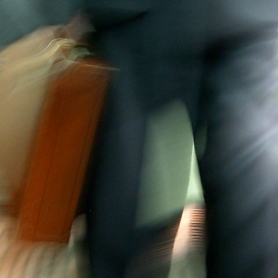
Hi Antonio, It's a man walking with a briefcase in his hand, taken from the waist down...;o) Thanks for your comment, I appreciate your honesty.
Cheers,
Hugo
|
|
|
|
|
Antonio Trincone
{K:23167} 6/6/2004
|
very intriguing abstract for this one Hugo, like the color tones too, at same time dislike the unrecognizable subject
|
|
|
|
|
Domenico Pescosolido
{K:10022} 6/6/2004
|
Hi Hugo, an interesting point of view to show the motion in photography, the composition looks like very balanced even if the colours on the center seems a little bit excessive, but is a minor issue considering the very slow time that you use. In my opinion it's a nice work. Bye Domenico.
|
|
|
|
 Teunis Haveman
{K:53426} 6/6/2004
Teunis Haveman
{K:53426} 6/6/2004
|
Hugo. ja ik zag iets vaags van een Filter an as en rook.
Groet teunis
|
|
|
|
|
Daniel S. Garcia
{K:13946} 6/6/2004
|
A real nice abstract. Almost looks like a painting. The colors work real well with the image. Beautiful work.
Daniel
|
|
|
|
 Clifton Jones
{K:10688} 6/6/2004
Clifton Jones
{K:10688} 6/6/2004
|
Good stuff Hugo...I like the absract design and the soft colors created by the motion...well done..
Clifton...
|
|
|
|
 zosia zija
{K:11106} 6/6/2004
zosia zija
{K:11106} 6/6/2004
|
interesting...
|
|
|
|
|
Hugo de Wolf
{K:185110} 6/6/2004
|
Ha Teunis, waar haal je die rokende sigaret vandaan? Die had ik er nog niet ingezien... Ben benieuwd...;o)
Groeten,
Hugo
|
|
|
|
|
Teunis Haveman
{K:53426} 6/6/2004
|
Hugo,mooie abstracte compositie van een rokende sigaret lijkt het wel
Teunis
|
|


 the Roof II (or: What happens when you follow the blue lines....)")


