|
|
|
Carlheinz Bayer
{K:14220} 3/3/2004
|
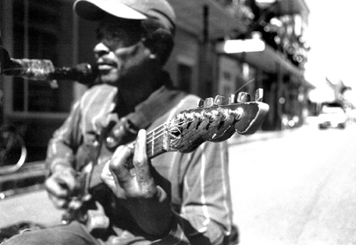
The original one is good! Where is the problem on that? I like the street scene because he looks like a street musican. The high contrast on the RHS doesn't bother at all because you have a lot of light and shaddow here. I like the head stick in focus. This picture tells a story; with a crop you have just a guy with a guitar. Good one! Carlheinz
|
|
|
|
|
aviva s.
{K:346} 2/26/2004
|
the range in depth and focus really draws one to see the music
|
|
|
|
 Rocco T
{K:4130} 2/14/2004
Rocco T
{K:4130} 2/14/2004
|
interesting DOF,..good work!
|
|
|
|
|
Sandy Stein
{K:936} 2/12/2004
|
Lighten up Dave. As an artist you can't get so upset everytime someone says something negative or offers critisism. It's only their viewpoint and has no more validity than an accolade, though they're nicer to read. This whole thing is suppose to be fun, not a source of stress. Try reading "Creativity and Fear" it's a quick read and will help. Thanks for your suggestion on my photo.
|
|
|
|
|
elias leisring
{K:37} 2/12/2004
|
i think you definetly want to leave out the overexposed right side unless you can burn it in the darkroom. I think the in focus guitar and dreamy blur of the player works well but then i am a guitarist. I like the second crop a lot
|
|
|
|
|
Sandy Stein
{K:936} 2/12/2004
|
Dave,
I'd rethink the photo. I like the crop eliminating the blown out right side but it doesn't help the fact that the emphasis stays on the tuning end of the guitar, while the real subject is relegated to out of focus 2nd fiddle(pun intended).
|
|
|
|
|
Dave Slaugenhoup
{K:827} 2/12/2004
|
One last possible option...
|

|
|
|
|
|
Dave Slaugenhoup
{K:827} 2/12/2004
|
This is another crop that I was considering to be better.
|

|
|