|
|
|
Johanna Kaikkonen
{K:151} 3/10/2004
|
You've really captured the atmosphere of Ballymun. I like the original version more, it has the same impact but better balance. Great work!
Regards, Johanna
Ps. Garda = Police
|
|
|
|
|
Stefan Engström
{K:24473} 1/28/2004
|
I don't think there is a huge difference in impact between the two versions. On the balance I'd say I prefer the original post. The contrast is very gentle here, you could play with that if you wanted to convey a harsher impression.
|
|
|
|
|
Eduardo Bernardes
{K:8999} 1/28/2004
|
Beautiful tones!!!
Congrats, Eduardo
|
|
|
|
|
Çetin Lütfi Baydar
{K:1291} 1/28/2004
|
I could not find how to write u. sorry:)
about my photo:
the little one is the most dangerous:)
|

|
|
|
|
|
Çetin Lütfi Baydar
{K:1291} 1/28/2004
|
I could not find how to write u. sorry:)
about my fhoto:
the little one is the most dangerous:)
|
|
|
|
|
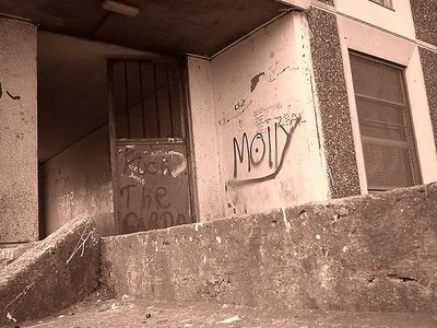
Rhonda Prince
{K:17687} 1/27/2004
|
I live the one you posted better. The crop is fine on it. Toning is good too! Do you know what the Garda is?
|
|
|
|
|
Eddy ~
{K:1152} 1/27/2004
|
very appealing texture.. i like those writings on walls, i think it's an art by itself.. really nice composition and tonning.. i just think it's a little bit overexposed even though u tried not to show it ;) still nice and appealing though
|
|
|
|
 Matej Maceas
 {K:24381} 1/27/2004
|
I prefer the original upload.
|
|
|
|
 Debprasad Datta
{K:1545} 1/26/2004
Debprasad Datta
{K:1545} 1/26/2004
|
Namaskar jake, I've been receving all your encouraging comments on my works........I do appreciate them and try to correct my infammies.........this one of your's is good.....please contact me by email........I'd like to personally get in touch with you. (munna7000@rediffmail.com)
|
|
|
|
|
Rhonda Prince
{K:17687} 1/26/2004
|
I personally like the less severely cropped image above. More impact for me. But I've been wrong before....what do you feel? Love the toning and I'd really like to meet Molly!
|
|
|
|
|
jake griffin
{K:3439} 1/26/2004
|
Does this crop have even more impact????????????
|

|
|