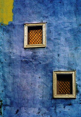
How to judge a shot like this ? Not easy imo. Ok, the wall itself looks great (colors and textures), but then we have, I think, to look at the composition. Could it be better...? I think so. You have here created a diagonal which flows down from top left to bottom right, but which doesn't end in the corner area. Therefore, once we reach the bottom right window (which is not as nice and colorful as the top one, by the way), we have nothing more to see, and yet, the wall continues below it... That is imo not right. I'd rather "quit while I'm ahead"...:-)
So, I have 2 propositions of crops to chose from:
1) you may want to crop middle of the bottom window in the width AND in the height, so that this window becomes less important and ends in the corner.
Or :
2) You may simplify this image tremendously and consider that the top window is nicer than the oder one, therefore just keeping one window in the center of a perfect square. The picture is then more simple, but textures appear more because a close-up is bound to enhance them, and you have a perfectly beautiful shot of something less amusing and surprising, but more perfect.
At the same time the yellow area top left, in both options, starts to play a major role. You may yourself regret the bottom window BECAUSE YOU WILL KNOW IT WAS THERE, but others wouldn't because they wouldn't know there was a 2nd window...
Last but not least, in every case, a bit more sun would be great.
I would be VERY interested to see next to each other the original and the 2 crops I proposed, and I suspect it could lead to a very interesting pros and cons discussion. Regards.


\" re-visit")


