|
|
|
michelle k.
{K:16270} 7/19/2003
|
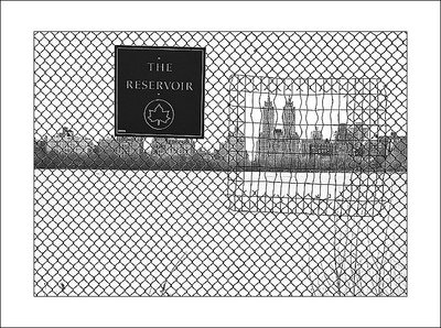
so great lisa, i love this one... cool design with the fence, good eye! : )) perfect contrasts....
|
|
|
|
|
paola f. casali
{K:7301} 7/13/2003
|
Original and beautiful composition, Lisa!!! :)
|
|
|
|
|
Ken Richardson
{K:1381} 7/13/2003
|
I like your eye Lisa. Good stuff. Regards.
|
|
|
|
|
Dave M
{K:9043} 7/13/2003
|
Love the way you framed the Dakota (at least I think it's the Dakota -- you were facing West, I believe) within the patched fencework. My only nit is that I wish focus was set to infinity, so that the buildings were a bit more sharp. But then again, I am torn, as the softness in the buildings seem to work too. Excellent.
|
|
|
|
|
Brian Bednarek
{K:1656} 7/13/2003
|
I like the stong graphic lines of the fence and how the patch repeats the shape of the sign. The patch also frames the buildings to make a sorta picture within a picture. Very well done.
|
|
|
|
|
Alan Sislen
{K:649} 7/13/2003
|
Lisa, very interesting perspective. I especially like the "patch" in the fence. One constructive (hopefully!) comment. I think the image would have been stronger if you could have changed your position slightly and not had the sign hide the upper part of the two buildings.
|
|