Just wanted to get a bit more tension on the overall look by including the stones out of focus, but was that a good decision? I'd be glad for any ideas.
Thanks a lot for the nice detailed comment, Jimmy!
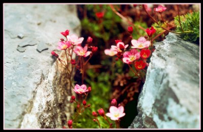
Interesting to know that you see the two stones as things that lead the eye into the image. I didn't consider that before and so the two stones give me some doubts too. I have the imporession that less of them should be taken into the image but as you say at least a part of them should be there for that "absorbing" look.
Muchas muchas gracias por la observación detallada, Gustavo, que deja en claro por qué a mí me tiene problemas con ésta. Creo que usted tiene razón, las piedras son demasiado pesados. Yo debería haber tenido menos de ellas en la imagen, en efecto! Esto mantendría la tensión y el contraste, pero las flores se hacen más como protagonistas.
i see the composition between the red flower in the midle of the stones..it was nice compo nick...the red of the flower is strongest point to to make viewer get into your photo..nice work..best regards...
mmm, yo creo que la composición, el balance de masas con el uso de las diágonales es buena, pero que las piedras muy "pesadas" en términos visuales, de alguna manera se roban y hacen languidecir a las flores, que son en definitiva el objeto de la foto...