Gracias por la explicación, voy poco a poco introduciendome en el HDR, pero intente hacer una prueba y el cielo me sale muy clarito, bueno, seguire intentandolo, sobre lo de esta foto, me gusta mucho pero no se porque al intentar poner mas contraste los blancos se queman y los negros no dejan apreciar el detalle del timbre,de todas formas si que te agradezco las explicaciones y los ejemplos que me das, como ves, con esto de los programas de retoques no me entero mucho... jejeje
Vaya vacaciones te has pegado este año eh? a este paso en breve te has hecho la vuelta al mundo!!! un abrazo
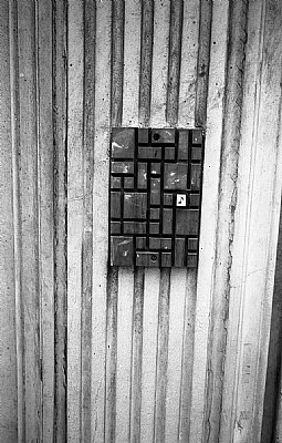
Hola Carlos: las verticales se corrigen fácilmente en photoshop; además los blancos están un poco fuera de rango; le falta un poco de contraste y de negros más profundos; "square" significa un formato cuadrado, es decir las mismas dimensiones de ancho y alto, pero finalmente he retocado tu foto en formato 4:3 la he añadido un poco de grano para ganar en textura y un marco negro como recurso para la web, suelen quedar mejor las fotos si se enmarcan; esta es mi interpretación de la foto que has tomado, que me parece buena pero mejorable; dime que te parece; un abrazo....txules
Que tal? lo de las verticales es por lo de las rayas inclinadas no? la he revelado en laboratorio la foto y esta ligeramente inclinada, lo suficiente para que moleste a la vista, por cierto, que es el Square?
como abstracto es precioso; lo único que haría es corregir las verticales y cambiar el formato, quizás funcionaria bien en "square"...un abrazo Carlos....txules