|
|
|
michelle k.
{K:16270} 5/21/2003
|
AWESOME lisa.. in my favorites. excellent mood.
|
|
|
|
|
Ramiro
{K:136} 5/17/2003
|
I agree, your portfolio is amazing!
|
|
|
|
|
John Strazza
{K:11535} 5/16/2003
|
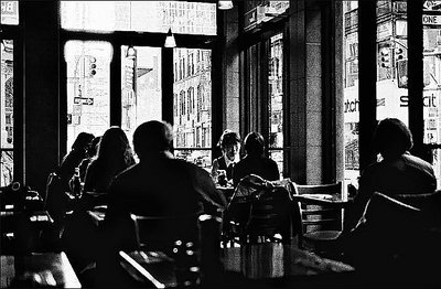
i totally love this image ... i thinks it's misunderstood here ... the way the background comes through each window like a broken painting ... amazing as is!!!
|
|
|
|
|
Deleted User
{K:881} 5/11/2003
|
you're right about the light, so why all the contrast? I do like it quite a bit but more for the grainy feel than light.
|
|
|
|
|
Brian T. Ach
{K:1742} 5/7/2003
|
Love the grain here, looks more like 1600...almost the feel of a graphic. Nice..
|
|
|
|
|
Balazs Borocz
{K:451} 5/6/2003
|
!!! great
|
|
|
|
|
Larry Roberg
{K:108} 5/2/2003
|
Good use of black and white and high grain to make a enviornmental picture. I see what you were trying to go for here, but I think the light is actually working against you. I would crop off about 1/3 of the top. The bright light coming in keeps taking my eye away from the much darker foreground. My eye also keeps going to the swatch sign on the right of the picture. (probably because it's also white and competes with the dark interior).
|
|
|
|
|
Erkan Gokce
{K:1414} 5/2/2003
|
very interesting photo!!
|
|